Bootstrap4 の使い方(4) Components (2)
Bootstrap のドキュメントを元にしたコンポーネントについての解説やサンプルです。
New モーダルを使ったライトボックスの実装方法(プラグインなし)や WordPress での利用方法を追加しました。
この他に以下のページもあるのでよろしければご覧ください。
- Layout(Bootstrap の読み込み、グリッドシステム、メディアオブジェクト)
- Content(タイポグラフィ、コード、イメージ、フィギュア、テーブル)
- Components part1(アラート、バッジ、パンくずリスト、ボタン、ドロップダウン、フォーム、インプットグループ、リストグループ、 ページネーション)
- Components part2(このページ。カード、表示・非表示切り替え、アコーディオン、ツールチップ、ポップオーバー、モーダル、ナビゲーション、ナビゲーションバー)
- Components part3(カルーセル、スクロールスパイ)
- Utilities
以下で説明している Bootstrap のバージョンは、4.1.3 です。
作成日:2018年12月27日
カード(Cards)
カード(Cards)はコンテンツを表示するための柔軟で拡張可能なコンテナのコンポーネントで、多数のオプションが用意されています。Bootstrap3 での パネル、囲み枠、サムネイル のコンポーネントは、Bootstrap4 ではカードに統合されています。
カードは Flexbox で構築されているため、簡単に配置したり他のコンポーネントと組み合わせることができます。但し、デフォルトではマージンは設定されていないので spacing utilities などを必要に応じて使用します。
以下はデフォルトで設定されている card クラスのスタイルです。
.card {
  position: relative;
  display: flex;
  flex-direction: column;
  min-width: 0;
  word-wrap: break-word;
  background-color: #fff;
  background-clip: border-box;
  border: 1px solid rgba(0, 0, 0, 0.125);
  border-radius: 0.25rem;
}
以下は、複数の要素からなる基本的なカードの例です。カードには幅の指定がないので、親要素の幅まで広がります。必要に応じてサイズを指定します。以下の例では固定幅で表示するように、インラインで幅(width: 18rem;)を指定しています。
<div class="card" style="width: 18rem;">
  <img class="card-img-top" src=".../286x180.png" alt="Card image cap">
  <div class="card-body">
    <h5 class="card-title">Card title</h5>
    <p class="card-text">Some quick example text to build on the card title and make up the bulk of the card's content.</p>
    <a href="#" class="btn btn-primary">Go somewhere</a>
  </div>
</div>
Card title
Some quick example text to build on the card title and make up the bulk of the card's content.
Go somewhereコンテンツタイプ(Content Type)
カードは、画像、テキスト、リストグループ、リンクなどの多様なコンテンツをサポートしています。以下は代表的なコンテンツのタイプです。(Content types)
カードボディ(Body)
カードを構成する領域の1つであるボディブロック(カードボディ)は card-body クラスを指定します。カード内にパディングの付いたセクション(領域)が必要な場合などに指定します(複数配置可能)。card-body クラスには、デフォルトで以下が設定されています。
.card-body {
  flex: 1 1 auto;
  padding: 1.25rem;
}
以下はカードボディを使った簡単なカードの例です。
<div class="card">
  <div class="card-body">
    This is some text within a card body.
  </div>
</div>
以下はカードとードボディのクラスを同時に指定したカード(カードボディ1つのみのカード)の例です。
<div class="card card-body"> This is some text within a card body. </div>
タイトル、テキスト、リンク
カードのタイトルは、h 要素に card-title クラスを指定します。サブタイトルは、同様に h 要素に card-subtitle クラスを指定します。 カードボディ内のタイトルとサブタイトルはうまく配置されるようになっています。以下が設定されているので、必要に応じて spacing utilities などを使って配置を調整します。
.card-title {
  margin-bottom: 0.75rem;
}
.card-subtitle {
  margin-top: -0.375rem;
  margin-bottom: 0;
}
リンクは、card-link クラスを指定すると複数ある場合は、右横に適切な間隔を取るようになっています。
.card-link + .card-link {
  margin-left: 1.25rem;
}
テキストは、card-text クラスを指定すると、以下が適用されます。
.card-text:last-child {
  margin-bottom: 0;
}
以下はカードボディ内に、タイトル、テキスト、リンクを使った例です。
<div class="card" style="width: 18rem;">
  <div class="card-body">
    <h5 class="card-title">Card title</h5>
    <h6 class="card-subtitle mb-2 text-muted">Card subtitle</h6>
    <p class="card-text">Some quick example text to build on the card title and make up the bulk of the card's content.</p>
    <a href="#" class="card-link">Card link</a>
    <a href="#" class="card-link">Another link</a>
  </div>
</div>
Card title
Card subtitle
Some quick example text to build on the card title and make up the bulk of the card's content.
Card link Another link画像
カードの先頭に画像を表示する場合は、card-img-top クラスを指定します。画像を一番下に表示する場合は、card-img-bottom クラスを指定します。
.card-img-top {
  width: 100%;
  border-top-left-radius: calc(0.25rem - 1px);
  border-top-right-radius: calc(0.25rem - 1px);
}
.card-img-bottom {
  width: 100%;
  border-bottom-right-radius: calc(0.25rem - 1px);
  border-bottom-left-radius: calc(0.25rem - 1px);
}
テキストはカードボディ内に card-text クラスを指定して配置します。
<div class="card" style="width: 18rem;">
  <img class="card-img-top" src=".../286x180.png" alt="Card image cap">
  <div class="card-body">
    <p class="card-text">Some quick example text to build on the card title and make up the bulk of the card's content.</p>
  </div>
</div>
Some quick example text to build on the card title and make up the bulk of the card's content.
リストグループ
リストグループのカードを作成するには、枠なしのリストグループ(flush list group)を使用します。
<div class="card" style="width: 18rem;">
  <ul class="list-group list-group-flush">
    <li class="list-group-item">Cras justo odio</li>
    <li class="list-group-item">Dapibus ac facilisis in</li>
    <li class="list-group-item">Vestibulum at eros</li>
  </ul>
</div>
- Cras justo odio
- Dapibus ac facilisis in
- Vestibulum at eros
以下はリストグループとカードヘッダーを配置した例です。
<div class="card" style="width: 18rem;">
  <div class="card-header">
    Featured
  </div>
  <ul class="list-group list-group-flush">
    <li class="list-group-item">Cras justo odio</li>
    <li class="list-group-item">Dapibus ac facilisis in</li>
    <li class="list-group-item">Vestibulum at eros</li>
  </ul>
</div>
- Cras justo odio
- Dapibus ac facilisis in
- Vestibulum at eros
複数コンテンツの組み合わせ
カードには色々なコンテンツを配置することができます。以下は、画像、ブロック、テキスト、リストグループを固定幅のカードに配置した例です。(Kitchen sink)
<div class="card" style="width: 18rem;">
  <img class="card-img-top" src=".../286x180.png" alt="Card image cap">
  <div class="card-body">
    <h5 class="card-title">Card title</h5>
    <p class="card-text">Some quick example text to build on the card title and make up the bulk of the card's content.</p>
  </div>
  <ul class="list-group list-group-flush">
    <li class="list-group-item">Cras justo odio</li>
    <li class="list-group-item">Dapibus ac facilisis in</li>
    <li class="list-group-item">Vestibulum at eros</li>
  </ul>
  <div class="card-body">
    <a href="#" class="card-link">Card link</a>
    <a href="#" class="card-link">Another link</a>
  </div>
</div>
Card title
Some quick example text to build on the card title and make up the bulk of the card's content.
- Cras justo odio
- Dapibus ac facilisis in
- Vestibulum at eros
div 要素や h 要素を使ってヘッダやフッタを配置することができます。それぞれ、card-header または card-footer クラスを指定します。ヘッダとフッタには薄い背景色が付きます。
以下は div 要素を使ったヘッダの例です。
<div class="card">
  <div class="card-header">
    Featured
  </div>
  <div class="card-body">
    <h5 class="card-title">Special title treatment</h5>
    <p class="card-text">With supporting text below as a natural lead-in to additional content.</p>
    <a href="#" class="btn btn-primary">Go somewhere</a>
  </div>
</div>
Special title treatment
With supporting text below as a natural lead-in to additional content.
Go somewhere以下は h 要素を使ったヘッダの例です。
<div class="card">
  <h5 class="card-header">Featured</h5>
  <div class="card-body">
    <h5 class="card-title">Special title treatment</h5>
    <p class="card-text">With supporting text below as a natural lead-in to additional content.</p>
    <a href="#" class="btn btn-primary">Go somewhere</a>
  </div>
</div>
Featured
Special title treatment
With supporting text below as a natural lead-in to additional content.
Go somewhere以下はヘッダとブロッククォートを配置したカードの例です。
<div class="card">
  <div class="card-header">
    Quote
  </div>
  <div class="card-body">
    <blockquote class="blockquote mb-0">
      <p>Lorem ipsum dolor sit amet, consectetur adipiscing elit. Integer posuere erat a ante.</p>
      <footer class="blockquote-footer">Someone famous in <cite title="Source Title">Source Title</cite></footer>
    </blockquote>
  </div>
</div>
Lorem ipsum dolor sit amet, consectetur adipiscing elit. Integer posuere erat a ante.
以下は、ヘッダとフッタを配置した例です。
<div class="card text-center">
  <div class="card-header">
    Featured
  </div>
  <div class="card-body">
    <h5 class="card-title">Special title treatment</h5>
    <p class="card-text">With supporting text below as a natural lead-in to additional content.</p>
    <a href="#" class="btn btn-primary">Go somewhere</a>
  </div>
  <div class="card-footer text-muted">
    2 days ago
  </div>
</div>
Special title treatment
With supporting text below as a natural lead-in to additional content.
Go somewhereサイズ調整
カードは特定の幅を想定していないので、指定しない限り幅は 100% になり、親要素いっぱいまで広がります。独自の CSS やグリッドシステムのクラス、ユーティリティのクラスを使って幅を指定することができます。(Sizing)
グリッドシステムを利用
グリッドシステムを使ってサイズを調整するには、行(class="row")とカラム(class="col-*")を配置しカラム内にカードを配置します。
<div class="row">
  <div class="col-sm-6">
    <div class="card">
      <div class="card-body">
        <h5 class="card-title">Special title treatment</h5>
        <p class="card-text">With supporting text below as a natural lead-in to additional content.</p>
        <a href="#" class="btn btn-primary">Go somewhere</a>
      </div>
    </div>
  </div>
</div>
Special title treatment
With supporting text below as a natural lead-in to additional content.
Go somewhereSpecial title treatment
With supporting text below as a natural lead-in to additional content.
Go somewhereユーティリティを利用
サイズのユーティリティを使ってサイズを調整することもできます。
<div class="card w-75">
  <div class="card-body">
    <h5 class="card-title">Card title</h5>
    <p class="card-text">With supporting text below as a natural lead-in to additional content.</p>
    <a href="#" class="btn btn-primary">Button</a>
  </div>
</div>

<div class="card w-50 mt-3">
  <div class="card-body">
    <h5 class="card-title">Card title</h5>
    <p class="card-text">With supporting text below as a natural lead-in to additional content.</p>
    <a href="#" class="btn btn-primary">Button</a>
  </div>
</div>
独自の CSS で調整
独自の CSS(スタイルシートまたはインライン)を使ってサイズを調整することもできます。
<div class="card" style="width: 18rem;">
  <div class="card-body">
    <h5 class="card-title">Special title treatment</h5>
    <p class="card-text">With supporting text below as a natural lead-in to additional content.</p>
    <a href="#" class="btn btn-primary">Go somewhere</a>
  </div>
</div>
Special title treatment
With supporting text below as a natural lead-in to additional content.
Go somewhereテキストの行揃え
テキストユーティリティのクラスを使って、カード全体や一部のテキストの右寄せ(.text-right)や中央寄せ(.text-center)などが可能です。(Text alignment)
<div class="card" style="width: 22rem;">
  <div class="card-body">
    <h5 class="card-title">Special title treatment</h5>
    <p class="card-text">With supporting text below as a natural lead-in to additional content.</p>
    <a href="#" class="btn btn-primary">Go somewhere</a>
  </div>
</div>

<div class="card text-center" style="width: 22rem;">
  <div class="card-body">
    <h5 class="card-title">Special title treatment</h5>
    <p class="card-text">With supporting text below as a natural lead-in to additional content.</p>
    <a href="#" class="btn btn-primary">Go somewhere</a>
  </div>
</div>

<div class="card text-right" style="width: 22rem;">
  <div class="card-body">
    <h5 class="card-title">Special title treatment</h5>
    <p class="card-text">With supporting text below as a natural lead-in to additional content.</p>
    <a href="#" class="btn btn-primary">Go somewhere</a>
  </div>
</div>
Special title treatment
With supporting text below as a natural lead-in to additional content.
Go somewhereSpecial title treatment
With supporting text below as a natural lead-in to additional content.
Go somewhereSpecial title treatment
With supporting text below as a natural lead-in to additional content.
Go somewhere画像
カードに画像とキャプションを配置する場合、キャプションを画像の上または下に配置する方法や画像にキャプションを重ねて表示する方法があります。画像は配置する位置に応じて card-img-top または card-img-bottom クラスを指定します。画像のみを配置する場合は、画像に card-img クラスを指定します。
<div class="card mb-3">
  <img class="card-img-top" src=".../852x180.png" alt="Card image cap">
  <div class="card-body">
    <h5 class="card-title">Card title</h5>
    <p class="card-text">This is a wider card with supporting text below as a natural lead-in to additional content. This content is a little bit longer.</p>
    <p class="card-text"><small class="text-muted">Last updated 3 mins ago</small></p>
  </div>
</div>
<div class="card">
  <div class="card-body">
    <h5 class="card-title">Card title</h5>
    <p class="card-text">This is a wider card with supporting text below as a natural lead-in to additional content. This content is a little bit longer.</p>
    <p class="card-text"><small class="text-muted">Last updated 3 mins ago</small></p>
  </div>
  <img class="card-img-bottom" src=".../852x180.png" alt="Card image cap">
</div>

Card title
This is a wider card with supporting text below as a natural lead-in to additional content. This content is a little bit longer.
Last updated 3 mins ago
Card title
This is a wider card with supporting text below as a natural lead-in to additional content. This content is a little bit longer.
Last updated 3 mins ago
以下は、画像のみをカードで表示する例です。画像に card-img クラスを指定すると四隅全てが角丸になります。
<div class="card">
  <img class="card-img" src="../852x270.png" alt="Card image">
</div>

オーバーレイ
画像にキャプションを重ねて表示する場合は、画像に card-img クラスを指定して、キャプション部分に card-img-overlay クラスを指定します。画像の種類(内容)などによっては追加のスタイルの指定が必要になるかも知れません。
以下の例では、背景色(.bg-dark)と文字色(.text-white)のクラスを指定しています。
<div class="card bg-dark text-white">
  <img class="card-img" src=".../852x270.png" alt="Card image">
  <div class="card-img-overlay">
    <h5 class="card-title">Card title</h5>
    <p class="card-text">This is a wider card with supporting text below as a natural lead-in to additional content. This content is a little bit longer.</p>
    <p class="card-text">Last updated 3 mins ago</p>
  </div>
</div>
背景色などのスタイル
ユーティリティクラスを使ってカードの背景色や枠線、文字色を設定することができます。
以下はカラーユーティリティを使って背景色や文字色を設定する例です。
<div class="card text-white bg-primary mb-3" style="max-width: 18rem;">
  <div class="card-header">Header</div>
  <div class="card-body">
    <h5 class="card-title">Primary card title</h5>
    <p class="card-text">Some quick example text to build on the card title and make up the bulk of the card's content.</p>
  </div>
</div>
<div class="card text-white bg-secondary mb-3" style="max-width: 18rem;">
  <div class="card-header">Header</div>
  <div class="card-body">
    <h5 class="card-title">Secondary card title</h5>
    <p class="card-text">Some quick example text to build on the card title and make up the bulk of the card's content.</p>
  </div>
</div>
<div class="card text-white bg-success mb-3" style="max-width: 18rem;">
  <div class="card-header">Header</div>
  <div class="card-body">
    <h5 class="card-title">Success card title</h5>
    <p class="card-text">Some quick example text to build on the card title and make up the bulk of the card's content.</p>
  </div>
</div>
<div class="card text-white bg-danger mb-3" style="max-width: 18rem;">
  <div class="card-header">Header</div>
  <div class="card-body">
    <h5 class="card-title">Danger card title</h5>
    <p class="card-text">Some quick example text to build on the card title and make up the bulk of the card's content.</p>
  </div>
</div>
<div class="card text-white bg-warning mb-3" style="max-width: 18rem;">
  <div class="card-header">Header</div>
  <div class="card-body">
    <h5 class="card-title">Warning card title</h5>
    <p class="card-text">Some quick example text to build on the card title and make up the bulk of the card's content.</p>
  </div>
</div>
<div class="card text-white bg-info mb-3" style="max-width: 18rem;">
  <div class="card-header">Header</div>
  <div class="card-body">
    <h5 class="card-title">Info card title</h5>
    <p class="card-text">Some quick example text to build on the card title and make up the bulk of the card's content.</p>
  </div>
</div>
<div class="card bg-light mb-3" style="max-width: 18rem;">
  <div class="card-header">Header</div>
  <div class="card-body">
    <h5 class="card-title">Light card title</h5>
    <p class="card-text">Some quick example text to build on the card title and make up the bulk of the card's content.</p>
  </div>
</div>
<div class="card text-white bg-dark mb-3" style="max-width: 18rem;">
  <div class="card-header">Header</div>
  <div class="card-body">
    <h5 class="card-title">Dark card title</h5>
    <p class="card-text">Some quick example text to build on the card title and make up the bulk of the card's content.</p>
  </div>
</div>
Primary card title
Some quick example text to build on the card title and make up the bulk of the card's content.
Secondary card title
Some quick example text to build on the card title and make up the bulk of the card's content.
Success card title
Some quick example text to build on the card title and make up the bulk of the card's content.
Danger card title
Some quick example text to build on the card title and make up the bulk of the card's content.
Warning card title
Some quick example text to build on the card title and make up the bulk of the card's content.
Info card title
Some quick example text to build on the card title and make up the bulk of the card's content.
Light card title
Some quick example text to build on the card title and make up the bulk of the card's content.
Dark card title
Some quick example text to build on the card title and make up the bulk of the card's content.
枠線の色の指定
ボーダーユーティリティのコンテクスチュアルカラーのクラスを使うと、カードの枠線の色を変更することができます。また、カラーユーティリティの text-{color} クラスを card クラスを指定した親要素に指定すれば、以下の例のようにカード全体の文字色を変更することもできます。
<div class="card border-primary mb-3" style="max-width: 18rem;">
  <div class="card-header">Header</div>
  <div class="card-body text-primary">
    <h5 class="card-title">Primary card title</h5>
    <p class="card-text">Some quick example text to build on the card title and make up the bulk of the card's content.</p>
  </div>
</div>
<div class="card border-secondary mb-3" style="max-width: 18rem;">
  <div class="card-header">Header</div>
  <div class="card-body text-secondary">
    <h5 class="card-title">Secondary card title</h5>
    <p class="card-text">Some quick example text to build on the card title and make up the bulk of the card's content.</p>
  </div>
</div>
<div class="card border-success mb-3" style="max-width: 18rem;">
  <div class="card-header">Header</div>
  <div class="card-body text-success">
    <h5 class="card-title">Success card title</h5>
    <p class="card-text">Some quick example text to build on the card title and make up the bulk of the card's content.</p>
  </div>
</div>
<div class="card border-danger mb-3" style="max-width: 18rem;">
  <div class="card-header">Header</div>
  <div class="card-body text-danger">
    <h5 class="card-title">Danger card title</h5>
    <p class="card-text">Some quick example text to build on the card title and make up the bulk of the card's content.</p>
  </div>
</div>
<div class="card border-warning mb-3" style="max-width: 18rem;">
  <div class="card-header">Header</div>
  <div class="card-body text-warning">
    <h5 class="card-title">Warning card title</h5>
    <p class="card-text">Some quick example text to build on the card title and make up the bulk of the card's content.</p>
  </div>
</div>
<div class="card border-info mb-3" style="max-width: 18rem;">
  <div class="card-header">Header</div>
  <div class="card-body text-info">
    <h5 class="card-title">Info card title</h5>
    <p class="card-text">Some quick example text to build on the card title and make up the bulk of the card's content.</p>
  </div>
</div>
<div class="card border-light mb-3" style="max-width: 18rem;">
  <div class="card-header">Header</div>
  <div class="card-body">
    <h5 class="card-title">Light card title</h5>
    <p class="card-text">Some quick example text to build on the card title and make up the bulk of the card's content.</p>
  </div>
</div>
<div class="card border-dark mb-3" style="max-width: 18rem;">
  <div class="card-header">Header</div>
  <div class="card-body text-dark">
    <h5 class="card-title">Dark card title</h5>
    <p class="card-text">Some quick example text to build on the card title and make up the bulk of the card's content.</p>
  </div>
</div>
Primary card title
Some quick example text to build on the card title and make up the bulk of the card's content.
Secondary card title
Some quick example text to build on the card title and make up the bulk of the card's content.
Success card title
Some quick example text to build on the card title and make up the bulk of the card's content.
Danger card title
Some quick example text to build on the card title and make up the bulk of the card's content.
Warning card title
Some quick example text to build on the card title and make up the bulk of the card's content.
Info card title
Some quick example text to build on the card title and make up the bulk of the card's content.
Light card title
Some quick example text to build on the card title and make up the bulk of the card's content.
Dark card title
Some quick example text to build on the card title and make up the bulk of the card's content.
ヘッダやフッタのスタイル
ヘッダやフッタの枠線は card-header クラスを指定した要素にボーダーユーティリティのクラスを指定して変更することができます。ヘッダやフッタの背景色を削除するには bg-transparent クラスを指定します。
<div class="card border-success mb-3" style="max-width: 18rem;">
  <div class="card-header bg-transparent border-success">Header</div>
  <div class="card-body text-success">
    <h5 class="card-title">Success card title</h5>
    <p class="card-text">Some quick example text to build on the card title and make up the bulk of the card's content.</p>
  </div>
  <div class="card-footer bg-transparent border-success">Footer</div>
</div>
Success card title
Some quick example text to build on the card title and make up the bulk of the card's content.
カードのレイアウト
カード用のレイアウトのオプションもありますが、現時点(バージョン4.1.3)ではこれらのレイアウトはレスポンシブ対応にはなっていません。(Card layout)
カードグループ
カードグループ(card-group クラス)を使うとそれぞれのカードの幅と高さを等しくして1つのまとまりとして表示します。例えばカードグループ内にカードを4つ配置すると、一行に4列のカードが1つのまとまりとして表示されます。カードグループはサイズを均一にするために display: flex; を使っています。(Card groups)
<div class="card-group">
  <div class="card">
    <img class="card-img-top" src=".../100px180/" alt="Card image cap">
    <div class="card-body">
      <h5 class="card-title">Card title</h5>
      <p class="card-text">This is a wider card with supporting text below as a natural lead-in to additional content. This content is a little bit longer.</p>
      <p class="card-text"><small class="text-muted">Last updated 3 mins ago</small></p>
    </div>
  </div>
  <div class="card">
    <img class="card-img-top" src=".../100px180/" alt="Card image cap">
    <div class="card-body">
      <h5 class="card-title">Card title</h5>
      <p class="card-text">This card has supporting text below as a natural lead-in to additional content.</p>
      <p class="card-text"><small class="text-muted">Last updated 3 mins ago</small></p>
    </div>
  </div>
  <div class="card">
    <img class="card-img-top" src=".../100px180/" alt="Card image cap">
    <div class="card-body">
      <h5 class="card-title">Card title</h5>
      <p class="card-text">This is a wider card with supporting text below as a natural lead-in to additional content. This card has even longer content than the first to show that equal height action.</p>
      <p class="card-text"><small class="text-muted">Last updated 3 mins ago</small></p>
    </div>
  </div>
</div>
Card title
This is a wider card with supporting text below as a natural lead-in to additional content. This content is a little bit longer.
Last updated 3 mins ago
Card title
This card has supporting text below as a natural lead-in to additional content.
Last updated 3 mins ago
Card title
This is a wider card with supporting text below as a natural lead-in to additional content. This card has even longer content than the first to show that equal height action.
Last updated 3 mins ago
それぞれのカードにフッタを指定すると、フッタの位置は自動的に調整されます。
<div class="card-group">
  <div class="card">
    <img class="card-img-top" src=".../100px180/" alt="Card image cap">
    <div class="card-body">
      <h5 class="card-title">Card title</h5>
      <p class="card-text">This is a wider card with supporting text below as a natural lead-in to additional content. This content is a little bit longer.</p>
    </div>
    <div class="card-footer">
      <small class="text-muted">Last updated 3 mins ago</small>
    </div>
  </div>
  <div class="card">
    <img class="card-img-top" src=".../100px180/" alt="Card image cap">
    <div class="card-body">
      <h5 class="card-title">Card title</h5>
      <p class="card-text">This card has supporting text below as a natural lead-in to additional content.</p>
    </div>
    <div class="card-footer">
      <small class="text-muted">Last updated 3 mins ago</small>
    </div>
  </div>
  <div class="card">
    <img class="card-img-top" src=".../100px180/" alt="Card image cap">
    <div class="card-body">
      <h5 class="card-title">Card title</h5>
      <p class="card-text">This is a wider card with supporting text below as a natural lead-in to additional content. This card has even longer content than the first to show that equal height action.</p>
    </div>
    <div class="card-footer">
      <small class="text-muted">Last updated 3 mins ago</small>
    </div>
  </div>
</div>
Card title
This is a wider card with supporting text below as a natural lead-in to additional content. This content is a little bit longer.
Card title
This card has supporting text below as a natural lead-in to additional content.
Card title
This is a wider card with supporting text below as a natural lead-in to additional content. This card has even longer content than the first to show that equal height action.
カードデッキ
隣接したカードに間隔を置いて配置する場合はカードデッキ(card-deck クラス)を使用します。(Card decks)
<div class="card-deck">
  <div class="card">
    <img class="card-img-top" src=".../100px200/" alt="Card image cap">
    <div class="card-body">
      <h5 class="card-title">Card title</h5>
      <p class="card-text">This is a longer card with supporting text below as a natural lead-in to additional content. This content is a little bit longer.</p>
      <p class="card-text"><small class="text-muted">Last updated 3 mins ago</small></p>
    </div>
  </div>
  <div class="card">
    <img class="card-img-top" src=".../100px200/" alt="Card image cap">
    <div class="card-body">
      <h5 class="card-title">Card title</h5>
      <p class="card-text">This card has supporting text below as a natural lead-in to additional content.</p>
      <p class="card-text"><small class="text-muted">Last updated 3 mins ago</small></p>
    </div>
  </div>
  <div class="card">
    <img class="card-img-top" src=".../100px200/" alt="Card image cap">
    <div class="card-body">
      <h5 class="card-title">Card title</h5>
      <p class="card-text">This is a wider card with supporting text below as a natural lead-in to additional content. This card has even longer content than the first to show that equal height action.</p>
      <p class="card-text"><small class="text-muted">Last updated 3 mins ago</small></p>
    </div>
  </div>
</div>
Card title
This is a longer card with supporting text below as a natural lead-in to additional content. This content is a little bit longer.
Last updated 3 mins ago
Card title
This card has supporting text below as a natural lead-in to additional content.
Last updated 3 mins ago
Card title
This is a wider card with supporting text below as a natural lead-in to additional content. This card has even longer content than the first to show that equal height action.
Last updated 3 mins ago
カードクラス同様、それぞれのカードにフッタを指定すると、フッタの位置は自動的に調整されます。
<div class="card-deck">
  <div class="card">
    <img class="card-img-top" src=".../100px180/" alt="Card image cap">
    <div class="card-body">
      <h5 class="card-title">Card title</h5>
      <p class="card-text">This is a wider card with supporting text below as a natural lead-in to additional content. This content is a little bit longer.</p>
    </div>
    <div class="card-footer">
      <small class="text-muted">Last updated 3 mins ago</small>
    </div>
  </div>
  <div class="card">
    <img class="card-img-top" src=".../100px180/" alt="Card image cap">
    <div class="card-body">
      <h5 class="card-title">Card title</h5>
      <p class="card-text">This card has supporting text below as a natural lead-in to additional content.</p>
    </div>
    <div class="card-footer">
      <small class="text-muted">Last updated 3 mins ago</small>
    </div>
  </div>
  <div class="card">
    <img class="card-img-top" src=".../100px180/" alt="Card image cap">
    <div class="card-body">
      <h5 class="card-title">Card title</h5>
      <p class="card-text">This is a wider card with supporting text below as a natural lead-in to additional content. This card has even longer content than the first to show that equal height action.</p>
    </div>
    <div class="card-footer">
      <small class="text-muted">Last updated 3 mins ago</small>
    </div>
  </div>
</div>
Card title
This is a wider card with supporting text below as a natural lead-in to additional content. This content is a little bit longer.
Card title
This card has supporting text below as a natural lead-in to additional content.
Card title
This is a wider card with supporting text below as a natural lead-in to additional content. This card has even longer content than the first to show that equal height action.
カードカラム
カードを Masonry のように表示するには、card-columns クラスを使用します。この場合カードは、Flexbox ではなく、CSS column プロパティで構築されます。また、カードは、上から下、左から右の順に並べられます。(Card columns)
<div class="card-columns">
  <div class="card">
    <img class="card-img-top" src=".../100px160/" alt="Card image cap">
    <div class="card-body">
      <h5 class="card-title">Card title that wraps to a new line</h5>
      <p class="card-text">This is a longer card with supporting text below as a natural lead-in to additional content. This content is a little bit longer.</p>
    </div>
  </div>
  <div class="card p-3">
    <blockquote class="blockquote mb-0 card-body">
      <p>Lorem ipsum dolor sit amet, consectetur adipiscing elit. Integer posuere erat a ante.</p>
      <footer class="blockquote-footer">
        <small class="text-muted">
          Someone famous in <cite title="Source Title">Source Title</cite>
        </small>
      </footer>
    </blockquote>
  </div>
  <div class="card">
    <img class="card-img-top" src=".../100px160/" alt="Card image cap">
    <div class="card-body">
      <h5 class="card-title">Card title</h5>
      <p class="card-text">This card has supporting text below as a natural lead-in to additional content.</p>
      <p class="card-text"><small class="text-muted">Last updated 3 mins ago</small></p>
    </div>
  </div>
  <div class="card bg-primary text-white text-center p-3">
    <blockquote class="blockquote mb-0">
      <p>Lorem ipsum dolor sit amet, consectetur adipiscing elit. Integer posuere erat.</p>
      <footer class="blockquote-footer">
        <small>
          Someone famous in <cite title="Source Title">Source Title</cite>
        </small>
      </footer>
    </blockquote>
  </div>
  <div class="card text-center">
    <div class="card-body">
      <h5 class="card-title">Card title</h5>
      <p class="card-text">This card has a regular title and short paragraphy of text below it.</p>
      <p class="card-text"><small class="text-muted">Last updated 3 mins ago</small></p>
    </div>
  </div>
  <div class="card">
    <img class="card-img" src=".../100px260/" alt="Card image">
  </div>
  <div class="card p-3 text-right">
    <blockquote class="blockquote mb-0">
      <p>Lorem ipsum dolor sit amet, consectetur adipiscing elit. Integer posuere erat a ante.</p>
      <footer class="blockquote-footer">
        <small class="text-muted">
          Someone famous in <cite title="Source Title">Source Title</cite>
        </small>
      </footer>
    </blockquote>
  </div>
  <div class="card">
    <div class="card-body">
      <h5 class="card-title">Card title</h5>
      <p class="card-text">This is another card with title and supporting text below. This card has some additional content to make it slightly taller overall.</p>
      <p class="card-text"><small class="text-muted">Last updated 3 mins ago</small></p>
    </div>
  </div>
</div>
Card title that wraps to a new line
This is a longer card with supporting text below as a natural lead-in to additional content. This content is a little bit longer.
Lorem ipsum dolor sit amet, consectetur adipiscing elit. Integer posuere erat a ante.
Card title
This card has supporting text below as a natural lead-in to additional content.
Last updated 3 mins ago
Lorem ipsum dolor sit amet, consectetur adipiscing elit. Integer posuere erat.
Card title
This card has a regular title and short paragraphy of text below it.
Last updated 3 mins ago
Lorem ipsum dolor sit amet, consectetur adipiscing elit. Integer posuere erat a ante.
Card title
This is another card with title and supporting text below. This card has some additional content to make it slightly taller overall.
Last updated 3 mins ago
カードカラムは、追加の記述でカスタマイズ(拡張)することができます。以下は、既存のクラス .card-columns を拡張して画面幅がラージサイズの場合は4列に、エクストララージサイズの場合は5列にカラム数を変更してレスポンシブにする例です。
.card-columns {
  @include media-breakpoint-only(lg) {
    column-count: 4;
  }
  @include media-breakpoint-only(xl) {
    column-count: 5;
  }
}
表示・非表示切り替え(Collapse)
Collapse は JavaScript を使ってコンテンツの表示・非表示を切り替えるコンポーネントです。
ボタンやリンクを使って特定のコンテンツ(要素)を表示したり非表示にします。非表示にする際は、アニメーションを使ってそのコンテンツの高さを 0 にします。collapse クラスを指定した要素にはパディングは指定できないので、必要に応じて内側に div 要素などを配置し、その要素にパディングを指定します。
サンプル
以下のいずれかのボタン(どちらも同じ機能)をクリックすると、クラスの変更(切り替え)により他の要素が表示されたり非表示になります。
- .collapse :コンテンツを非表示にするクラス
- .collapsing :切り替わる際に適用されるクラス
- .collapse.show :コンテンツを表示にするクラス
表示を切り替えるボタンには、a 要素か button 要素を使用することができます。どちらを使用する場合でも、data-toggle="collapse" を指定する必要があります。
<p>
  <a class="btn btn-primary" data-toggle="collapse" href="#collapseExample" role="button" aria-expanded="false" aria-controls="collapseExample">
    Link with href
  </a>
  <button class="btn btn-primary" type="button" data-toggle="collapse" data-target="#collapseExample" aria-expanded="false" aria-controls="collapseExample">
    Button with data-target
  </button>
</p>
<div class="collapse" id="collapseExample">
  <div class="card card-body">
    Anim pariatur cliche reprehenderit, enim eiusmod high life accusamus terry richardson ad squid. Nihil anim keffiyeh helvetica, craft beer labore wes anderson cred nesciunt sapiente ea proident.
  </div>
</div>
- 表示・非表示を切り替えるボタン
-
- a 要素か button 要素を使用し、data-toggle="collapse" を指定
- a 要素の場合、href 属性にコンテンツの要素の id を指定し、role="button" を指定
- button 要素の場合、data-target 属性にコンテンツの要素の id を指定
- コンテンツ
-
- collapse クラスを指定(最初から表示しておく場合は、show クラスも同時に指定)
- id 属性を指定(ボタンのターゲット)
- パディングが必要な場合は、内側に div 要素などを配置し、その要素にパディングを指定(カードを使うなど)
- アクセシビリティ
-
- role="button" :ボタンが button 要素以外(a 要素など)の場合にその役割(button であること)を伝えます
- aria-expanded="false":要素の開閉の状態を伝えます(show クラスを指定して表示状態にしている場合は、aria-expanded="true")
- aria-controls="コンテンツの id":ボタンとコンテンツの関連付けを伝えます
ターゲット(表示・非表示する要素)が複数ある場合
button 要素、または a 要素のボタンの href または data-target 属性に、それぞれが参照する要素の id や class の値を指定すれば、複数のターゲットを表示・非表示にすることができます。
以下の例では、3つ目のボタンで2つの要素の表示を同時に切り替えるため、両方の要素に multi-collapse と言うクラスを指定してボタンから参照しています(指定するクラス名は任意の名前を指定できます)。
<p>
  <a class="btn btn-primary" data-toggle="collapse" href="#multiCollapseExample1" role="button" aria-expanded="false" aria-controls="multiCollapseExample1">Toggle first element</a>
  <a class="btn btn-primary" data-toggle="collapse" href="#multiCollapseExample2" role="button" aria-expanded="false" aria-controls="multiCollapseExample2">Toggle second element</a>
  <a class="btn btn-primary" data-toggle="collapse" href=".multi-collapse" role="button" aria-expanded="false" aria-controls="multiCollapseExample1 multiCollapseExample2">Toggle both elements</a>
</p>
<div class="collapse multi-collapse" id="multiCollapseExample1">
  <div class="card card-body mb-3">
    (First Element) Anim pariatur cliche reprehenderit, enim eiusmod high life accusamus terry richardson ad squid. Nihil anim keffiyeh helvetica, craft beer labore wes anderson cred nesciunt sapiente ea proident.
  </div>
</div>
<div class="collapse multi-collapse" id="multiCollapseExample2">
  <div class="card card-body">
    (Second Element)  Anim pariatur cliche reprehenderit, enim eiusmod high life accusamus terry richardson ad squid. Nihil anim keffiyeh helvetica, craft beer labore wes anderson cred nesciunt sapiente ea proident.
  </div>
Toggle first element Toggle second element Toggle both elements
アコーディオン(Accordion)
Collapse とカードと組み合わせるとアコーディオンのように開閉するパネルを作成することができます。(Accordion)
- 全体を accordion クラスと role="tablist"、id を指定した div 要素で囲みます。 id の値は各パネルの data-parent 属性で参照する際に使用します。
- 各パネルはカードを使って記述し、開閉のボタンはカードのヘッダ内に記述します。
- ボタンは button 要素または a 要素で記述し、data-toggle="collapse" を追加して、data-target 属性(a 要素の場合は href 属性)でターゲットのパネルを参照します
- 以下の例では、button 要素にボタンコンポーネントの btn と btn-link クラスを指定していますが、btn-block などを指定することもできます。
- パネルが非表示状態になっているボタンには、collapsed クラスを追加します。
- パネルには collapse クラスを指定し、予め表示しておくパネルには、collapse と show クラスの両方を指定します。
- data-parent 属性を指定すると、他のパネルを開くと開いていたパネルを閉じるようになります(指定しなければ、個々のパネルが開閉します)。
<div class="accordion" id="accordionExample" role="tablist">

  <div class="card">
    <div class="card-header" id="headingOne">
      <h5 class="mb-0">
        <button class="btn btn-link" type="button" data-toggle="collapse" data-target="#collapseOne" aria-expanded="true" aria-controls="collapseOne">
          Collapsible Group Item #1
        </button>
      </h5>
    </div>
    <div id="collapseOne" class="collapse show" aria-labelledby="headingOne" data-parent="#accordionExample">
      <div class="card-body">
        Anim pariatur cliche reprehenderit, enim eiusmod high life accusamus terry richardson ad squid. ・・・中略・・・heard of them accusamus labore sustainable VHS.
      </div>
    </div>
  </div>

  <div class="card">
    <div class="card-header" id="headingTwo">
      <h5 class="mb-0">
        <button class="btn btn-link collapsed" type="button" data-toggle="collapse" data-target="#collapseTwo" aria-expanded="false" aria-controls="collapseTwo">
          Collapsible Group Item #2
        </button>
      </h5>
    </div>
    <div id="collapseTwo" class="collapse" aria-labelledby="headingTwo" data-parent="#accordionExample">
      <div class="card-body">
        Anim pariatur cliche reprehenderit, enim eiusmod high life accusamus terry richardson ad squid. ・・・中略・・・ heard of them accusamus labore sustainable VHS.
      </div>
    </div>
  </div>

  <div class="card">
    <div class="card-header" id="headingThree">
      <h5 class="mb-0">
        <button class="btn btn-link collapsed" type="button" data-toggle="collapse" data-target="#collapseThree" aria-expanded="false" aria-controls="collapseThree">
          Collapsible Group Item #3
        </button>
      </h5>
    </div>
    <div id="collapseThree" class="collapse" aria-labelledby="headingThree" data-parent="#accordionExample">
      <div class="card-body">
        Anim pariatur cliche reprehenderit, enim eiusmod high life accusamus terry richardson ad squid. ・・・中略・・・ heard of them accusamus labore sustainable VHS.
      </div>
    </div>
  </div>

</div>
以下は、ボタンに class="btn btn-block bg-transparent text-left" を指定し、CSS で .btn:focus のボックスシャドウを削除してスタイルを変更した例です。また、Font Awesome のアイコンを使って状態を表示しています。
<div class="accordion" id="accordionExample2" role="tablist">
  <div class="card">
    <div class="card-header" id="headingOne2">
      <h5 class="mb-0">
        <button class="btn btn-block bg-transparent text-left" type="button" data-toggle="collapse" data-target="#collapseOne2" aria-expanded="true" aria-controls="collapseOne2">
          Collapsible Group Item #1
        </button>
      </h5>
    </div>
    <div id="collapseOne2" class="collapse show" aria-labelledby="headingOne2" data-parent="#accordionExample2">
      <div class="card-body">
        Anim pariatur cliche reprehenderit, enim eiusmod high life accusamus terry richardson ad squid・・・中略・・・heard of them accusamus labore sustainable VHS.
      </div>
    </div>
  </div>

  <div class="card">
    <div class="card-header" id="headingTwo2">
      <h5 class="mb-0">
        <button class="btn btn-block bg-transparent text-left collapsed" type="button" data-toggle="collapse" data-target="#collapseTwo2" aria-expanded="false" aria-controls="collapseTwo2">
          Collapsible Group Item #2
        </button>
      </h5>
    </div>
    <div id="collapseTwo2" class="collapse" aria-labelledby="headingTwo2" data-parent="#accordionExample2">
      <div class="card-body">
        Anim pariatur cliche reprehenderit, enim eiusmod high life accusamus terry richardson ad squid・・・中略・・・heard of them accusamus labore sustainable VHS.
      </div>
    </div>
  </div>

  <div class="card">
    <div class="card-header" id="headingThree2">
      <h5 class="mb-0">
        <button class="btn btn-block bg-transparent text-left collapsed" type="button" data-toggle="collapse" data-target="#collapseThree2" aria-expanded="false" aria-controls="collapseThree2">
          Collapsible Group Item #3
        </button>
      </h5>
    </div>
    <div id="collapseThree2" class="collapse" aria-labelledby="headingThree" data-parent="#accordionExample2">
      <div class="card-body">
        Anim pariatur cliche reprehenderit, enim eiusmod high life accusamus terry richardson ad squid・・・中略・・・heard of them accusamus labore sustainable VHS.
      </div>
    </div>
  </div>
</div>
以下は、追加で指定した CSS です。アイコンの追加は擬似要素を使って、button 要素の collapsed クラスを利用しています。(関連ページ:Font Awesome 5 を疑似要素で使う)
#accordionExample2 .btn:focus {
  outline: 0;
  box-shadow: 0 0 0 transparent;
}

/* Font Awesome 5 を使う場合 */
#accordionExample2 .card-header button[data-toggle="collapse"].collapsed::after {
  font-family: 'Font Awesome 5 Free';
  font-weight: 900;
  content: "\f103";/* angle-double-down */
  float: right;
}
#accordionExample2 .card-header button[data-toggle="collapse"]::after {
  font-family: 'Font Awesome 5 Free';
  font-weight: 900;
  content: "\f102";/* angle-double-up */
  float: right;
}

/* Font Awesome 4 を使う場合 */
#accordionExample2 .card-header button[data-toggle="collapse"].collapsed::after {
  font-family: 'FontAwesome';
  content: "\f103";/* angle-double-down */
  float: right;
}
#accordionExample2 .card-header button[data-toggle="collapse"]::after {
  font-family: 'FontAwesome';
  content: "\f102";/* angle-double-up */
  float: right;
}
イベント
Collapse のイベントは、collapse クラスを指定した要素において発火されます。以下のイベントが定義されています。
| イベントタイプ | 説明 |
|---|---|
| show.bs.collapse | このイベントは、show インスタンスメソッドが呼ばれた直後に発火します。 |
| shown.bs.collapse | このイベントは、collapse 要素(非表示になっている要素)が表示されると発火します(CSS トランジションが完了するまで待ちます)。 |
| hide.bs.collapse | このイベントは、 hide インスタンスメソッドが呼び出た直後に発火します。 |
| hidden.bs.collapse | このイベントは、collapse 要素(表示されている要素)が非表示になる(隠される)と発火します(CSS トランジションが完了するまで待ちます)。 |
以下のような使い方をします。
$('#myCollapsible').on('hidden.bs.collapse', function () {
  // 要素が隠された(非表示になった)際の処理
})
以下は、非表示・表示を切り替えると、ボタンの文字を変更する例です。
<p>
  <a class="btn btn-primary" data-toggle="collapse" href="#collapseExample3" role="button" aria-expanded="false" aria-controls="collapseExample">表示する</a>
</p>
<div class="collapse" id="collapseExample3">
  <div class="card card-body">
    Anim pariatur cliche reprehenderit, enim eiusmod high.....
  </div>
</div>
$('#collapseExample3').on('show.bs.collapse', function () {
  $('[href="#collapseExample3"]').text("隠す");
})
$('#collapseExample3').on('hide.bs.collapse', function () {
  $('[href="#collapseExample3"]').text("表示する");
})
上記のような動作であれば、JavaScritp を使わなくても、CSS の擬似要素だけで実装することができますが、擬似要素は HTML として認識されないため、この例の場合はアクセシビリティに関して問題がある可能性があるので、あくまで参考まで。
<div id="collapse_sample">
  <p> <a class="btn btn-primary noicon" data-toggle="collapse" href="#collapseExample4" role="button" aria-expanded="false" aria-controls="collapseExample"></a> </p>
  <div class="collapse" id="collapseExample4">
    <div class="card card-body">
      Anim pariatur cliche reprehenderit, enim eiusmod high....
    </div>
  </div>
</div>
#collapse_sample a[aria-expanded="false"]::after {
  content: "Show";
}
#collapse_sample a[aria-expanded="true"]::after {
  content: "Hide";
}
ツールチップ(Tooltips)
ツールチップはマウスオーバー時に説明文などを表示する機能です。(Tooltips)
この機能はサードパーティのライブラリ Popper.js を利用しているため、popper.min.js を Bootstrap の JavaScript の前に読み込むか、Popper.js を含む bootstrap.bundle.min.js(または bootstrap.bundle.js)を読み込む必要があります。Bootstrap の JavaScript をソースからビルドしている場合は、util.js が必要になります。
また、この機能はデフォルトでは有効になっていないので JavaScript を使って自分で初期化の記述をする必要があります。その他、以下のような制約があります。
- title 属性の値の長さが 0(空)の場合は、表示されません。(title 属性を空にしても、data-original-title 属性に値を指定すれば表示されるようです)
- インプットグループやボタングループなどの複雑なコンポーネントでは、オプションで container: 'body' を指定することによりレンダリングの問題を回避できます。
- 非表示の要素をトリガーとしたツールチップは機能しません。
- disabled クラスを指定したり disabled 属性を指定した要素は、ラッパー要素(その要素を囲む要素)から起動するようにする必要があります。
- 複数行にまたがるハイパーリンクに対しては、ツールチップは中央に表示されます。これを回避するには、white-space: nowrap; を a 要素に指定します。
- ツールチップは、対応する要素が DOM から削除される前に非表示にする必要があります。
初期化の記述
以下を JavaScript に記述すると、data-toggle="tooltip" を指定した要素でツールチップを有効にすることができます。
 $(function () {
  $('[data-toggle="tooltip"]').tooltip();
})
ツールチップに表示する内容は、title 属性に記述します。
これは <a href="#" data-toggle="tooltip" title="この内容が表示されます">サンプル</a>です。
これは サンプルです。
以下は、button 要素を使ったサンプルです。data-placement 属性を使ってツールチップを表示する位置のオプション(デフォルトは top)を指定しています。
<button type="button" class="btn btn-secondary" data-toggle="tooltip" data-placement="top" title="Tooltip on top">
  Tooltip on top
</button>
<button type="button" class="btn btn-secondary" data-toggle="tooltip" data-placement="right" title="Tooltip on right">
  Tooltip on right
</button>
<button type="button" class="btn btn-secondary" data-toggle="tooltip" data-placement="bottom" title="Tooltip on bottom">
  Tooltip on bottom
</button>
<button type="button" class="btn btn-secondary" data-toggle="tooltip" data-placement="left" title="Tooltip on left">
  Tooltip on left
</button>
以下は、data-html="true" オプションを指定して表示する内容を HTML を使って指定する例です。
※XSS 攻撃(クロスサイトスクリプティング)が心配な場合は、このオプションを使用しないことが推奨されています。
<button type="button" class="btn btn-secondary" data-toggle="tooltip" data-html="true" title="<em>Tooltip</em> <u>with</u> <b>HTML</b>">
  Tooltip with HTML
</button>
任意のクラスで初期化
任意のクラスを指定した要素でツールチップを表示させることもできます。その場合、そのクラスを使ってツールチップの機能を有効にします。
例えば、ttps というクラスを指定した要素でツールチップを表示させるには以下のようにします。以下の JavaScript (jQuery) は、クラス属性の値が "ttps" の要素で tooltip() を実行するというような意味になります。
但し、tooltip と言うクラス名は既に Bootstrap で使用されているため、それ以外のクラス名を指定する必要があります。
$('.ttps').tooltip();
この場合、data-toggle="tooltip" を指定する必要はありません。
<p>これは ttps クラスで<a href="#" class="ttps" title="クラスで表示">ツールチップ</a>を表示する例です。</p>
これは ttps クラスでツールチップを表示する例です。
表示されるツールチップのマークアップ
ツールチップのプラグインによりツールチップを表示する際は、以下のようなマークアップが生成されます。(必要であれば、template オプションで変更することも可能です)
<!-- ツールチップを表示するマークアップ -->
<a href="#" data-toggle="tooltip" title="Some tooltip text!">Hover over me</a>

<!-- ツールチップ表示の際にプラグインにより生成されるマークアップ -->
<div class="tooltip bs-tooltip-top" role="tooltip">
  <div class="arrow"></div>
  <div class="tooltip-inner">
    Some tooltip text!
  </div>
</div>
無効な要素での表示
disabled クラスを指定したり disabled 属性を指定した要素に対しては、ホバーやフォーカスなどでツールチップを起動することができません。無効な要素にツールチップを表示するには、div 要素や span 要素で無効な要素をラップして(囲んで)ツールチップを設定します。その際に、tabindex="0" を指定してキーボードでフォーカスできるようにし、そして無効な要素のポインターイベントを上書きすることが望ましいとされています。
<span class="d-inline-block" tabindex="0" data-toggle="tooltip" title="Disabled tooltip">
  <button class="btn btn-primary" style="pointer-events: none;" type="button" disabled>Disabled button</button>
</span>
オプション
オプションは data 属性または JavaScript を使って指定することができます。(Options)
data 属性を使って指定する場合は、例えば、placement のオプションなら data-placement="auto(オプションの値)" のように指定します。
<a href="#" data-toggle="tooltip" data-placement="auto" title="ツールチップ">tooltips</a>
JavaScript の場合は、以下のように指定することができます。
$('#example').tooltip({ placement: 'auto' });
| オプション名 | タイプ | デフォルト値 | 説明 |
|---|---|---|---|
| animation | boolean | true | ツールチップに CSS フェードのトランジションアニメーションを適用するかどうか |
| container | string | element | false | false | ツールチップを特定の要素に対して付加するかどうか。(例)container: 'body' この指定は、ウィンドウのリサイズの際にツールチップが起動した要素から離れてしまうのを防ぐのに有効です。 |
| delay | number | object | 0 | ツールチップの表示・非表示にかかる時間をミリ秒で指定。但し trigger オプションを manual に指定している場合は適用されません。number(数値)で指定した場合は、表示・非表示の両方に適用され、Object で指定する場合は、delay: { "show": 500, "hide": 100 } のように指定できます。 |
| html | boolean | false | ツールチップ表示に HTML の使用を許可するかどうか。false の場合は、jQuery の text() メソッドを使用。※XSS 攻撃(クロスサイトスクリプティング)が心配な場合は、このオプションを使用しない(true にしない)ことが推奨されています。 |
| placement | string | function | 'top' | ツールチップの位置を指定。指定できる値は、 auto、top、bottom、left、right。auto を指定すると動的に位置が変更されます。関数(function)が使用される場合は、第一引数にツールチップの DOM ノードを、第二引数にツールチップを起動する DOM ノードを受け取ります。this のコンテクストはツールチップのインスタンスになります。 |
| selector | string | false | false | セレクタが提供されれば、ツールチップのオブジェクトは指定されたターゲットに付与(delegated to)されます。実際には、popovers を追加した場合に使用されます。(参考サイト) |
| template | string | '<div class="tooltip" role="tooltip"><div class="arrow"></div><div class="tooltip-inner"></div></div>' | ツールチップのベースとなる HTML マークアップ。ツールチップのタイトルは、.tooltip-inner 内に挿入され、.arrow は矢印。最も外側の要素は .tooltip クラスと role="tooltip" が指定されている必要があります。 |
| title | string | element | function | '' | title 属性がない場合の、デフォルトの title の値。 |
| trigger | string | 'hover focus' | どのようにツールチップを起動するか。指定できる値は、click、hover、focus、manual。複数の値をスペース区切りで指定可能。manual を指定した場合は、.tooltip('show'),.tooltip('hide'),.tooltip('toggle') により起動され、他のオプションと同時に指定することはできません。hover だけを単独で指定すると、キーボードからの操作で起動できないので、キーボードのみのユーザーに他の手段でツールチップの内容を伝える必要があります。 |
| offset | number | string | 0 | ツールチップのターゲットからのオフセット。詳細は Popper.js ドキュメントを参照。 |
| fallbackPlacement | string | array | 'flip' | Popper.js がフォールバックの際に取り得る位置。詳細は Popper.js ドキュメントを参照。 |
| boundary | string | element | 'scrollParent' | ツールチップのオーバーフロー制約の境界の指定。'viewport', 'window', 'scrollParent' または HTML 要素 (JavaScript only)。詳細は Popper.js ドキュメントを参照。 |
ポップオーバー(Popovers)
ツールチップと似たような機能としてポップオーバーという機能も用意されています。ポップオーバーはクリックすると表示され、説明文が見出しと本文からなる形式になっています。(Popovers)
この機能はサードパーティのライブラリ Popper.js を利用しているため、popper.min.js を Bootstrap の JavaScript の前に読み込むか、Popper.js を含む bootstrap.bundle.min.js(または bootstrap.bundle.js)を読み込む必要があります。Bootstrap の JavaScript をソースからビルドしている場合は、util.js が必要になります。
また、この機能はデフォルトでは有効になっていないので JavaScript を使って自分で初期化の記述をする必要があります。その他、以下のような制約があります。
- ポップオーバーは依存関係としてツールチップのプラグインが必要です。
- title 属性と data-content 属性の値の両方の長さが 0(空)の場合は、表示されません。
- インプットグループやボタングループなどの複雑なコンポーネントでは、オプションで container: 'body' を指定することによりレンダリングの問題を回避できます。
- 非表示の要素をトリガーとしたポップオーバーは機能しません。
- disabled クラスを指定したり disabled 属性を指定した要素は、ラッパー要素(その要素を囲む要素)から起動するようにする必要があります。
- 複数行にまたがるハイパーリンクに対しては、ポップオーバーは中央に表示されます。これを回避するには、white-space: nowrap; を a 要素に指定します。
- ポップオーバーは、対応する要素が DOM から削除される前に非表示にする必要があります。
初期化の記述
以下を JavaScript に記述すると、data-toggle="popover" を指定した要素でポップオーバーを有効にすることができます。
$(function () {
  $('[data-toggle="popover"]').popover()
})
ポップオーバーを使用するには、要素に data-toggle="popover" 属性を指定し、title 属性にポップオーバーで表示するタイトルを、data-content 属性にポップオーバーの本文(内容)を指定ます(title 属性を指定しない場合は、本文のみが表示されます)。
<a href="#" data-toggle="popover" data-content="コンテンツ(内容)" title="タイトル" >ポップオーバーを表示</a>
任意のクラスを指定した要素でポップオーバーを表示させることもできます。その場合、そのクラスを使ってポップオーバーの機能を有効にします。
例えば、ppovr というクラス(popover と言うクラス名は使用できません)を指定した要素でポップオーバーを表示させるには以下のようにします。以下の JavaScript (jQuery) は、クラス属性の値が "ppovr" の要素で popover() を実行するというような意味になります。
$(function () {
  $('.ppovr').popover();
})
<a href="#" data-content="コンテンツ(内容)" title="タイトル" class="ppovr">ポップオーバーを表示</a>
container オプション
親要素に何らかのスタイルを適用しているために、ポップオーバーの表示に影響がある場合は、container オプション(container:'body')を指定してポップオーバーの HTML がその要素内に表示することができます。以下は JavaScript を使った指定の例です。
$(function () {
  $('.example-popover').popover({
    container: 'body'
  })
})
data 属性を使って container オプションを指定する場合は、data-container="body" とします。
<a href="#" data-toggle="popover" data-container="body" data-content="コンテンツ(内容)" title="タイトル" >ポップオーバーを表示</a>
表示する位置
表示する位置は top, right, bottom, と left を指定することができます。
<button type="button" class="btn btn-secondary" data-container="body" data-toggle="popover" data-placement="top" data-content="Vivamus sagittis lacus vel augue laoreet rutrum faucibus.">
  Popover on top
</button>

<button type="button" class="btn btn-secondary" data-container="body" data-toggle="popover" data-placement="right" data-content="Vivamus sagittis lacus vel augue laoreet rutrum faucibus.">
  Popover on right
</button>

<button type="button" class="btn btn-secondary" data-container="body" data-toggle="popover" data-placement="bottom" data-content="Vivamus
sagittis lacus vel augue laoreet rutrum faucibus.">
  Popover on bottom
</button>

<button type="button" class="btn btn-secondary" data-container="body" data-toggle="popover" data-placement="left" data-content="Vivamus sagittis lacus vel augue laoreet rutrum faucibus.">
  Popover on left
</button>
閉じ方のオプション
ポップオーバーは、ポップオーバーを表示する要素を再度クリックすることで閉じるようになっていますが、その要素以外の他の部分(要素)をクリックして閉じることができるようにするには、trigger オプション(data-trigger="focus")を指定します。
但し、この方法を全てのブラウザで正しく実行するには、button 要素ではなく a 要素を使い、tabindex 属性(tabindex="0")も合わせて指定することが推奨されています。
<a tabindex="0" class="btn btn-lg btn-danger" role="button" data-toggle="popover" data-trigger="focus" title="Dismissible popover" data-content="And here's some amazing content...">Dismissible popover</a>
以下は、JavaScript を使ってオプションを指定する例です。
$('.popover-dismiss').popover({
  trigger: 'focus'
})
無効な要素での表示
disabled クラスを指定したり disabled 属性を指定した要素に対しては、ホバーやフォーカスなどでポップオーバーを起動することができません。無効な要素にポップオーバーを表示するには、div 要素や span 要素で無効な要素をラップして(囲んで)ポップオーバーを設定します。その際に、無効な要素のポインターイベントを上書き(style="pointer-events: none;")することが望ましいとされています。
また、無効になっている要素をクリックすることはあまりないので、data-trigger="hover" のオプションを指定して、ポップオーバーの起動をホバー時に行うようにすると良いかもしれません。
<span class="d-inline-block" data-toggle="popover" data-trigger="hover" title="Hover Opt" data-content="Disabled popover">
  <button class="btn btn-primary" style="pointer-events: none;" type="button" disabled>Disabled button</button>
</span>
オプション
オプションは data 属性または JavaScript を使って指定することができます。(Options)
data 属性を使って指定する場合は、例えば、trigger のオプションなら data-trigger="hover(オプションの値)" のように指定します。
JavaScript の場合は、以下のように指定することができます。
$('#example').popover({ placement: 'auto' });
| オプション名 | タイプ | デフォルト値 | 説明 |
|---|---|---|---|
| animation | boolean | true | ポップオーバーに CSS フェードのトランジションアニメーションを適用するかどうか |
| container | string | element | false | false | ポップオーバーを特定の要素に対して付加するかどうか。(例)container: 'body' この指定は、ウィンドウのリサイズの際にポップオーバーが起動した要素から離れてしまうのを防ぐのに有効です。 |
| delay | number | object | 0 | ポップオーバーの表示・非表示にかかる時間をミリ秒で指定。但し trigger オプションを manual に指定している場合は適用されません。number(数値)で指定した場合は、表示・非表示の両方に適用され、Object で指定する場合は、delay: { "show": 500, "hide": 100 } のように指定できます。 |
| html | boolean | false | ポップオーバー表示に HTML の使用を許可するかどうか。false の場合は、jQuery の text() メソッドを使用。※XSS 攻撃(クロスサイトスクリプティング)が心配な場合は、このオプションを使用しない(true にしない)ことが推奨されています。 |
| placement | string | function | 'right' | ポップオーバーの位置を指定。指定できる値は、 auto、top、bottom、left、right。auto を指定すると動的に位置が変更されます。関数(function)が使用される場合は、第一引数にポップオーバーの DOM ノードを、第二引数にポップオーバーを起動する DOM ノードを受け取ります。this のコンテクストはポップオーバーのインスタンスになります。 |
| selector | string | false | false | セレクタが提供されれば、ポップオーバーのオブジェクトは指定されたターゲットに付与(delegated to)されます。(参考サイト) |
| template | string | '<div class="popover" role="tooltip"><div class="arrow"></div><h3 class="popover-header"></h3><div class="popover-body"></div></div>' | ポップオーバーのベースとなる HTML マークアップ。ポップオーバーのタイトルは、.popover-header 内に、コンテンツは popover-body 内に挿入され .arrow は矢印。最も外側の要素は .popover クラスが指定されている必要があります。 |
| title | string | element | function | '' | title 属性がない場合の、デフォルトの title の値。 |
| trigger | string | 'click' | どのようにポップオーバーを起動するか。指定できる値は、click、hover、focus、manual。複数の値をスペース区切りで指定可能。manual を指定した場合は他のオプションと同時に指定することはできません。 |
| offset | number | string | 0 | ポップオーバーのターゲットからのオフセット。詳細は Popper.js ドキュメントを参照。 |
| fallbackPlacement | string | array | 'flip' | Popper.js がフォールバックの際に取り得る位置。詳細は Popper.js ドキュメントを参照。 |
| boundary | string | element | 'scrollParent' | ポップオーバーのオーバーフロー制約の境界の指定。'viewport', 'window', 'scrollParent' または HTML 要素 (JavaScript only)。詳細は Popper.js ドキュメントを参照。 |
モーダル(Modal)
モーダル(Modal)は、ボタンやリンク等をクリックした時に、モーダルダイアログを表示する機能です。以下のような特徴や制約があります。
- モーダルは HTML、CSS、JavaScript を使って構築されていて、全ての他の要素より上に位置し、モーダルがスクロールできるように body 要素からスクロール機能を削除しています。
- モーダルの背景部分をクリックすると自動的にモーダルを閉じるようになっています。
- Bootstrap は1つのモーダルのみをサポートしています。ネストされた(入れ子になった)モーダルはサポートされていません、
- モーダルは position: fixed を使用しています。そのため可能であれば、他の要素からの影響を受けないようにするため、モーダルの HTML をトップレベルに配置するようにします。
- modal クラスの要素を別の position: fixed を適用した要素内にネストすると問題が発生する可能性が高くなります。
- position: fixed を使用しているため、モバイルデバイスでの使用には注意が必要です(browser support docs)。
- HTML5 のセマンティックの定義により、autofocus 属性は Bootstrap のモーダルでは効果がありません。オートフォーカスの効果を得るには JavaScript を使って以下のようにします。
$('#myModal').on('shown.bs.modal', function () {
  $('#myInput').trigger('focus')
})
サンプル
モーダルダイアログを表示する要素(button 要素や a 要素など)に data-toggle="modal" を指定し、data-target 属性(a 要素の場合は href 属性)にモーダルダイアログ用の div 要素の id 属性(または特定できる class 属性)の値を指定します。
モーダルダイアログ用の div 要素に、modal と fade クラスを指定し、前述の data-target 属性(a 要素の場合は href 属性)に指定した値を id 属性に指定します。
モーダルダイアログ用の div 要素の中に modal-dialog クラスを指定した div 要素を作成し、更にその中に modal-content クラスを指定した div 要素を作成します。
modal-content クラスを指定した div 要素の中に必要に応じて、ヘッダ(modal-header クラスを指定した div 要素)、本文(modal-body クラスを指定した div 要素)、フッタ(modal-footer クラスを指定した di v要素)を配置します。ヘッダ内に表示する文字に modal-title クラスを指定しておくと、余白や行間などが適切なスタイルに設定されます。
また、モーダルダイアログを閉じるボタンを作成するには、その要素に data-dismiss="modal" という属性(JavaScript が機能するための Bootstrap 独自の属性)を指定します。
以下の例では、ヘッダとフッタにダイアログを閉じるためのボタンを配置しています。ヘッダのボタンには close クラスを指定しています。Bootstrap では少なくともヘッダ内にダイアログを閉じるためのボタンを配置することを推奨しています。
<!-- モーダルを表示するボタン -->
<button type="button" class="btn btn-primary" data-toggle="modal" data-target="#exampleModal">
Launch demo modal
</button>
<!-- モーダルダイアログ本体-->
<div class="modal fade" id="exampleModal" tabindex="-1" role="dialog" aria-labelledby="exampleModalLabel" aria-hidden="true">
<div class="modal-dialog" role="document">
<div class="modal-content">
<div class="modal-header">
<h5 class="modal-title" id="exampleModalLabel">Modal title</h5>
<button type="button" class="close" data-dismiss="modal" aria-label="Close">
<span aria-hidden="true">×</span>
</button>
</div>
<div class="modal-body">
Woohoo, you're reading this text in a modal!
</div>
<div class="modal-footer">
<button type="button" class="btn btn-secondary" data-dismiss="modal">Close</button>
<button type="button" class="btn btn-primary">Save changes</button>
</div>
</div>
</div>
</div>
アクセシビリティ
- tabindex="-1":キーボードの順次ナビゲーションでは到達できないようにします(非表示のため)
- role="dialog" :モーダルダイアログとしての役割であることを伝えます。
- aria-hidden="true":その要素が非表示であることを伝え、読み上げをしないようにします。
- aria-labelledby="参照要素の id":モーダルダイアログの説明を伝えます。
- role="document":ドキュメントとしての役割であることを伝えます。
- aria-label="Close":「閉じる(Close)」と言う意味を伝えます。
コンテンツが長い場合
モーダルダイアログボックスに表示するコンテンツがビューボートやデバイスに対して長くなった場合は、自動的にスクロールするようになっています。(特に設定は必要ありません)
垂直方向の中央配置
モーダルダイアログを垂直方向に中央配置するには、modal-dialog クラスを指定した div 要素に modal-dialog-centered クラスを指定します。
<!-- Button trigger modal -->
<button type="button" class="btn btn-primary" data-toggle="modal" data-target="#exampleModalCenter">
Launch demo modal
</button>
<!-- Modal -->
<div class="modal fade" id="exampleModalCenter" tabindex="-1" role="dialog" aria-labelledby="exampleModalCenterTitle" aria-hidden="true">
<div class="modal-dialog modal-dialog-centered" role="document">
<div class="modal-content">
<div class="modal-header">
<h5 class="modal-title" id="exampleModalCenterTitle">Modal title</h5>
<button type="button" class="close" data-dismiss="modal" aria-label="Close">
<span aria-hidden="true">×</span>
</button>
</div>
<div class="modal-body">
...
</div>
<div class="modal-footer">
<button type="button" class="btn btn-secondary" data-dismiss="modal">Close</button>
<button type="button" class="btn btn-primary">Save changes</button>
</div>
</div>
</div>
</div>
ツールチップとポップオーバーの追加
ツールチップやポップオーバーをモーダルに追加することができます。モーダルを閉じると、これらも自動的に閉じるようになっています。
<!-- Button trigger modal -->
<button type="button" class="btn btn-primary" data-toggle="modal" data-target="#exampleModalttp_ppvr">
Launch demo modal
</button>
<!-- Modal -->
<div class="modal fade" id="exampleModalttp_ppvr" tabindex="-1" role="dialog" aria-labelledby="exampleModalTTpTitle" aria-hidden="true">
<div class="modal-dialog modal-dialog-centered" role="document">
<div class="modal-content">
<div class="modal-header">
<h5 class="modal-title" id="exampleModalTTpTitle">Modal title</h5>
<button type="button" class="close" data-dismiss="modal" aria-label="Close">
<span aria-hidden="true">×</span>
</button>
</div>
<div class="modal-body">
<h5>Popover in a modal</h5>
<p>This <a href="#" role="button" data-toggle="popover" class="btn btn-secondary" title="Popover title" data-content="Popover body content.">button</a> triggers a popover on click.</p>
<hr>
<h5>Tooltips in a modal</h5>
<p><a href="#" data-toggle="tooltip" title="Tooltip">This link</a> and <a href="#" data-toggle="tooltip" title="Tooltip">that link</a> have tooltips on hover.</p>
</div>
<div class="modal-footer">
<button type="button" class="btn btn-secondary" data-dismiss="modal">Close</button>
<button type="button" class="btn btn-primary">Save changes</button>
</div>
</div>
</div>
</div>
グリッドシステムの使用
Bootstrap のグリッドシステムを使用する場合は、modal-body クラスを指定した div 要素内に、container-fluid クラスを指定した div 要素を配置(ネスト)して、通常のグリッドシステムのクラスを使用します。
<!-- Button trigger modal -->
<button type="button" class="btn btn-primary" data-toggle="modal" data-target="#exampleModalGrid">
Launch demo modal
</button>
<!-- Modal -->
<div class="modal fade" id="exampleModalGrid" tabindex="-1" role="dialog" aria-labelledby="exampleModalGridTitle" aria-hidden="true">
<div class="modal-dialog modal-dialog-Grided" role="document">
<div class="modal-content">
<div class="modal-header">
<h5 class="modal-title" id="exampleModalGridTitle">Modal title</h5>
<button type="button" class="close" data-dismiss="modal" aria-label="Close">
<span aria-hidden="true">×</span>
</button>
</div>
<div class="modal-body">
<div class="container-fluid"><!-- .container-fluid -->
<div class="row">
<div class="col-md-4">.col-md-4</div>
<div class="col-md-4 ml-auto">.col-md-4 .ml-auto</div>
</div>
<div class="row">
<div class="col-md-3 ml-auto">.col-md-3 .ml-auto</div>
<div class="col-md-2 ml-auto">.col-md-2 .ml-auto</div>
</div>
<div class="row">
<div class="col-md-6 ml-auto">.col-md-6 .ml-auto</div>
</div>
<div class="row">
<div class="col-sm-9">
Level 1: .col-sm-9
<div class="row">
<div class="col-8 col-sm-6">
Level 2: .col-8 .col-sm-6
</div>
<div class="col-4 col-sm-6">
Level 2: .col-4 .col-sm-6
</div>
</div>
</div>
</div>
</div>
</div>
<div class="modal-footer">
<button type="button" class="btn btn-secondary" data-dismiss="modal">Close</button>
<button type="button" class="btn btn-primary">Save changes</button>
</div>
</div>
</div>
</div>
コンテンツの再利用
複数のボタンから内容が少しだけ異なるモーダルダイアログを表示する場合、 JavaScript の event.relatedTarget と HTML の data-* 属性を使ってそれぞれのボタンごとにモーダルダイアログの内容を変更することができます。(Varying modal content)
以下は HTML と JavaScript を使った例で、モーダルの要素(#exampleModalVaryingContent)のイベント(show.bs.modal)を利用して、それぞれのボタンの data-recipient 属性の値を取得して表示する内容を変更しています。
<button type="button" class="btn btn-primary" data-toggle="modal" data-target="#exampleModalVaryingContent" data-recipient="@mdo">Open modal for @mdo</button>
<button type="button" class="btn btn-primary" data-toggle="modal" data-target="#exampleModalVaryingContent" data-recipient="@fat">Open modal for @fat</button>
<button type="button" class="btn btn-primary" data-toggle="modal" data-target="#exampleModalVaryingContent" data-recipient="@getbootstrap">Open modal for @getbootstrap</button>
<div class="modal fade" id="exampleModalVaryingContent" tabindex="-1" role="dialog" aria-labelledby="exampleModalVaryingContentLabel" aria-hidden="true">
<div class="modal-dialog" role="document">
<div class="modal-content">
<div class="modal-header">
<h5 class="modal-title" id="exampleModalVaryingContentLabel">New message</h5>
<button type="button" class="close" data-dismiss="modal" aria-label="Close">
<span aria-hidden="true">×</span>
</button>
</div>
<div class="modal-body">
<form>
<div class="form-group">
<label for="recipient-name" class="col-form-label">Recipient:</label>
<input type="text" class="form-control" id="recipient-name">
</div>
<div class="form-group">
<label for="message-text" class="col-form-label">Message:</label>
<textarea class="form-control" id="message-text"></textarea>
</div>
</form>
</div>
<div class="modal-footer">
<button type="button" class="btn btn-secondary" data-dismiss="modal">Close</button>
<button type="button" class="btn btn-primary">Send message</button>
</div>
</div>
</div>
</div>
$('#exampleModalVaryingContent').on('show.bs.modal', function (event) {
  // show.bs.modal イベントはモーダルダイアログが表示されると発火され、クリックされた場合、そのクリックされた要素は event.relatedTarget で取得可能(次の行)
  var button = $(event.relatedTarget) // モーダルを起動するボタン
  var recipient = button.data('recipient') // data-* 属性(data-recipient)から情報を取得
  // 以下で jQuery を使ってモーダルダイアログのコンテンツを更新
  var modal = $(this) // this はモーダルダイアログの要素
  modal.find('.modal-title').text('New message to ' + recipient)
  modal.find('.modal-body input').val(recipient)
})
アニメーションの削除
モーダルダイアログをフェード効果のアニメーションなしで表示するには、fade クラスを削除します。
<div class="modal" tabindex="-1" role="dialog" aria-labelledby="..." aria-hidden="true">
  ...
</div>
高さの動的な更新
モーダルダイアログが開いている状態で高さが変更され、スクロールバーが表示される場合、$('#myModal').modal('handleUpdate') でモーダルダイアログの位置を調整することができます。
YouTube 動画の埋め込み
YouTube 動画をモーダルで表示する場合、追加の JavaScript が必要になります。詳細は「Stack Overflow post」を参照ください。
サイズのオプション
モーダルには2つのオプションのサイズ(Large と Small)があります。modal-dialog クラスを指定した div 要素に modal-lg または modal-sm クラスを追加することでサイズを変更することができます。
※ v4.2.1 では modal-xl(Extra Large)が追加されています。
| Size | Class | Modal max-width |
|---|---|---|
| Small | .modal-sm | 300px |
| Default | (指定)なし | 500px |
| Large | .modal-lg | 800px |
| Extra large | .modal-xl | 1140px |
<!-- Large modal -->
<button type="button" class="btn btn-primary" data-toggle="modal" data-target=".bd-example-modal-lg">Large modal</button>

<div class="modal fade" tabindex="-1" role="dialog" aria-labelledby="myLargeModalLabel" aria-hidden="true">
  <div class="modal-dialog modal-lg">
    <div class="modal-content">
      ...
    </div>
  </div>
</div>

<!-- Small modal -->
<button type="button" class="btn btn-primary" data-toggle="modal" data-target=".bd-example-modal-sm">Small modal</button>

<div class="modal fade" tabindex="-1" role="dialog" aria-labelledby="mySmallModalLabel" aria-hidden="true">
  <div class="modal-dialog modal-sm">
    <div class="modal-content">
      ...
    </div>
  </div>
</div>
オプション
| オプション名 | タイプ | デフォルト値 | 説明 |
|---|---|---|---|
| backdrop | boolean | 'static' | true | modal-backdrop 要素(背景のオーバーレイ表示)を含めるかどうか。または、static を指定すると、背景をクリックしてもモーダルを閉じない。 |
| keyboard | boolean | true | エスケープキーを押した時にモーダルを閉じるかどうか。 |
| focus | boolean | true | 初期化時にモーダルにフォーカスを移動するかどうか。 |
| show | boolean | true | 初期化時にモーダルを表示するかどうか。 |
ライトボックス(Lightbox)
今までの例ではボタンをクリックしてモーダルダイアログのコンテンツを表示しましたが、ボタンの代わりに(サムネイル)画像を使い、モーダルダイアログのコンテンツに拡大した画像を指定すればライトボックスのような効果が得られます。
以下の例ではサムネイル画像と拡大表示する画像は同じものを使ってサムネイル画像には幅を指定して縮小表示していますが、サイズの異なる画像を用意した方が良いかも知れません。
modal-dialog クラスの div 要素には画像を中央表示するための modal-dialog-centered(垂直方向の中央配置)と大サイズで表示するための modal-lg クラスを指定しています(サイズのオプション)。
閉じるボタンにはインラインのスタイルで絶対配置にしてマージンと背景色を指定しています。
サムネイル画像にはインラインのスタイルでカーソルの形状をポインターにしています。
<!-- Element(img) trigger modal -->
<p><img src="../images/image01.jpg" data-toggle="modal" data-target="#exampleModalLB" alt="" width="220" style="cursor: pointer"></p>
<!-- Modal -->
<div class="modal fade" id="exampleModalLB" tabindex="-1" role="dialog" aria-labelledby="modalLBlabel" aria-hidden="true">
<div class="modal-dialog modal-dialog-centered modal-lg" role="img">
<div class="modal-content">
<button type="button" class="close" data-dismiss="modal" aria-label="Close" style="position:absolute; right:-1em; top:-1em; background:#FFF; height:1em; width:1em; border-radius:1em;"> <span aria-hidden="true">×</span> </button>
<!-- sr-only クラスを指定したラベル -->
<p class="sr-only" id="modalLBlabel">Hoboken から見たマンハッタンの写真</p>
<img src="../images/image01.jpg" alt="マンハッタンの写真"> </div>
</div>
</div>
ライトボックスサンプル

ライトボックスの実装
上記のような記述を拡大表示する画像に全て指定するのは面倒なので、サムネイル画像のリンクに任意のクラスを指定してクリックすると拡大表示するライトボックスを jQuery を使って実装する例です。
使い方はライトボックスで表示するサムネイル画像に、クラス名を指定した画像へのリンク(a 要素)を設定します。
この例の場合、a 要素に bs-lbox と言うクラスを指定しています。
<p>
  <a class="bs-lbox" href="../images/1200x900_01.jpg">
    <img src="../images/240x180_01.jpg" alt="">
  </a>
</p>
以下の jQuery を JavaScript ファイルなどに記述します。
13~15行目は拡大表示する画像の先読み込みです。この方法の場合、先読み込みをしておかないと拡大画像が表示される際にカクッとなる可能性があります。
19行目は長いですが、拡大画像を表示するためのモーダルダイアログの HTML です。一番外側の div 要素の id(変数 modal_id)はイベント処理の対象の要素を識別する値として使います。画像の URL は画像がクリックされた際に jQuery で入れ替えるため何でも構いません構いませんが、実在しない画像を指定するとコンソールにはその画像に対して 404 (Not Found) というエラーが表示されてしまうので、以下の例では base64 というデータ形式の 1×1px の gif 画像を src 属性に指定しています。
21~23行目はサムネイル画像のリンク(a 要素)をモーダルダイアログを表示する要素とするために、data-target と data-toggle 属性を設定しています。
26行目からはモーダルの show.bs.modal イベントの設定です
show.bs.modal イベントはモーダルダイアログが表示されると発火され、クリックされた場合、そのクリックされた要素は event.relatedTarget で取得できるので、クリックされた画像のリンク(a 要素)を変数 image_link に入れます。
リンク(image_link)の href 属性から拡大表示する画像の URL を取得して、それをモーダルダイアログ内の画像要素の src 属性に指定しています。
$(function () {
//Light Box
var lightbox_class = '.bs-lbox'; //画像へのリンク(a 要素)に指定するクラス
var modal_id = 'bs-lbox-dialog'; //モーダルの要素に指定する ID
var modal_id_hash = '#' + modal_id; //ID の前に # を付けた値
//「閉じる」ボタンにインラインで指定するスタイル
var button_style = 'style="position:absolute; right:-1em; top:-1em; background:#FFF; height:1em; width:1em; border-radius:1em;"';
//閉じるの「x」にインラインで指定するスタイル
var span_style = '';
if($(lightbox_class).length > 0 ) {//bs-lboxクラスを指定した要素が存在すれば以下を実行
$('a' + lightbox_class).each(function() { //画像の先読み込み
$("<img>").attr("src", $(this).attr('href'));
});
var size = 'modal-lg'; //モーダルのサイズを指定(modal-sm/modal-lg/modal-xl/'')
$('body').append('<div class="modal fade" id="' + modal_id + '" tabindex="-1" role="dialog" aria-hidden="true"><div class="modal-dialog modal-dialog-centered ' + size + '" role="img"><div class="modal-content"><button type="button" class="close" data-dismiss="modal" aria-label="Close" ' + button_style + '> <span aria-hidden="true" ' + span_style + '>×</span> </button><img src="data:image/gif;base64,R0lGODlhAQABAAAAACH5BAEKAAEALAAAAAABAAEAAAICTAEAOw==" alt=""> </div></div></div>');
$(lightbox_class).each(function() {
$(this).attr('data-target', modal_id_hash).attr('data-toggle', 'modal');
});
}
$(modal_id_hash).on('show.bs.modal', function (event) {
var image_link = $(event.relatedTarget);// モーダルを起動する要素(クリックされた a 要素)
var href = image_link.attr('href'); // href 属性から URL を取得
// 以下でモーダルダイアログの img 要素(拡大表示する画像)の src 属性を更新
var modal = $(this); // this はモーダルダイアログの要素
modal.find('.modal-content img').attr('src', href);
});
});
以下はサンプルです。画像のリンク(a 要素)に bs-lbox と言うクラスを指定します。他のクラス名でも問題ありませんが、その場合は前述の jQuery の該当箇所(3行目)もそのクラス名に変更する必要があります。
<p><a class="bs-lbox" href="../images/1200x900_01.jpg"><img src="../images/240x180_01.jpg" alt=""></a></p>
<p><a class="bs-lbox" href="../images/1200x900_02.jpg"><img src="../images/240x180_02.jpg" alt=""></a></p>
<p><a class="bs-lbox" href="../images/1200x900_03.jpg"><img src="../images/240x180_03.jpg" alt=""></a></p>


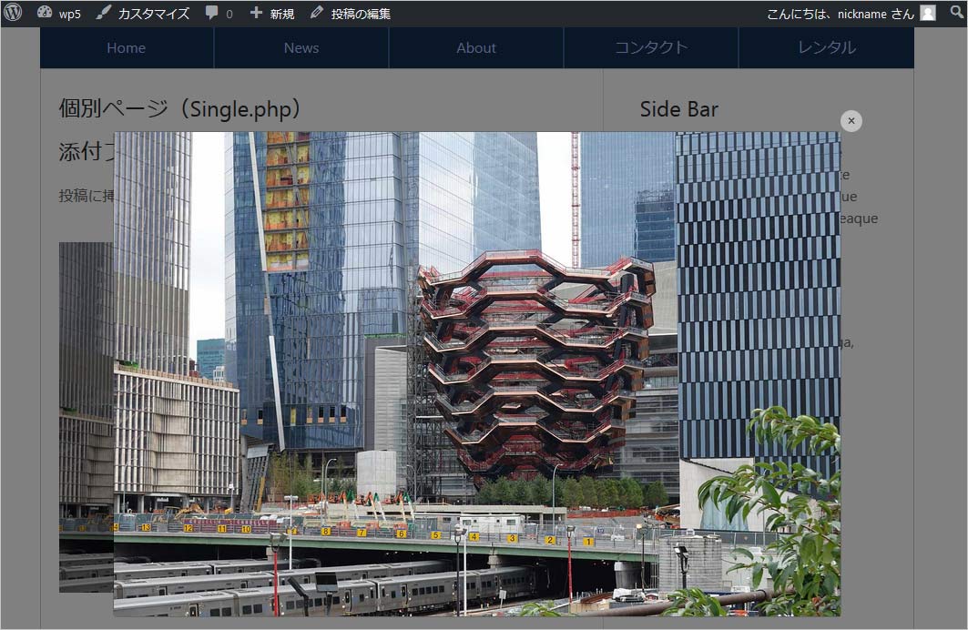
WordPress で Lightbox
WordPress で Bootstrap 4 を使うには Bootstrap の JavaScript と CSS を読み込む必要があります。
関連ページ:WordPress で Bootstrap 4 のカルーセルを使う/Bootstrap の読み込み
ライトボックスを実装するには前述同様、独自の JavaScript ファイルに以下を記述します。
「ライトボックスの実装方法」と内容はほとんど同じです(※)。閉じるのボタンの位置が少しずれるのでインラインのスタイルを追加していますが、それぞれの環境でスタイルは調整する必要があるかと思います。
$(function () {
//Light Box
var lightbox_class = '.bs-lbox'; //画像へのリンク(a 要素)に指定するクラス
var modal_id = 'bs-lbox-dialog'; //モーダルの要素に指定する ID
var modal_id_hash = '#' + modal_id; //ID の前に # を付けた値
//「閉じる」ボタンにインラインで指定するスタイル
var button_style = 'style="position:absolute; right:-1em; top:-1em; background:#FFF; height:1em; width:1em; border-radius:1em;"';
//閉じるの「x」にインラインで指定するスタイル(※ 前述の例との違いはここのみ)
var span_style = 'style="position:relative; bottom: .5em;"';
if($(lightbox_class).length > 0 ) {//bs-lboxクラスを指定した要素が存在すれば以下を実行
$('a' + lightbox_class).each(function() { //画像の先読み込み
$("<img>").attr("src", $(this).attr('href'));
});
var size = 'modal-lg'; //モーダルのサイズを指定(modal-sm/modal-lg/modal-xl/'')
$('body').append('<div class="modal fade" id="' + modal_id + '" tabindex="-1" role="dialog" aria-hidden="true"><div class="modal-dialog modal-dialog-centered ' + size + '" role="img"><div class="modal-content"><button type="button" class="close" data-dismiss="modal" aria-label="Close" ' + button_style + '> <span aria-hidden="true" ' + span_style + '>×</span> </button><img src="data:image/gif;base64,R0lGODlhAQABAAAAACH5BAEKAAEALAAAAAABAAEAAAICTAEAOw==" alt=""> </div></div></div>');
$(lightbox_class).each(function() {
$(this).attr('data-target', modal_id_hash).attr('data-toggle', 'modal');
});
}
$(modal_id_hash).on('show.bs.modal', function (event) {
var image_link = $(event.relatedTarget);// モーダルを起動する要素(クリックされた a 要素)
var href = image_link.attr('href'); // href 属性から URL を取得
// 以下でモーダルダイアログの img 要素(拡大表示する画像)の src 属性を更新
var modal = $(this); // this はモーダルダイアログの要素
modal.find('.modal-content img').attr('src', href);
});
});
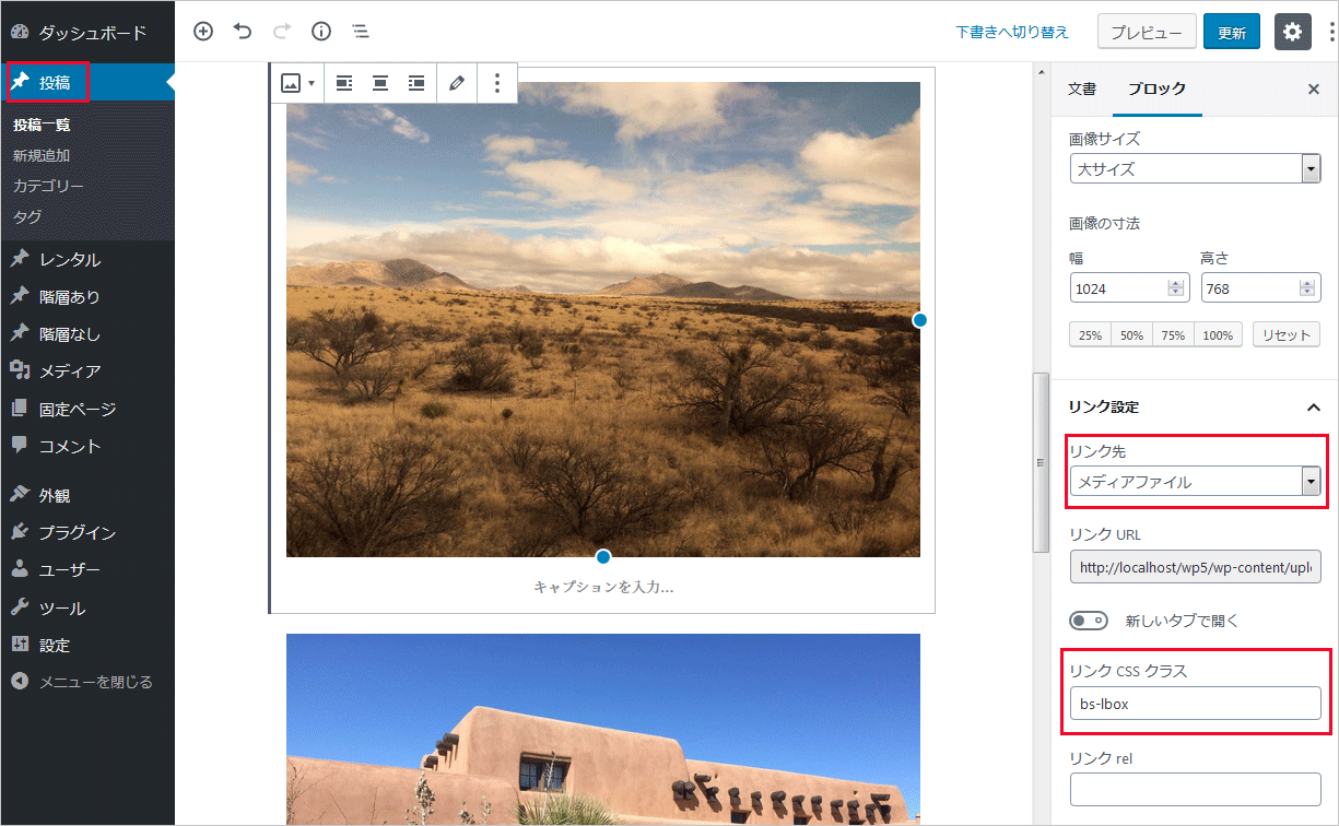
後はライトボックス表示する投稿の画像にクラス bs-lbox を指定して、画像のリンク先をに拡大表示する画像(メディアファイル)を指定するだけです。
画像に指定クラスは画像を選択して右側の「リンク CSS クラス」に入力し、画像のリンク先は「リンク先」のプルダウンで「メディアファイル」を選択します。
以下のように表示されると思います。