Compass
作成日:2016年5月30日
Compass の基本的な使い方
Compass は Sass のミックスインや関数など多数の機能を提供してくれるフレームワークです。Compass のサイトには「Compass is an open-source CSS Authoring Framework.」と書かれています。
Compass のインストールや設定に関しては検索するか「Sass/Compass のインストールと基本的な環境設定(2014年3月4日の記事なので少し古いですが)」をご参照ください。以下ではすでに Compass のインストール及び設定は完了していることを前提にしています。
現時点(2016年5月)での Compass の最新バージョンは、 Compass 1.0.3 (Polaris) です。コマンドプロンプトで「compass -v」とタイプすると確認できます。
C:\Users\xxxx>compass -v
Compass 1.0.3 (Polaris)
Copyright (c) 2008-2016 Chris Eppstein
Released under the MIT License.
以下は、フォルダ構成の一例です。
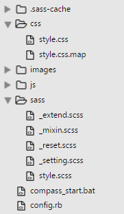
以下は、config.rb の設定例です。
http_path = "/"
css_dir = "css"
sass_dir = "sass"
images_dir = "images"
javascripts_dir = "js"
output_style = :expanded  //アウトプットスタイルの指定
relative_assets = true  //関数等で使うURLを相対パスに
line_comments = false  //Sass ファイルの行数などのコメントを書き出さない
asset_cache_buster :none  //画像のクエリ情報をつけない
sourcemap = true  //コンパイル時に Source Map の生成
以下は、compass_start.bat の設定例です。
cd /d %~dp0  //このバッチファイルがある場所に移動
compass w  //自動監視スタート
Compass のインポート
Compass を利用するには、Compass をインポートする必要があります。
Compass をインポートするには、Sass ファイルに以下のように指定して Compass をインポートします。
//SASS (.scss)
@import "compass";
上記のように指定すると、以下の Compass のコアモジュールがインポートされ、ミックスイン等の機能が使えるようになります。
Compass のコアモジュール
- CSS3 : ベンダープレフィックスやレガシーブラウザ対応のミックスインなど
- Typography : テキストカラー、行間などのテキスト系ミックスイン
- Utilities : 色や Clearfix などのミックスイン
モジュールを個別にインポートすることも可能です。
//SASS (.scss)
@import "compass/css3";
@import "compass/typography";
@import "compass/utilities";
以下の2つのモジュールはコアモジュールでインポートされないので、個別にインポート指定する必要があります。
//SASS (.scss)
@import "compass/layout";
@import "compass/reset";
Compass のベンダープレフィックス
ベンダープレフィックスの出力を制御するには、いくつかの方法があります。
参考:
Tuning Vendor Prefixes from Compass Stylesheets
Compass Cross-Browser Support Configuration
$graceful-usage-threshold
$graceful-usage-threshold という設定変数があり、デフォルトの値は「0.1」に設定されています。これは、対象のブラウザのユーザーが 0.1% より少なくなると、そのベンダープレフィックスは削除されるようになっています。
この値を大きくすれば、ベンダープレフィックスが付かなくなり、値を小さくすればより多くのベンダープレフィックスが付くようになっています。
//SASS (.scss)
$graceful-usage-threshold: 0.001;  //より多くのベンダープレフィックスが付く
$graceful-usage-threshold: 99;  //ベンダープレフィックスが付かなくなる
※但し、この設定変数は Compass のインポートの前に設定しておく必要があります。
//SASS (.scss)
$graceful-usage-threshold: 99;
@import "compass";
//_setting.scss
$graceful-usage-threshold: 5;
//SASS (.scss)
@import "setting";
@import "compass";
モジュールごとの閾値
$graceful-usage-threshold:はシステム全体の閾値の設定で、モジュールごとに個別に閾値を設定できます。
例えば、border-radius() の場合は以下の設定変数で閾値を設定できます。
//SASS (.scss)
$border-radius-threshold: 0.01;

.foo {
  @include border-radius(5px);
}
モジュールごとの閾値(例えば $border-radius-threshold)は基本的には $graceful-usage-threshold (の値)が設定されています。
個別にベンダープレフィックスを設定
with-prefix() を使うと個別にベンダープレフィックスを設定できます。
//SASS (.scss)
.foo a {
  @include with-prefix(-moz) {
    @include border-radius(4px);
  }
}
/* CSS コンパイル後*/
.foo a {
  -moz-border-radius: 4px;
  border-radius: 4px;
}
ブラウザサポートの停止
ブラウザサポートを停止するには、以下のように「$supported-browsers」に「reject(browsers())」を使って対象のブラウザを記述します。以下の例は全てのブラウザを対象にしているので、ベンダープレフィックスは出力されなくなります。
//SASS (.scss)
$supported-browsers: reject(browsers(),
 android,
 blackberry,
 chrome,
 android-chrome,
 firefox,
 android-firefox,
 ie,
 ie-mobile,
 safari,
 ios-safari,
 opera,
 opera-mini,
 opera-mobile
);
$debug-browser-support
$debug-browser-support を「true」に指定すると、何故そのブラウザサポートがされているのか、またはされていないかの理由がコメントで表示されます。
//SASS (.scss)
$debug-browser-support: true;

.foo a {
  @include border-radius(4px);
}
/* CSS コンパイル後*/
.foo a {
  /* Capability border-radius is prefixed with -moz because 0.25036% of users need it which is more than the threshold of 0.1%. */
  /* Creating new -moz context. */
  -moz-border-radius: 4px;
  /* Capability border-radius is not prefixed with -ms because 0% of users are affected which is less than the threshold of 0.1. */
  /* Capability border-radius is not prefixed with -o because 0% of users are affected which is less than the threshold of 0.1. */
  /* Capability border-radius is prefixed with -webkit because 0.1583% of users need it which is more than the threshold of 0.1%. */
  /* Creating new -webkit context. */
  -webkit-border-radius: 4px;
  border-radius: 4px;
}
Compass のミックスイン
Compass には便利なミックスインが用意されています。
CSS3 モジュール
CSS3 モジュールは、ベンダープレフィックスや、ブラウザの下位バージョンに対応するプロパティを書き出してくれます。最近ではベンダープレフィックスはだんだん不要になってきているので、無駄なベンダープレフィックスは付けないようにした方が良いでしょう。
以下は、CSS3 モジュールの中のいくつかのミックスインの使用例です。ほとんどのミックスインではパラメータ(引数)に、通常の CSS3 のプロパティの値を指定することができます。
ボックスシャドウ
パラメータは、CSS3 のプロパティの値の書式で指定します。
/* CSS */
box-shadow: 横オフセット 縦オフセット ブラー スプレッド 色 insetキーワード ;
以下は box-shadow() の使用例です。
//SASS (.scss)
.foo {
  @include box-shadow();
}

.bar {
  @include box-shadow(2px 2px 10px red);
}
/* CSS コンパイル後*/
.foo {
  -moz-box-shadow: 0px 0px 5px #333333;
  -webkit-box-shadow: 0px 0px 5px #333333;
  box-shadow: 0px 0px 5px #333333;
}

.bar {
  -moz-box-shadow: 2px 2px 10px red;
  -webkit-box-shadow: 2px 2px 10px red;
  box-shadow: 2px 2px 10px red;
}
パラメータを指定しない場合は、以下のデフォルトの値が適用されます。
| 設定変数 | 意味 | デフォルト値 |
|---|---|---|
| $default-box-shadow-h-offset | 横オフセット | 0px |
| $default-box-shadow-v-offset | 縦オフセット | 0px |
| $default-box-shadow-blur | ブラー | 5px |
| $default-box-shadow-spread | スプレッド | null |
| $default-box-shadow-color | 色 | #333333 |
| $default-box-shadow-inset | inset キーワード | null |
上記の設定変数の値を変更すれば、デフォルトの値を変更することができます。
//SASS (.scss)
$default-box-shadow-h-offset : 2px;
$default-box-shadow-v-offset : 3px;
$default-box-shadow-blur : 5px;
$default-box-shadow-spread : 2px;
$default-box-shadow-color : rgba(#6C7AA6, .3);
$default-box-shadow-inset : null;

%box-shadow {
  @include box-shadow();
}

.foo {
  @extend %box-shadow;
}

.bar {
  @extend %box-shadow;
}
/* CSS コンパイル後*/
.foo, .bar {
  -moz-box-shadow: 2px 3px 5px 2px rgba(108, 122, 166, 0.3);
  -webkit-box-shadow: 2px 3px 5px 2px rgba(108, 122, 166, 0.3);
  box-shadow: 2px 3px 5px 2px rgba(108, 122, 166, 0.3);
}
Sass の rgba($color, $alpha) 関数なども使えます。また、CSS3 同様に複数の影も指定できます。
//SASS (.scss)
.foo {
  @include box-shadow(0 2px 4px rgba(#5540CC, .8));
}

.bar {
  @include box-shadow(0 2px 4px 1px rgba(#000, .3), 5px 5px 10px 3px rgba(orange ,0.1) inset);
}
/* CSS コンパイル後*/
.foo {
  -moz-box-shadow: 0 2px 4px rgba(85, 64, 204, 0.8);
  -webkit-box-shadow: 0 2px 4px rgba(85, 64, 204, 0.8);
  box-shadow: 0 2px 4px rgba(85, 64, 204, 0.8);
}

.bar {
  -moz-box-shadow: 0 2px 4px 1px rgba(0, 0, 0, 0.3), 5px 5px 10px 3px rgba(255, 165, 0, 0.1) inset;
  -webkit-box-shadow: 0 2px 4px 1px rgba(0, 0, 0, 0.3), 5px 5px 10px 3px rgba(255, 165, 0, 0.1) inset;
  box-shadow: 0 2px 4px 1px rgba(0, 0, 0, 0.3), 5px 5px 10px 3px rgba(255, 165, 0, 0.1) inset;
}
グラデーション
グラデーションは、Compass Images(background または background-image)の ミックスインを利用します。
//SASS (.scss)
@include background(linear-gradient(値));
@include background(radial-gradient(値));

@include background-image(linear-gradient(値));
@include background-image(radial-gradient(値));
グラデーションのベンダープレフィックスの出力は $gradient-support-threshold 設定変数の値を調整することで制御できます。デフォルトの値は「0.1」で、値を大きくすると出力されるベンダープレフィックスは少なくなります。
SVG の背景画像の書き出しの制御は、$svg-gradient-shim-threshold 設定変数の値を調整することで制御できます。
線形グラデーション linear-gradient()
パラメータは、CSS3 のプロパティの値の書式で指定します。
/* CSS */
linear-gradient( 方向または角度, 開始色 位置, 途中色 位置, 終了色 位置);
以下は linear-gradient() の使用例です。
//SASS (.scss)
.foo {
   @include background-image(linear-gradient(to top, #333, #999));
}
/* CSS コンパイル後*/
.foo {
  background-image: url('data:image/svg+xml;base64,PD94bWwgdmVyc2lvbj0iMS4wIiBlbmNvZGluZz0idXRmLTgiPz4gPHN2ZyB2ZXJzaW9uPSIxLjEiIHhtbG5zPSJodHRwOi8vd3d3LnczLm9yZy8yMDAwL3N2ZyI+PGRlZnM+PGxpbmVhckdyYWRpZW50IGlkPSJncmFkIiBncmFkaWVudFVuaXRzPSJvYmplY3RCb3VuZGluZ0JveCIgeDE9IjAuNSIgeTE9IjEuMCIgeDI9IjAuNSIgeTI9IjAuMCI+PHN0b3Agb2Zmc2V0PSIwJSIgc3RvcC1jb2xvcj0iIzMzMzMzMyIvPjxzdG9wIG9mZnNldD0iMTAwJSIgc3RvcC1jb2xvcj0iIzk5OTk5OSIvPjwvbGluZWFyR3JhZGllbnQ+PC9kZWZzPjxyZWN0IHg9IjAiIHk9IjAiIHdpZHRoPSIxMDAlIiBoZWlnaHQ9IjEwMCUiIGZpbGw9InVybCgjZ3JhZCkiIC8+PC9zdmc+IA==');
  background-size: 100%;
  background-image: -webkit-gradient(linear, 50% 100%, 50% 0%, color-stop(0%, #333333), color-stop(100%, #999999));
  background-image: -moz-linear-gradient(bottom, #333333, #999999);
  background-image: -webkit-linear-gradient(bottom, #333333, #999999);
  background-image: linear-gradient(to top, #333333, #999999);
}
コンパイル後の CSS を見ると SVG の背景画像の書き出しや、ベンダープレフィックスが出力されているのがわかります。また、方向に to を使わない古い書き方をすると現在の書式に自動的に変換してくれます。
SVG の背景画像の書き出しをしないようにするには、$svg-gradient-shim-threshold にある程度以上の数値を指定します。デフォルトは、$graceful-usage-threshold の値(0.1)です。
または、$graceful-usage-threshold の値を調整します。その場合は、他のベンダープレフィックスの出力も影響を受けます。
//SASS (.scss)
$svg-gradient-shim-threshold: 3;

.foo {
   @include background-image(linear-gradient(#333, #999));
}
/* CSS コンパイル後*/
.foo {
  background-image: -webkit-gradient(linear, 50% 0%, 50% 100%, color-stop(0%, #333333), color-stop(100%, #999999));
  background-image: -moz-linear-gradient(#333333, #999999);
  background-image: -webkit-linear-gradient(#333333, #999999);
  background-image: linear-gradient(#333333, #999999);
}
以下は、カラーヘルパー関数 adjust-lightness() を利用したミックスインの例です。このミックスインは色と明るさの割合を指定すると線形グラデーションを作成します。
また、$gradient-support-threshold の値を変更してベンダープレフィックスの出力を制御しています。
//SASS (.scss)
$svg-gradient-shim-threshold: 3;
$gradient-support-threshold: 10;

@mixin linearGradient($color, $amount: 20%, $direction:to bottom) {
  @if unitless($amount) {
    $amount: 1% * $amount;
  }
  @include background(linear-gradient($direction, $color, adjust-lightness($color, $amount)));
}

.foo {
  @include linearGradient(#729a7f);
}

.bar {
  @include linearGradient(#999, -30%, to left);
}
/* CSS コンパイル後*/
.foo {
  background: -webkit-linear-gradient(top, #729a7f, #adc5b5);
  background: linear-gradient(to bottom, #729a7f, #adc5b5);
}

.bar {
  background: -webkit-linear-gradient(right, #999999, #4d4d4d);
  background: linear-gradient(to left, #999999, #4d4d4d);
}
円形グラデーション radial-gradient()
パラメータは、CSS3 のプロパティの値の書式で指定します。
/* CSS */
radial-gradient( 形状 サイズ 中心の位置, 開始色 位置, 途中色 位置, 終了色 位置);
以下は radial-gradient() の使用例です。
//SASS (.scss)
.baz {
   @include background(radial-gradient(#B9F1FB 0%, #39A5C0 50%, #057293 100%));
}
/* CSS コンパイル後*/
.baz {
  background: url('data:image/svg+xml;base64,PD94bWwgdmVyc2lvbj0iMS4wIiBlbmNvZGluZz0idXRmLTgiPz4gPHN2ZyB2ZXJzaW9uPSIxLjEiIHhtbG5zPSJodHRwOi8vd3d3LnczLm9yZy8yMDAwL3N2ZyI+PGRlZnM+PHJhZGlhbEdyYWRpZW50IGlkPSJncmFkIiBncmFkaWVudFVuaXRzPSJ1c2VyU3BhY2VPblVzZSIgY3g9IjUwJSIgY3k9IjUwJSIgcj0iMTAwJSI+PHN0b3Agb2Zmc2V0PSIwJSIgc3RvcC1jb2xvcj0iI2I5ZjFmYiIvPjxzdG9wIG9mZnNldD0iNTAlIiBzdG9wLWNvbG9yPSIjMzlhNWMwIi8+PHN0b3Agb2Zmc2V0PSIxMDAlIiBzdG9wLWNvbG9yPSIjMDU3MjkzIi8+PC9yYWRpYWxHcmFkaWVudD48L2RlZnM+PHJlY3QgeD0iMCIgeT0iMCIgd2lkdGg9IjEwMCUiIGhlaWdodD0iMTAwJSIgZmlsbD0idXJsKCNncmFkKSIgLz48L3N2Zz4g');
  background: -moz-radial-gradient(#b9f1fb 0%, #39a5c0 50%, #057293 100%);
  background: -webkit-radial-gradient(#b9f1fb 0%, #39a5c0 50%, #057293 100%);
  background: radial-gradient(#b9f1fb 0%, #39a5c0 50%, #057293 100%);
}
変形処理(トランスフォーム)
以下は、CSS3 の transform プロパティの書式です。
/* CSS3 */
transform: トランスフォーム関数();
パラメータは、CSS3 のプロパティの値の書式で指定します。
以下は rotate() 関数の使用例です。
//SASS (.scss)
.foo {
  @include rotate(15deg);
}
/* CSS コンパイル後*/
.foo {
  -moz-transform: rotate(15deg);
  -ms-transform: rotate(15deg);
  -webkit-transform: rotate(15deg);
  transform: rotate(15deg);
}
以下は、transform() の設定変数とその初期値(デフォルト値)です。
| 設定変数 | 意味 | デフォルト値 |
|---|---|---|
| $transform-support-threshold | ベンダープレフィックスの制御 | $graceful-usage-threshold |
| $default-origin-x | transform-origin の x-offset | 50% |
| $default-origin-y | transform-origin の y-offset | 50% |
| $default-origin-z | transform-origin の z-offset | 50% |
| $default-scale-x | X 軸方向の伸縮する比率 | 1.25 |
| $default-scale-y | Y 軸方向の伸縮する比率 | $default-scale-x |
| $default-scale-z | Z 軸方向の伸縮する比率 | $default-scale-x |
| $default-rotate | 回転角度 | 45deg |
| $default-translate-x | X 軸方向の移動距離 | 1em |
| $default-translate-y | Y 軸方向の移動距離 | $default-translate-x |
| $default-translate-z | Z 軸方向の移動距離 | $default-translate-x |
| $default-skew-x | X 軸の傾斜角度 | 5deg |
| $default-skew-y | Y 軸の傾斜角度 | 5deg |
以下は、transform() の使用例です。
//SASS (.scss)
.foo {
   @include skew(-20deg, -20deg);
}

.bar {
  @include scale(2);
}

.baz {
  @include translate(20px, 40px);
}
/* CSS コンパイル後*/
.foo {
  -moz-transform: skew(-20deg, -20deg);
  -ms-transform: skew(-20deg, -20deg);
  -webkit-transform: skew(-20deg, -20deg);
  transform: skew(-20deg, -20deg);
}

.bar {
  -moz-transform: scale(2, 2);
  -ms-transform: scale(2, 2);
  -webkit-transform: scale(2, 2);
  transform: scale(2, 2);
}

.baz {
  -moz-transform: translate(20px, 40px);
  -ms-transform: translate(20px, 40px);
  -webkit-transform: translate(20px, 40px);
  transform: translate(20px, 40px);
}
トランジション transition
以下は、transition() の設定変数とその初期値(デフォルト値)です。
| 設定変数 | 意味 | デフォルト値 |
|---|---|---|
| $default-transition-property | 適用する対象の CSS プロパティ | all |
| $default-transition-duration | アニメーションの継続時間 | 1s |
| $default-transition-function | イージング | false |
| $default-transition-delay | 遅延時間 | false |
Timing-function ($default-transition-function) と delay はブラウザのデフォルトの値を使用するように false に設定されています (ease, 0s)。
以下は、transition を使ったロールオーバーアニメーションの例です。パラメータに何も指定していないので、デフォルトの値が適用されます。
//SASS (.scss)
.foo {
  width: 80px;
  height: 80px;
  background: #F8DDDD;
  margin: 20px;
  @include transition();
}

.foo:hover {
  width: 240px;
  background: #F94D50;
}
/* CSS コンパイル後*/
.foo {
  width: 80px;
  height: 80px;
  background: #F8DDDD;
  margin: 20px;
  -moz-transition: all 1s;
  -o-transition: all 1s;
  -webkit-transition: all 1s;
  transition: all 1s;
}

.foo:hover {
  width: 240px;
  background: #F94D50;
}
transition のプロパティは個別に指定することも、ショートハンドでまとめて指定することもできます。
//SASS (.scss)
.foo {
  width: 80px;
  height: 80px;
  line-height: 80px;
  text-align: center;
  margin: 50px 0;
  border: 1px solid #BBB232;
  background-color: #F7ED91;
  color: #ECB94C;
  @include transition-property(transform, color);
  @include transition-duration(0.5s);
}

.foo:hover {
  color: #E47609;
  @include rotate(360deg);
}
/* CSS コンパイル後*/
.foo {
  width: 80px;
  height: 80px;
  line-height: 80px;
  text-align: center;
  margin: 50px 0;
  border: 1px solid #BBB232;
  background-color: #F7ED91;
  color: #ECB94C;
  -moz-transition-property: -moz-transform, color;
  -o-transition-property: -o-transform, color;
  -webkit-transition-property: -webkit-transform, color;
  transition-property: transform, color;
  -moz-transition-duration: 0.5s;
  -o-transition-duration: 0.5s;
  -webkit-transition-duration: 0.5s;
  transition-duration: 0.5s;
}

.foo:hover {
  color: #E47609;
  -moz-transform: rotate(360deg);
  -ms-transform: rotate(360deg);
  -webkit-transform: rotate(360deg);
  transform: rotate(360deg);
}
以下はショートハンドで指定する例です。また、transform-origin: right; で回転軸の位置を指定しています。
//SASS (.scss)
.foo{
  margin: 30px 0;
  width: 80px;
  height: 80px;
  line-height: 80px;
  text-align: center;
  color: #2A94B9;
  border: 1px solid #317AAF;
  background-color: #B9DFFB;
  @include transition(transform 1s, color 0.8s);
  transform-origin: right;
}

.foo:hover {
  color: #E47609;
  @include rotateY(180deg);
}
/* CSS コンパイル後*/
.foo {
  margin: 30px 0;
  width: 80px;
  height: 80px;
  line-height: 80px;
  text-align: center;
  color: #2A94B9;
  border: 1px solid #317AAF;
  background-color: #B9DFFB;
  -moz-transition: -moz-transform 1s, color 0.8s;
  -o-transition: -o-transform 1s, color 0.8s;
  -webkit-transition: -webkit-transform 1s, color 0.8s;
  transition: transform 1s, color 0.8s;
  transform-origin: right;
}

.foo:hover {
  color: #E47609;
  -moz-transform: rotateY(180deg);
  -webkit-transform: rotateY(180deg);
  transform: rotateY(180deg);
}
イージング Timing-function
transition や animation では、イージングを指定することができます。標準で指定できるのは linear, ease (デフォルト), ease-in, ease-out, ease-in-out の5種類ですが、以下のサイトでいろいろなイージングの中から好きなものを選択して、cubic-bezier 関数の値を取得することができます。
また、Sass では変数が使えるのでこれらの値を変数に格納してパーシャルファイルに記述しておきインポートして利用すると便利です。以下の値は上記のサイトを参考にしました。
//SASS (.scss)
//timing-function/Easing
$easeInSine: cubic-bezier(0.47, 0, 0.745, 0.715);
$easeOutSine: cubic-bezier(0.39, 0.575, 0.565, 1);
$easeInOutSine: cubic-bezier(0.445, 0.05, 0.55, 0.95);
$easeInQuad: cubic-bezier(0.55, 0.085, 0.68, 0.53);
$easeOutQuad: cubic-bezier(0.25, 0.46, 0.45, 0.94);
$easeInOutQuad: cubic-bezier(0.455, 0.03, 0.515, 0.955);
$easeInCubic: cubic-bezier(0.55, 0.055, 0.675, 0.19);
$easeOutCubic: cubic-bezier(0.215, 0.61, 0.355, 1);
$easeInOutCubic: cubic-bezier(0.645, 0.045, 0.355, 1);
$easeInQuart: cubic-bezier(0.895, 0.03, 0.685, 0.22);
$easeOutQuart: cubic-bezier(0.165, 0.84, 0.44, 1);
$easeInOutQuart: cubic-bezier(0.77, 0, 0.175, 1);
$easeInQuint: cubic-bezier(0.755, 0.05, 0.855, 0.06);
$easeOutQuint: cubic-bezier(0.23, 1, 0.32, 1);
$easeInOutQuint: cubic-bezier(0.86, 0, 0.07, 1);
$easeInExpo: cubic-bezier(0.95, 0.05, 0.795, 0.035);
$easeOutExpo: cubic-bezier(0.19, 1, 0.22, 1);
$easeInOutExpo: cubic-bezier(1, 0, 0, 1);
$easeInCirc: cubic-bezier(0.6, 0.04, 0.98, 0.335);
$easeOutCirc: cubic-bezier(0.075, 0.82, 0.165, 1);
$easeInOutCirc: cubic-bezier(0.785, 0.135, 0.15, 0.86);
$easeInBack: cubic-bezier(0.6, -0.28, 0.735, 0.045);
$easeOutBack: cubic-bezier(0.175, 0.885, 0.32, 1.275);
$easeInOutBack: cubic-bezier(0.68, -0.55, 0.265, 1.55);
以下は、上記変数($easeInOutBack)を使ってイージングを指定した例です。
//SASS (.scss)
.foo{
  margin: 30px 0;
  width: 80px;
  height: 80px;
  line-height: 80px;
  text-align: center;
  background-color: #BBF3D2;
  border: 1px solid #7FC392;
  color: #43825E;
  @include transition(transform 0.7s $easeInOutBack);
}

.foo:hover {
  @include translate(200px, 0);
}
/* CSS コンパイル後*/
.foo {
  margin: 30px 0;
  width: 80px;
  height: 80px;
  line-height: 80px;
  text-align: center;
  background-color: #BBF3D2;
  border: 1px solid #7FC392;
  color: #43825E;
  -moz-transition: -moz-transform 0.7s cubic-bezier(0.68, -0.55, 0.265, 1.55);
  -o-transition: -o-transform 0.7s cubic-bezier(0.68, -0.55, 0.265, 1.55);
  -webkit-transition: -webkit-transform 0.7s cubic-bezier(0.68, -0.55, 0.265, 1.55);
  transition: transform 0.7s cubic-bezier(0.68, -0.55, 0.265, 1.55);
}

.foo:hover {
  -moz-transform: translate(200px, 0);
  -ms-transform: translate(200px, 0);
  -webkit-transform: translate(200px, 0);
  transform: translate(200px, 0);
}
アニメーション animation
Compass で animation を設定するには、@include animation(animation プロパティ) と @include keyframes(キーフレーム名) のミックスインを使用します。
以下は、背景色を変化させる例です。
//SASS (.scss)
.foo {
  width: 80px;
  height: 80px;
  margin: 20px;
  background: #F8C6C7;
  border-radius: 40px;
  @include animation(animation01 3s infinite);
}

@include keyframes(animation01) {
  0% {
    background-color: #F8C6C7;
  }
  25% {
    background-color: #98D0F4;
  }
  50% {
    background-color: #B9F0B9;
  }
  75% {
    background-color: #F9F9C5;
  }
  100% {
    background-color: #F8C6C7;
  }
}
/* CSS コンパイル後*/
.foo {
  width: 80px;
  height: 80px;
  margin: 20px;
  background: #F8C6C7;
  border-radius: 40px;
  -moz-animation: animation01 3s infinite;
  -webkit-animation: animation01 3s infinite;
  animation: animation01 3s infinite;
}

@-moz-keyframes animation01 {
  0% {
    background-color: #F8C6C7;
  }
  25% {
    background-color: #98D0F4;
  }
  50% {
    background-color: #B9F0B9;
  }
  75% {
    background-color: #F9F9C5;
  }
  100% {
    background-color: #F8C6C7;
  }
}
@-webkit-keyframes animation01 {
  0% {
    background-color: #F8C6C7;
  }
  25% {
    background-color: #98D0F4;
  }
  50% {
    background-color: #B9F0B9;
  }
  75% {
    background-color: #F9F9C5;
  }
  100% {
    background-color: #F8C6C7;
  }
}
@keyframes animation01 {
  0% {
    background-color: #F8C6C7;
  }
  25% {
    background-color: #98D0F4;
  }
  50% {
    background-color: #B9F0B9;
  }
  75% {
    background-color: #F9F9C5;
  }
  100% {
    background-color: #F8C6C7;
  }
}
以下は、HSLカラーの彩度(Saturation)と明度(Lightness)を固定し色相(Hue)だけを周期的に変化させるアニメーションの例です。
以下の例では、Sass の繰り返し処理(@for ~ through)を使ってキーフレームを出力しています。
以下は @for ~ through の構文です。
//SASS (.scss)
@for $変数名 from 開始の数値 through 終了の数値 {
  処理を記述
}
参考サイト:SCSSとCompassでおしゃれなCSSパーティクルを作ってみた(ics.media)
//SASS (.scss)
.foo {
  width: 80px;
  height: 80px;
  margin: 20px;
  border-radius: 40px;
  @include animation(hueAnimation 8s infinite);
}

@include keyframes(hueAnimation) {
  $keyFrameLength:10;
  @for $i from 0 through $keyFrameLength {
    #{(100 / $keyFrameLength) * $i + "%"} {
      $h: (360 / $keyFrameLength) * $i;
      $color: hsl($h, 80, 54);
      background-color: $color;
    }
  }
}
- $keyFrameLength:10;→キーフレームの数 - 1
- この例では、10% ごとにキーフレームを作成するので 11個のキーフレームが作成されます。この値を変えるだけで、キーフレームの数や色相(Hue)の値が自動的に調整されます。例えば 25% ごとにするには4にします。
- #{(100 / $keyFrameLength) * $i + "%"}
- 100% をキーフレーム数 -1 で割ってカウント変数を掛けて % を付けます。また個の部分はインターポレーションを使う必要があります。
- $h: (360 / $keyFrameLength) * $i;
$color: hsl($h, 80, 54); - 各キーフレームにおける色相(Hue)の値を算出しています。また、彩度(Saturation)と明度(Lightness)は固定にしています。
以下はコンパイル結果ですが、キーフレームのベンダープレフィックスは省略しています。
/* CSS コンパイル後*/
.foo {
  width: 80px;
  height: 80px;
  margin: 20px;
  border-radius: 40px;
  -moz-animation: hueAnimation 8s infinite;
  -webkit-animation: hueAnimation 8s infinite;
  animation: hueAnimation 8s infinite;
}

@keyframes hueAnimation {
  0% {
    background-color: #e82c2c;
  }
  10% {
    background-color: #e89c2c;
  }
  20% {
    background-color: #c2e82c;
  }
  30% {
    background-color: #51e82c;
  }
  40% {
    background-color: #2ce877;
  }
  50% {
    background-color: #2ce8e8;
  }
  60% {
    background-color: #2c77e8;
  }
  70% {
    background-color: #512ce8;
  }
  80% {
    background-color: #c22ce8;
  }
  90% {
    background-color: #e82c9c;
  }
  100% {
    background-color: #e82c2c;
  }
}
ヘルパー関数
Compass には色々なヘルパー関数(Compass Helper Functions)があります。
Color Helpers
Sass にも色関連の関数がありますが、Compass ではそれらの関数をより便利にしたものがあります。
- adjust-lightness($color, $amount)
- 明るさの調整をする関数で、Sass の lighten() と darken() の両方の機能を持ちます。
- $color:色
$amount:値(%)。正の値を指定すると明るくなり、負の値を指定すると暗くなります。
//SASS (.scss)
.foo {
  background: adjust-lightness(#999, 20%);
}

.bar {
  background: adjust-lightness(#999, -20%);
}
/* CSS コンパイル後*/
.foo {
  background: #cccccc;
}

.bar {
  background: #666666;
}
- adjust-saturation($color, $amount)
- 彩度の調整をする関数で、Sass の saturate() と desaturate() の両方の機能を持ちます。
- $color:色
$amount:値(%)。正の値を指定すると彩度が高くなり、負の値を指定すると低くなります。
//SASS (.scss)
.foo {
  background-color: #54c083;
}

.bar {
  background-color: adjust-saturation(#54c083, 30%);
}

.baz {
  background-color: adjust-saturation(#54c083, -30%);
}
/* CSS コンパイル後*/
.foo {
  background-color: #54c083;
}

.bar {
  background-color: #31e37e;
}

.baz {
  background-color: #779d88;
}
- shade($color, $percentage)
- 黒を混ぜることにより色を暗くする関数です。
- color:色
$percentage:割合(%)。負の値は指定できません。
- tint($color, $percentage)
- 白を混ぜることにより色を明るくする関数です。
- color:色
$percentage:割合(%)。負の値は指定できません。
//SASS (.scss)
.foo {
  background-color: #54c083;
}

.bar {
  background-color: shade(#54c083, 30%);
}

.baz {
  background-color: tint(#54c083, 30%);
}
/* CSS コンパイル後*/
.foo {
  background-color: #54c083;
}

.bar {
  background-color: #3b865c;
}

.baz {
  background-color: #87d3a8;
}
その他のヘルパー関数
カラーヘルパー以外にも沢山のヘルパー関数(Compass Helper Functions)があります。以下はそのごく一部です。
- 画像の幅と高さの取得
- image-width($image), image-height($image)
- $image:画像ファイル名(プロジェクト内 images フォルダ)
- ミックスインなどで使用することが多いと思います。
- 画像の URL を補完
- image-url($path, $only-path, $cache-buster)
- $path:画像ファイル名(プロジェクト内 images フォルダ)
$only-path:デフォルトは「false」。「true」を指定すると url() なしのパスを返します。
$cache-buster:デフォルトは「true」。「false」を指定すると cache-buster の機能を使用しません。config.rb の asset_cache_buster の設定にもよります。
以下はミックスイン内で画像の幅と高さ、及び URL を取得する例です。このミックスイン自体はサンプル用で適当なものです。
//SASS (.scss)
@mixin set-icon($icon, $width: image-width($icon), $height: image-height($icon)) {
  background: image-url($icon) no-repeat left center;
  line-height: $height;
  padding: 0 0 0 $width;
}

.foo {
  @include set-icon('wp-icon.png');
}
/* CSS コンパイル後*/
.foo {
  background: url('../images/wp-icon.png') no-repeat left center;
  line-height: 30px;
  padding: 0 0 0 30px;
}
- 画像をインラインイメージ(base64)に変換
- inline-image($image)
- 画像をインラインイメージ(data uri)に変換する関数です。
- $image:画像ファイル名
//SASS (.scss)
.foo {
  width: 24px;
  height: 24px;
  background-image: inline-image('leaf.png');
}
上記で指定した画像は以下のフォルダに保存されています。
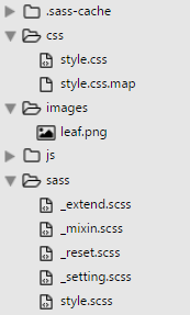
また、config.rb には画像フォルダが「images_dir = "images"」として指定されています。
/* CSS コンパイル後*/
.foo {
  width: 24px;
  height: 24px;
  background-image: url('data:image/png;base64,iVBORw0KGgoAAAANSUhEUgAAABgAAAAYCAYAAADgdz34AAAABHNCSVQICAgIfAhkiAAAAAlwSFlzAAALEgAACxIB0t1+/AAAABx0RVh0U29mdHdhcmUAQWRvYmUgRmlyZXdvcmtzIENTNui8sowAAAAWdEVYdENyZWF0aW9uIFRpbWUAMDUvMDMvMTPeQgfSAAAA7ElEQVRIidWVoQ7CMBCGvxIESJCz4JgEyxss81NYHoLn4A32AnPIIUEOOckskrkitgQCbcOVTfAnTUWv/9feNVeltaZPDXp1B4bSDUmmAiAEZu0A2KWRvnsDkkyNgSWwBiaGkBA4eQGSTK2AGBg5wuSA9tQbnmlwKbAtGAGt+da18U2mtAH2VxQLzJ36ACSZmtIUtBOZbrDoytwGmHv41BKAtWAOXSUAn+IWEoBUNXDuE5Db+lAXgAo4ugJ+AVTA3nV68GjXNDnP00gfvgmWAC5AkUba2DUlgKqdbzTvu0wjXUpMX6X+/k/+f8ADUXUzUlWzbikAAAAASUVORK5CYII=');
}
- インラインイメージ
- 画像を文字列に変換してそのデータを HTML や CSS のソースコード内に埋め込む方法
- 利点:
HTTPリクエストを減らせる。小さな画像ファイルではメリット有り。
注意点(デメリット):
データサイズが 37% 増加する
古いIEには対応していない。比較的新しいIEでも制限があり注意が必要
データ自体はキャッシュされない
- Headings h 要素の出力
- headings()
- h 要素を出力します。
- 引数に数値を指定することで特定の h 要素を出力できます。
//SASS (.scss)
#{headings()} {
    font-weight: normal;
}

#{headings(2)} {
    color: green;
}

#{headings(3,5)} {
    text-decoration: underline;
}
/* CSS コンパイル後*/
h1, h2, h3, h4, h5, h6 {
  font-weight: normal;
}

h1, h2 {
  color: green;
}

h3, h4, h5 {
  text-decoration: underline;
}
- 指定した種類の要素を返す
- elements-of-type($display)
- $display:要素のタイプ(種類)
指定できる要素のタイプには次のようなものがあります。
block, inline, inline-block, table, list-item, table-row-group, table-header-group, table-footer-group, table-row, table-cell, html5-block, html5-inline, html5
これらのタイプを指定したときに返される要素については「Compass Display Helpers」を参照ください。
//SASS (.scss)
#{elements-of-type(html5-block)} {
    display: block;
}
/* CSS コンパイル後*/
article, aside, details, figcaption, figure, footer, header, hgroup, main, menu, nav, section, summary {
  display: block;
}
Utilities モジュール
ユーティリティ系ミックスインで以下のような種類があります。
- Links – アンカーのスタイル
- Lists – リストのスタイル
- Text – テキストのスタイル
- Color – 色関連のユーティリティ
- General – 他に属さない色関連のユーティリティ
- Sprites – スプライトのミックスイン
- Tables – テーブルのスタイル
クリアフィックス
Compass には clearfix のミックスインが3種類あります。
- clearfix(通常?のクリアフィックス)
- legacy-pie-clearfix(Firefox3.5 以前に対応する場合はこちらを使用)
- pie-clearfix(overflow: hidden を使用していないクリアフィックス)
最近の傾向としては、pie-clearfix(別名 micro clear fix)が使用されるようです。
また、overflow: hidden; を使用すると問題がある場合は pie-clearfix を使用します。
//SASS (.scss)
.clearfix {
  @include clearfix;
}

.legacy-pie-clearfix {
  @include legacy-pie-clearfix;
}

.pie-clearfix {
  @include pie-clearfix;
}
/* CSS コンパイル後*/

/* clearfix */
.clearfix {
  overflow: hidden;
  *zoom: 1;
}

/* legacy-pie-clearfix */
.legacy-pie-clearfix {
  *zoom: 1;
}
.legacy-pie-clearfix:after {
  content: "\0020";
  display: block;
  height: 0;
  clear: both;
  overflow: hidden;
  visibility: hidden;
}

/* pie-clearfix */
.pie-clearfix {
  *zoom: 1;
}
.pie-clearfix:after {
  content: "";
  display: table;
  clear: both;
}
リストアイコン pretty-bullets
pretty-bullets はリストにアイコン画像を付けるミックスインです。以下が書式です。
@include pretty-bullets(画像ファイル名, 幅, 高さ, 行間, 左パディング )
画像ファイル名:必須(プロジェクト内であれば URL は自動で取得)
幅, 高さ, 行間, 左パディング :オプション
- 画像ファイル名のみを指定すると、自動でサイズを取得してくれます
- 行間のデフォルトは「18px」、左パディングのデフォルトは「14px」です
- 必要に応じて幅, 高さ, 行間, 左パディングを指定します(単位は統一する必要があります)
- ul 要素または ol 要素に対して指定します
画像ファイル名の末尾にクエリ情報が付く場合がありますが、設定ファイル(config.rb)で「asset_cache_buster :none」を指定すれば付かないようになります。
以下はプロジェクト内 images フォルダの 24 x 24 (px) の「leaf.png」という画像を使用する例です。
//SASS (.scss)
ul.foo {
  @include pretty-bullets('leaf.png', 24px, 24px, 24px, 24px);
  line-height: 24px;
}
/* CSS コンパイル後*/
ul.foo {
  margin-left: 0;
  line-height: 24px;
}
ul.foo li {
  padding-left: 24px;
  background: url('../images/leaf.png') no-repeat 0px 0px;
  list-style-type: none;
}
- list item
- list item
- list item
- list item
この例では、line-height を別途指定しています。pretty-bullets() のソースを見ると、引数に渡される行間の値はポジションの算出に使用されていて line-height の出力はないので、必要に応じて指定すると良いと思います。
//pretty-bullets() のソース
@mixin pretty-bullets($bullet-icon, $width: image-width($bullet-icon), $height: image-height($bullet-icon), $line-height: 18px, $padding: 14px) {
  margin-left: 0;
  li {
    padding-left: $padding;
    background: image-url($bullet-icon) no-repeat ($padding - $width) / 2 ($line-height - $height) / 2;
    list-style-type: none;
  }
}
以下は、上記を参考に作成したアイコンを挿入するミックスインです。環境に合わせて margin や padding を書き換える必要があるかと思います。
//SASS (.scss)
@mixin insert-icon($icon, $width: image-width($icon), $height: image-height($icon), $margin: (0 0 0 0), $padding:(0 0 0 image-width($icon)), $line-height: null) {
  margin: $margin;
  padding: $padding;
  background: image-url($icon) no-repeat left center;
  line-height: if($line-height, $line-height, $height);
}

.foo {
  @include insert-icon('wp-icon.png');
}

.bar {
  @include insert-icon('wp-icon.png', $margin: (30px 0), $line-height: 40px, $padding:(0 0 0 50px));
}
/* CSS コンパイル後*/
.foo {
  margin: 0 0 0 0;
  padding: 0 0 0 30px;
  background: url('../images/wp-icon.png') no-repeat left center;
  line-height: 30px;
}

.bar {
  margin: 30px 0;
  padding: 0 0 0 50px;
  background: url('../images/wp-icon.png') no-repeat left center;
  line-height: 40px;
}
<h4 class="bar">見出しにアイコン画像を挿入(サンプル)</h4>
見出しにアイコン画像を挿入(サンプル)
Typography モジュール
Typography モジュールはテキスト関連のモジュールです。
リンクカラー link-colors
リンクの文字色と疑似クラスを設定するミックスインです。
link-colors($normal, $hover, $active, $visited, $focus)
- $normal:通常の色(必須)
- $hover – :hover の色
- $active – :active の色
- $visited – :visited の色
- $focus – :focus の色
//SASS (.scss)
.foo {
  @include link-colors(#2C6BB7, darken(#2C6BB7, 20%), saturate(#2C6BB7,20%), desaturate(#2C6BB7,10%));
}
/* CSS コンパイル後*/
.foo {
  color: #2C6BB7;
}
.foo:visited {
  color: #376cac;
}
.foo:hover {
  color: #183b65;
}
.foo:active {
  color: #1569ce;
}
画像置換 replace-text-with-dimensions
画像置換のミックスインです。(text-indent プロパティでテキストを飛ばして置換します)
おなじようなミックスインに「replace-text」がありますが、対象の文字列の font-size と画像のサイズが大きく異なる場合などは画像が切れて表示されてしまうことがあります。
replace-text-with-dimensions は画像のサイズを取得して幅と高さを自動で指定してくれます。
replace-text-with-dimensions($img, $x, $y, $inline)
- img:画像ファイル名(必須)
- $x:background-position-x (デフォルトは 50%)
- $y:background-position-y (デフォルトは 50%)
- $inline:true を指定するとインラインイメージ(data uri)が使用されます(デフォルトは false)
画像ファイル名の末尾にクエリ情報が付く場合がありますが、設定ファイル(config.rb)で「asset_cache_buster :none」を指定すれば付かないようになります。
//SASS (.scss)
.foo {
  @include replace-text-with-dimensions('compass-icon.png', 0, 0);
}
/* CSS コンパイル後*/
.foo {
  text-indent: -119988px;
  overflow: hidden;
  text-align: left;
  text-transform: capitalize;
  background-image: url('../images/compass-icon.png');
  background-repeat: no-repeat;
  background-position: 0 0;
  width: 160px;
  height: 42px;
}
<h5 class="foo">Compass</h5>
Compass
バーティカル・リズム Vertical Rhythm
Vertical Rhythm(バーティカル・リズム)はページの行間サイズを揃えて(1行の高さを1つの単位として)、垂直方向のリズムを作る方法です。
最初に基本のフォントサイズと行の高さを設定します。この例ではフォントサイズの単位を「rem」にするため、変数 $rhythm-unit を使って単位を em から rem に変更します。
そして、設定した基本となるフォントサイズと行の高さを適用するために establish-baseline ミックスインを使って出力します。
- $base-font-size(基準となるフォントサイズ。デフォルトは 16px)
- $base-line-height(基準となる行間。デフォルトは 24px)
//SASS (.scss)
$base-font-size: 16px;  //ベースフォントサイズ
$base-line-height: 24px;  //ベースユニットサイズ
$rhythm-unit: "rem";  //単位を em から rem に変更

@include establish-baseline;
/* CSS コンパイル後*/
html {
  font-size: 100%;
  line-height: 1.5em;
}
また、ブラウザのデフォルトの padding や margin の値で Vertical Rhythm が乱れることもあるので、必要に応じて事前にリセットしておきます。(font-family によってもずれることがあります)
ベースフォントサイズとベースユニットサイズを決めて、それを元にガイドラインを引き、ガイドラインに合うように調整するのが簡単です。ガイドラインは以下の方法で表示することができます。
1つの方法は、Compass の debug-vertical-alignment や baseline-grid-background() ミックスインを使用する方法で、以下のように記述するとガイドラインが表示されます。
//SASS (.scss)
html {
  @include baseline-grid-background($base-line-height, red);
}
または、Basehold.it を利用して以下のように記述します。24px 幅の赤色(ff0000)の baseline grid を表示する場合の例。(2019/12/20 追記)色を指定するとうまくグリッドを表示できないようです。
//SASS (.scss)
html {
  background-image: url(//basehold.it/i/24/ff0000);
}
あとはミックスインを使って要素ごとに font-size, margin, padding 等を設定します。
フォントサイズと行の高さの設定
「adjust-font-size-to」ミックスインを使って設定します。
adjust-font-size-to($to-size, $lines, $from-size)
- $to-size:フォントサイズ。何 px に設定するかを指定(必須)
- $lines:line-height を基準となる行間の何倍に設定するか。
- $from-size:基準となるフォントサイズ。デフォルトは $base-font-size。
以下は Heading 要素の設定例です。
//SASS (.scss)
h1 { @include adjust-font-size-to(48px,2); }
h2 { @include adjust-font-size-to(36px,2); }
h3 { @include adjust-font-size-to(24px,1); }
h4 { @include adjust-font-size-to(22px,1); }
h5 { @include adjust-font-size-to(20px,1); }
h6 { @include adjust-font-size-to(18px,1); }
/* CSS コンパイル後*/
h1 {
  font-size: 48px;
  font-size: 3rem;
  line-height: 48px;
  line-height: 3rem;
}

h2 {
  font-size: 36px;
  font-size: 2.25rem;
  line-height: 48px;
  line-height: 3rem;
}

h3 {
  font-size: 24px;
  font-size: 1.5rem;
  line-height: 24px;
  line-height: 1.5rem;
}
//以下省略
要素の前後の余白(margin, padding)の設定
rhythm-margins() や rhythm-padding() ミックスインを使うと要素の前後の余白をまとめて設定することができます。
rhythm-margins($leader, $trailer, $font-size)
rhythm-padding($padding-leader, $padding-trailer, $font-size)
- $leader:上部のマージンを基準となる行間の何倍に設定するか。デフォルトは「1」。
- $trailer:下部のマージンを基準となる行間の何倍に設定するか。
- $font-size:基準となるフォントサイズ。デフォルトは $base-font-size。
以下は、rhythm-margins() のミックスインのソースです。
//SASS (.scss)
@mixin rhythm-margins($leader: 1, $trailer: $leader, $font-size: $base-font-size) {
  @include leader($leader, $font-size);
  @include trailer($trailer, $font-size);
}
ミックスインの内部では、leader():上部のマージンと、trailer():下部のマージンを呼び出しているのがわかります。これらを使って個別に指定することもできます。
leader($lines, $font-size, $property)
- margin-top($property の設定により padding-top)を設定
- $lines:基準となる行間の何倍にするか。
- $font-size:基準となるフォントサイズ。デフォルトは $base-font-size
- $property:margin か padding を指定。デフォルトは margin
trailer($lines, $font-size, $property)
- margin-bottom($property の設定により padding-bottom)を設定
- $lines:基準となる行間の何倍にするか。
- $font-size:基準となるフォントサイズ。デフォルトは $base-font-size
- $property:margin か padding を指定。デフォルトは margin
以下は、rhythm-margins() を使って前後のマージンを設定する例です。
//SASS (.scss)
h1,h2,h3 { @include rhythm-margins(2,1); }
h4,h5,h6 { @include rhythm-margins(1,1); }
p,ul,ol, dl {@include rhythm-margins(0,1);}
/* CSS コンパイル後*/
h1, h2, h3 {
  margin-top: 48px;
  margin-top: 3rem;
  margin-bottom: 24px;
  margin-bottom: 1.5rem;
}

h4, h5, h6 {
  margin-top: 24px;
  margin-top: 1.5rem;
  margin-bottom: 24px;
  margin-bottom: 1.5rem;
}

p, ul, ol, dl {
  margin-top: 0px;
  margin-top: 0rem;
  margin-bottom: 24px;
  margin-bottom: 1.5rem;
}
ボーダーの処理
ボーダーを指定した場合、その幅の分ずれる(リズムが狂う)ので rhythm-borders() ミックスインを利用して調整することができます。
rhythm-borders($width, $lines, $font-size, $border-style)
- $width:ボーダーの幅。デフォルトは $default-rhythm-border-width: 1px
- $lines:パディングを基準となる行間の何倍にするか。デフォルトは 1。
- $font-size:基準となるフォントサイズ。デフォルトは $base-font-size
- $border-style:ボーダースタイル。デフォルトは $default-rhythm-border-style: solid
以下は、rhythm-borders() を使って調整する例です。
//SASS (.scss)
.foo {
  @include rhythm-borders(1px, 1);
  border-color: #999;
}
パディングとボーダー幅で 24px になるように調整されています。
/* CSS コンパイル後*/
.foo {
  border-width: 1px;
  border-width: 0.0625rem;
  border-style: solid;
  padding: 23px;
  padding: 1.4375rem;
  border-color: #999;
}
leading-border() や trailing-border(), horizontal-borders() を使って個々のボーダーを調整することも可能です。