 Highlight.js カスタムブロック サンプル
WordPress で Highlight.js を使って入力したコードをシンタックスハイライトするカスタムブロックのサンプルです。インスペクターのオプションで表示をカスタマイズできるようにしています。
@wordpress/create-block を使ってブロックのプラグインを作成するので、node や npm、WordPress のローカル環境が必要です。
カスタムブロックを作成せず、WordPress で簡単に Highlight.js を使ってハイライト表示する方法は以下のページを御覧ください。
create-block を使用してブロックのプラグインを作成する詳細については以下のページを御覧ください。
また Highlight.js の使い方やカスタマイズ方法については以下のページを御覧ください。
以下ではコードのサンプルがメインで、詳しい説明はほとんどありません。また、以下のコードには改善すべきところが多々あると思いますので予めご了承ください。
以下で使用している環境
- @wordpress/create-block: v4.38.0
- @wordpress/scripts: v27.5.0
- node: v20.11.1
- npm: v10.5.0
- MAMP: v6.9
- WordPress: v6.4.3
- Highlight.js: v11.9.0
- Visual Studio Code: v1.87.2
関連ページ:WordPress ブロック開発入門 カスタムブロックの作り方
更新日:2024年12月13日
作成日:2024年02月11日
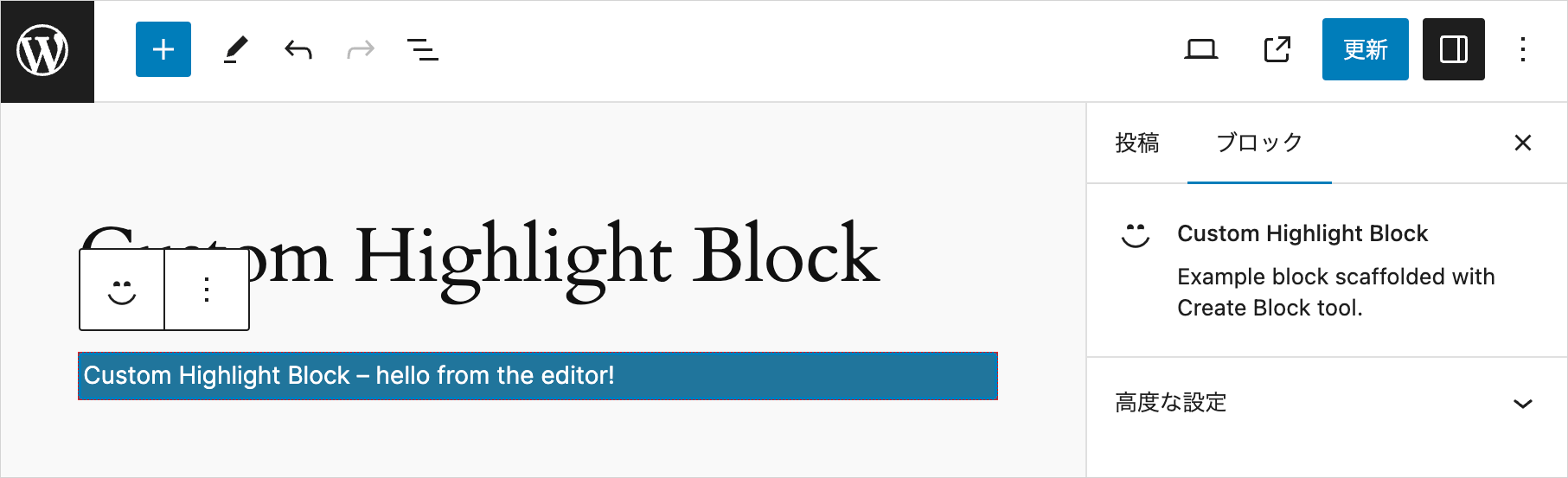
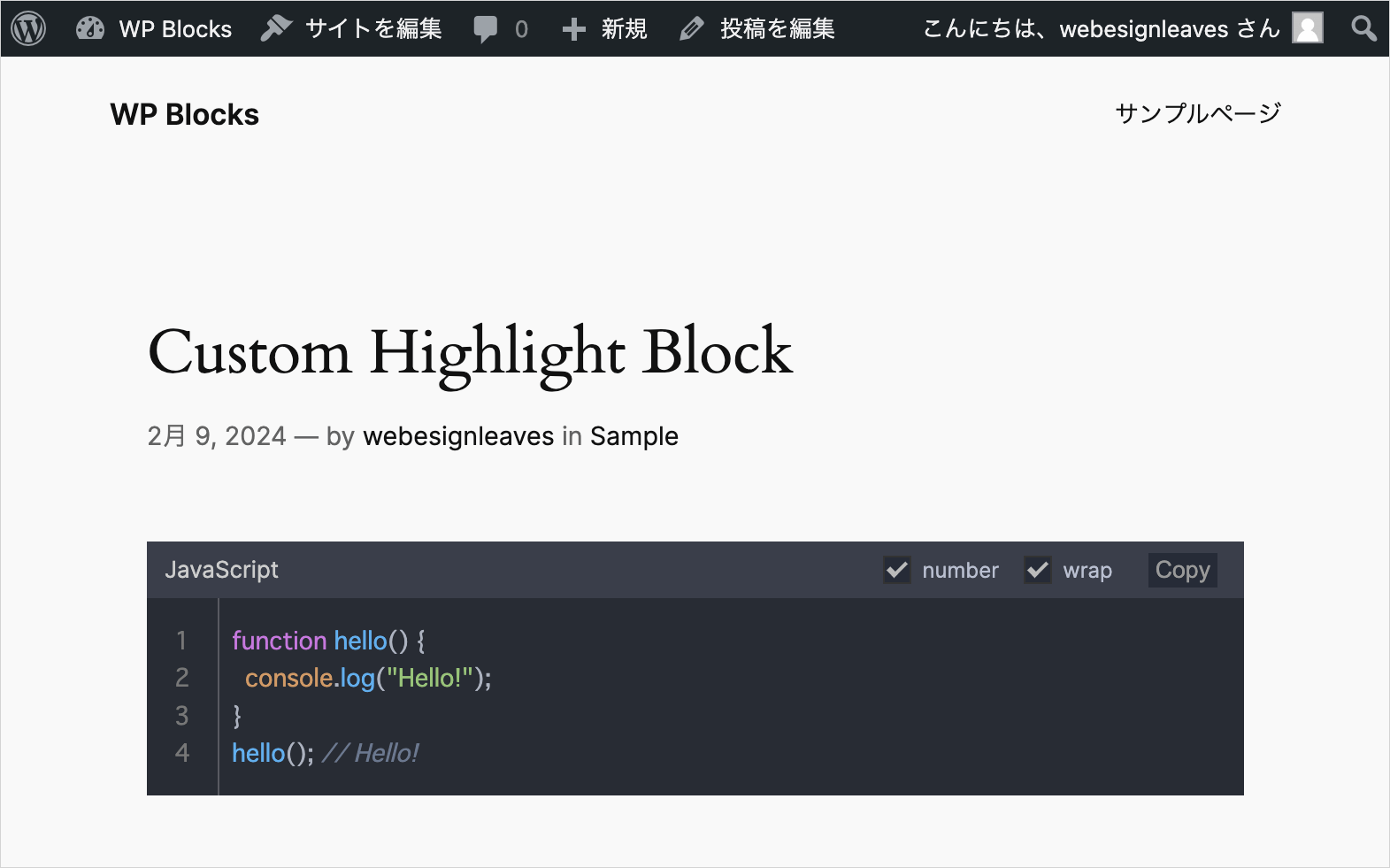
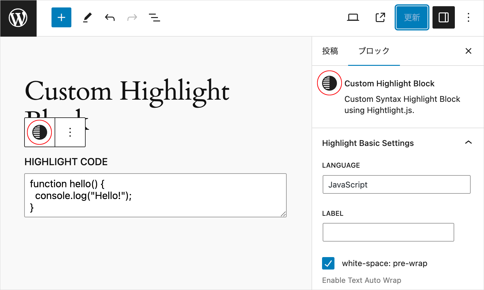
このサンプルのプラグインを作成すると、投稿の編集画面で以下のようなブロックを挿入することができ、コードをエスケープせずに直接入力することができます。
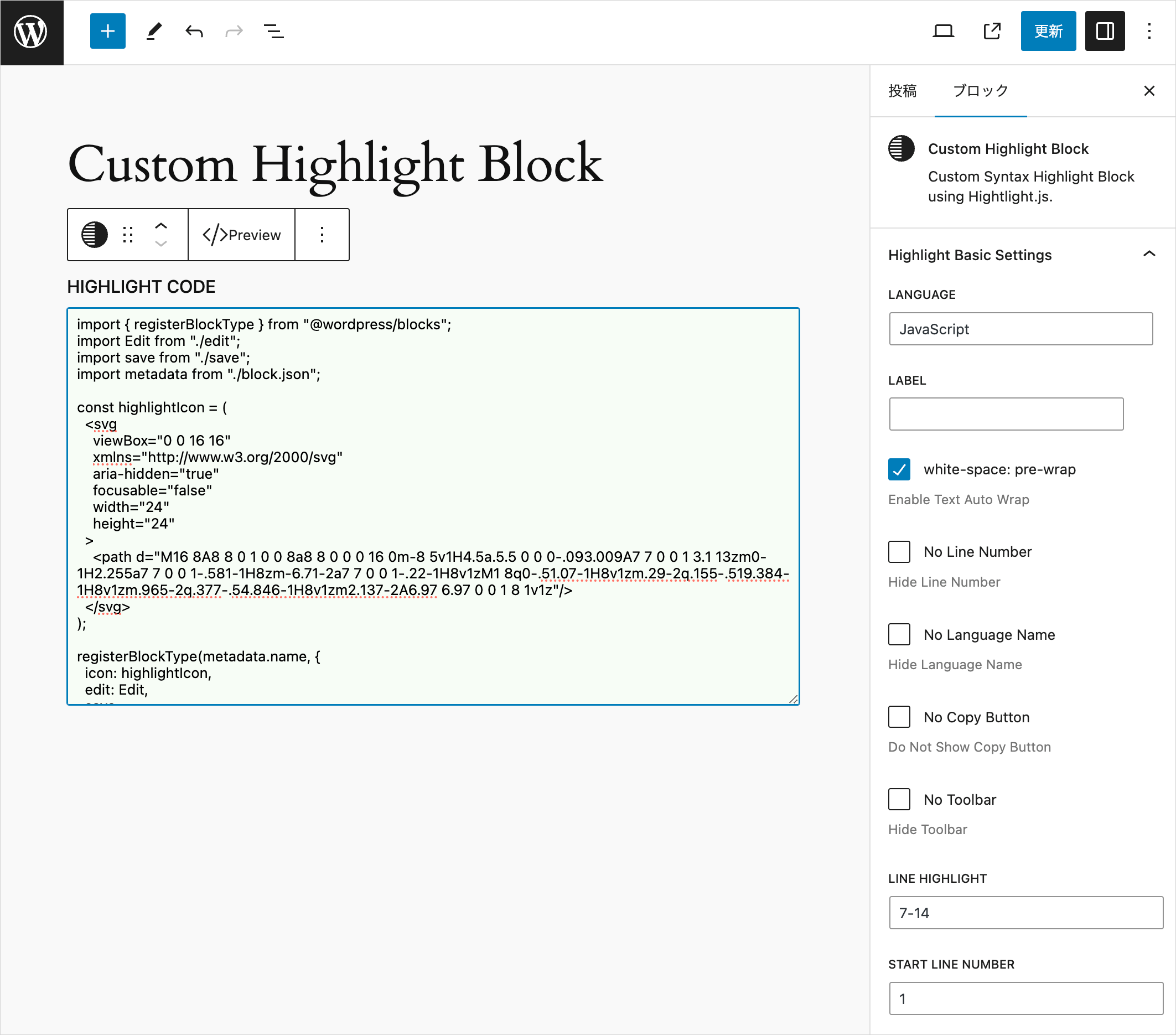
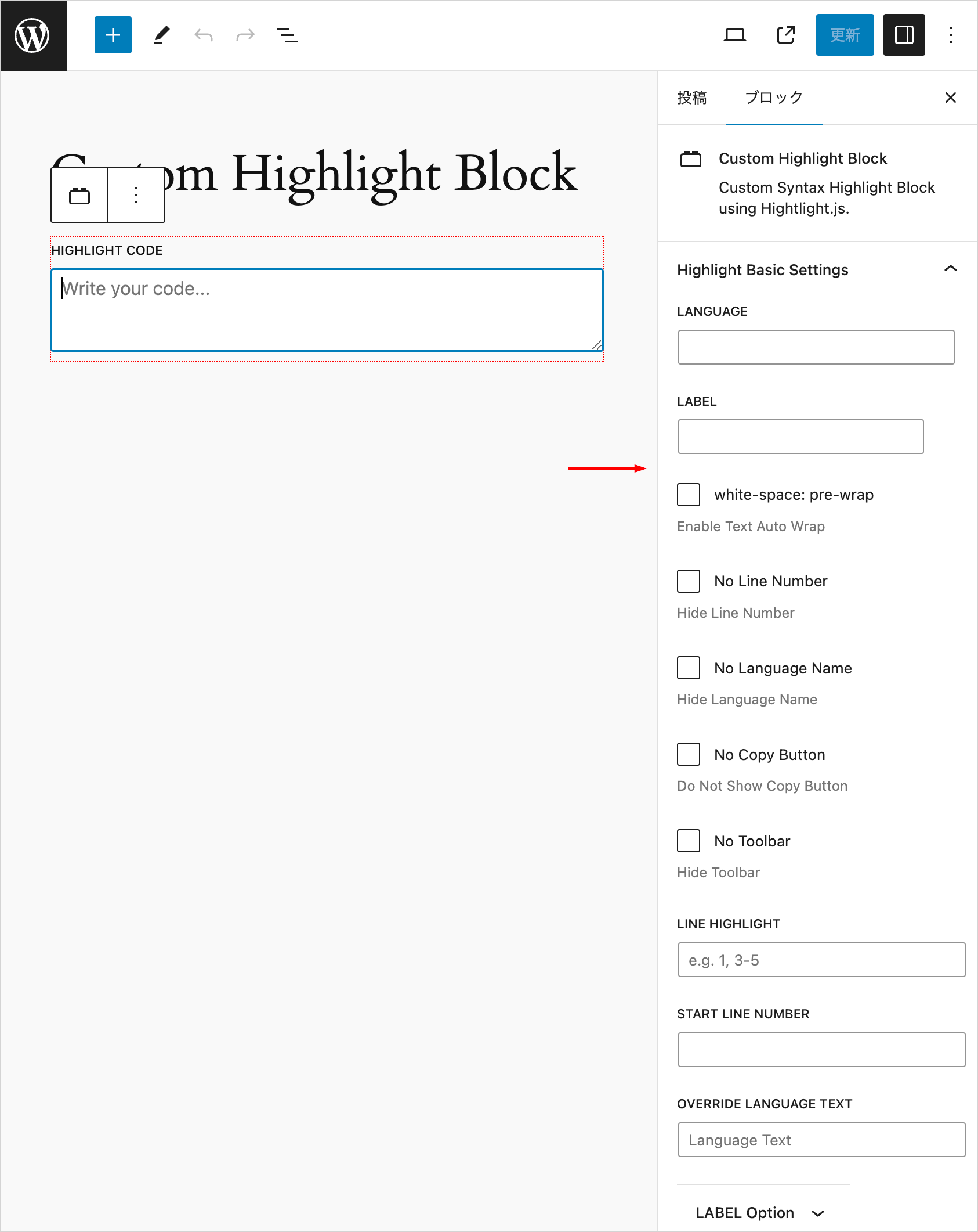
必要に応じて右側のインスペクターで言語名や行番号の表示の有無、行のハイライトなどを指定することができます(指定できるオプション)。
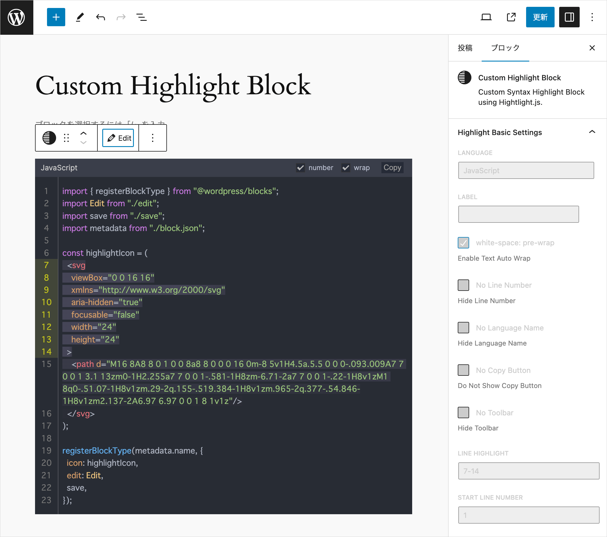
また、以下のようなプレビュー表示の機能を追加することもできます。
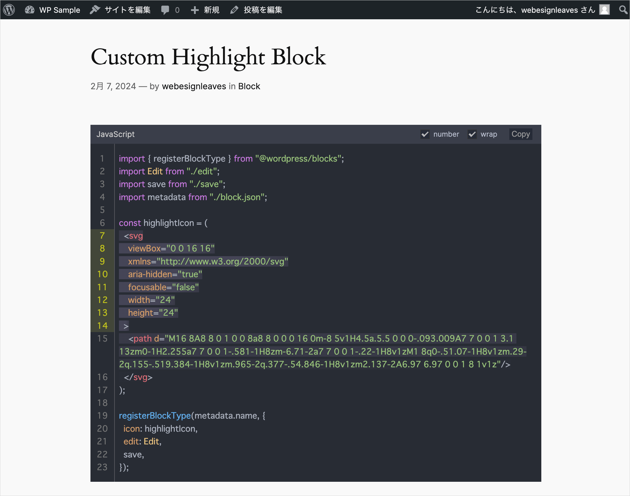
フロントエンド側では以下のような表示(このページのシンタックスハイライトとほぼ同じ)になります。
事前準備
Highlight.js から JavaScript とテーマの CSS をダウンロードしておきます。
以下の例では Highlight.js のテーマの CSS は atom-one-dark.min.css を使用しています。
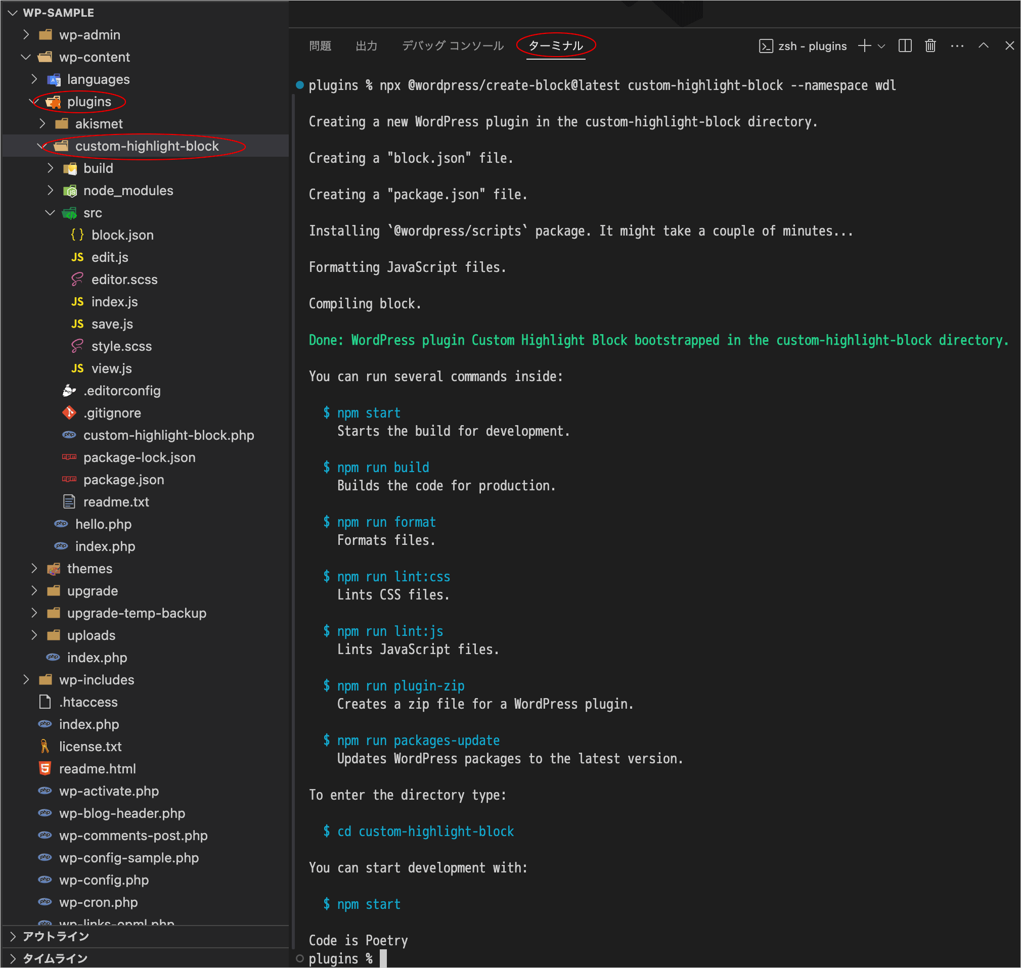
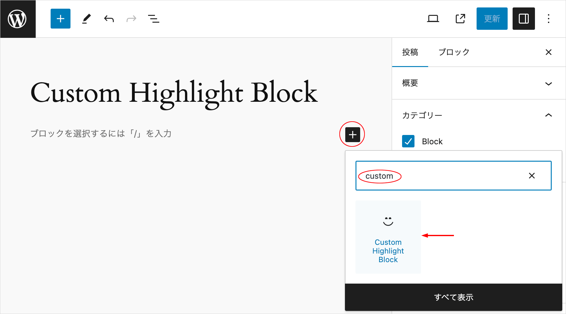
ブロックのひな形を作成
@wordpress/create-block を使用してブロックの初期構成のひな形を作成します。
ターミナルでプラグインディレクトリに移動します。
以下を実行してブロックのひな形を作成します。以下の場合、custom-highlight-block というディレクトリが plugins ディレクトリの中に作成され、その中にひな形のファイルが生成されます。
また、以下の例では --namespace オプションで名前空間に wdl を指定していますが、任意の文字列を指定できます(--namespace を省略した場合の名前空間の値は create-block になります)。
上記コマンドを実行して、インストールが完了すると以下のように表示されます。
インストールには数分かかります。
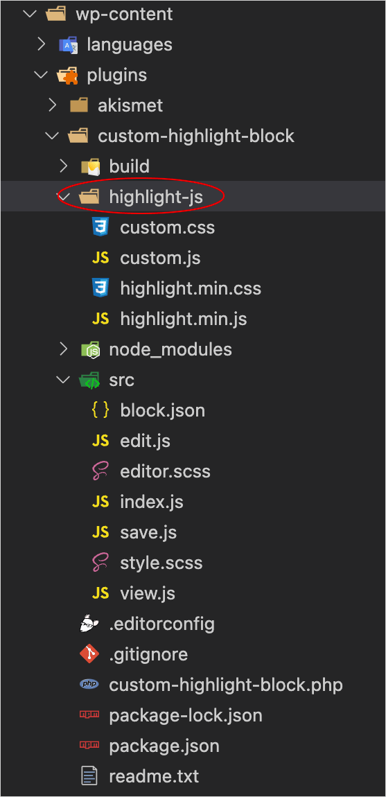
Highlight.js 関連ファイルを配置
create-block により作成されたディレクトリ(custom-highlight-block)の中に highlight-js というフォルダを作成します。
そして Highlight.js からダウンロードした JavaScript とテーマの CSS をその中に保存します。
この例ではテーマの CSS は highlight.min.css という名前に変更して保存しています。
また、以下のカスタマイズ用の CSS(custom.css)と JavaScript(custom.js)もコピーして同じフォルダに保存します(右上の Copy ボタンをクリックしてコードをコピーできます)。
/* updated (changed) on: 2024/03/29 (CSS Nesting) */
/* pre 要素のラッパー要素(div)に指定するクラス */
.hljs-wrap {
  position: relative;

  /* pre 要素 */
  pre {
    overflow-wrap: break-word;
    overflow-x: hidden;
    padding: 0;
    margin: 0;
    /* 必要に応じてフォントサイズなどを設定 */
  }

  /* pre-wrap クラスを指定すると行を自動で折り返す */
  pre.pre-wrap {
    white-space: pre-wrap;
  }

  /* pre クラスを指定すると行を自動で折返さない */
  pre.pre {
    white-space: pre;
  }

  /* code 要素 */
  pre code {
    padding-left: 3rem;
    position: relative;
    /* 自動折り返しの設定は親要素(pre)の値を継承 */
    white-space: inherit;
    /* コード内に垂直方向のスクロールバーが表示されるのを防止(必要に応じて) */
    overflow-y: hidden;
  }

  /* 行番号横枠線を表示する場合 */
  &.line-num-bordered pre code {
    padding-left: 3.25rem;
  }

  /* ツールバーを使わない場合の code 要素 */
  &.no-toolbar pre code,
  body.no-toolbar & pre code {
    padding-bottom: 1.5rem;
    padding-top: 2.5rem;
  }

  &.no-toolbar pre code.show-no-lang,
  body.no-toolbar & pre code.show-no-lang {
    padding-top: 1rem;
  }

  &.no-toolbar.has-copy-btn pre code.show-no-lang,
  body.no-toolbar.has-copy-btn & pre code.show-no-lang {
    padding-top: 2rem;
  }

  &.no-toolbar pre code,
  body.no-toolbar & pre code {
    padding-bottom: 1rem;
  }

  /* ツールバー */
  .highlight-toolbar {
    height: 2rem;
    background-color: #3a3e4a;
    padding-right: 5px;
    color: #999;
    font-size: 12px;
    display: flex;
    flex-direction: row;
    flex-wrap: nowrap;
    align-items: center;
  }

  &.no-lang .highlight-toolbar {
    justify-content: flex-end;
  }

  .highlight-toolbar + pre {
    margin-top: 0;
  }

  .highlight-toolbar label {
    color: #888;
    cursor: pointer;
    margin: 0 10px 0 0;
    transition: color 0.3s;
  }

  .highlight-toolbar input[type="checkbox"] {
    background-color: #262b37;
    transition: background-color 0.3s;
    display: none;
  }

  @media screen and (min-width: 640px) {
    .highlight-toolbar label {
      margin: 0 10px 0 3px;
    }

    .highlight-toolbar input[type="checkbox"] {
      display: block;
    }
  }

  .highlight-toolbar input[type="checkbox"]:hover {
    background-color: #0d37a9;
  }

  /* チェックボックスのスタイルのリセット */
  .highlight-toolbar input[type="checkbox"] {
    border-radius: 0;
    -webkit-appearance: none;
    -moz-appearance: none;
    appearance: none;
  }

  /* チェックボックスのスタイル */
  .highlight-toolbar input[type="checkbox"] {
    position: relative;
    width: 16px;
    height: 16px;
    border: 1px solid #333;
    cursor: pointer;
  }

  /* チェックマークのスタイル */
  .highlight-toolbar input[type="checkbox"]:checked:before {
    content: "";
    position: absolute;
    top: 0px;
    left: 4px;
    transform: rotate(45deg);
    width: 4px;
    height: 8px;
    border-right: 2px solid #bbb;
    border-bottom: 3px solid #bbb;
  }

  .highlight-toolbar input[type="checkbox"]:checked + label {
    color: #b9bfd0;
  }

  /* 言語名を表示 */
  code[data-language]::before {
    content: attr(data-language);
    position: absolute;
    top: 0;
    left: 0;
    color: #ccc;
    display: inline-block;
    padding: 0.5rem 1rem;
    /* コードの背景色と同じにする場合は background-color: #282c34; */
    background-color: #40547d;
    z-index: 5;
  }

  code[data-language].hide-line-num::before {
    left: 2.5rem;
  }

  /* ツールバーの中の言語名の表示 */
  .highlight-toolbar .lng-span {
    margin-right: auto;
    margin-left: 10px;
    font-size: 13px;
    color: #ccc;
  }

  /* コピーボタン(ツールバーを使用しない場合) */
  .hljs-copy-btn {
    position: absolute;
    top: 0;
    right: 0;
    background-color: #262b37;
    border: none;
    padding: 8px;
    color: #999;
    cursor: pointer;
    transition: color 0.3s, background-color 0.3s;
  }

  .hljs-copy-btn:hover {
    color: #eee;
    background-color: #162858;
  }

  /* ツールバーの中のコピーボタン */
  .highlight-toolbar .hljs-copy-btn {
    position: relative;
    margin: 0 10px;
    padding: 2px 4px;
  }

  /* ラベルとリンク(data-label 属性と data-label-url 属性で指定した文字列) */
  .hljs-label,
  .hljs-label-url {
    position: absolute;
    top: -2rem;
    right: 10px;
    color: #999;
    display: inline-block;
    padding: 0.5rem 0;
  }

  .hljs-label-url {
    color: #3987c7;
    text-decoration: none;
  }

  .hljs-label-url:hover {
    color: #55924f;
  }

  &.has-label {
    margin-top: 4rem;
  }

  &:not(.has-label) {
    margin-top: 2.25rem;
  }

  /* 行番号(CSS カウンター)*/
  pre {
    counter-reset: lineNumber;
  }

  pre span.line-num::before {
    counter-increment: lineNumber;
    content: counter(lineNumber);
    min-width: 2.5rem;
    display: inline-block;
    color: #777;
    text-align: center;
    position: absolute;
    left: 0;
    background: #282c34;
  }

  /* 行番号を非表示にする場合 */
  pre code.hide-line-num span.line-num::before {
    left: -2.5rem;
  }

  /* 行番号を非表示にする場合 */
  pre code.hide-line-num {
    margin-left: -2.5rem;
  }

  /* 行番号右側の枠線 */
  .hljs-border-span {
    background-color: transparent;
    width: 2.5rem;
    border-right: 1px solid #595a60;
    top: 0;
    left: 0;
  }

  /* 行番号非表示の場合(枠線なし) */
  pre code.hide-line-num .hljs-border-span {
    border: none;
  }

  /* 行のハイライト時の行番号部分 */
  pre span.line-num.line-num-highlight::before {
    color: #c2c21a;
    /* background: #424638; */
  }

  /* 行のハイライト時のコード部分 */
  .line-highlight {
    position: absolute;
    /* 行番号の幅と合わせる */
    left: 2.5rem;
    width: calc(100% - 2.5rem);
    margin-left: -2.5rem;
    width: 100%;
    background: linear-gradient(
      to right,
      hsla(254, 15%, 51%, 0.2) 50%,
      hsla(254, 15%, 51%, 0.01)
    );
    pointer-events: none;
  }

  /* 行数を指定して表示する場合にコード下に表示する領域 */
  .scroll-footer {
    margin: 0;
    font-size: 0.75rem;
    color: #999;
    /* コードの背景色と同じ色 */
    background-color: #282c34;
    padding: 8px;
    display: flex;
    justify-content: flex-end;
  }

  /* .scroll-footer の右端に表示するテキスト*/
  .scroll-footer-text {
    margin-left: auto;
  }

  /* .scroll-footer-text の左側に表示するアイコン(色は fill='%23aaaaaa' の aaaaaa 部分) */
  .scroll-footer-text::before {
    content: "";
    display: inline-block;
    height: 0.875rem;
    width: 0.875rem;
    vertical-align: -2px;
    margin-right: 8px;
    background-repeat: no-repeat;
    background-image: url("data:image/svg+xml,%3Csvg xmlns='http://www.w3.org/2000/svg' fill='%23aaaaaa' viewBox='0 0 16 16'%3E  %3Cpath fill-rule='evenodd' d='M11.5 15a.5.5 0 0 0 .5-.5V2.707l3.146 3.147a.5.5 0 0 0 .708-.708l-4-4a.5.5 0 0 0-.708 0l-4 4a.5.5 0 1 0 .708.708L11 2.707V14.5a.5.5 0 0 0 .5.5m-7-14a.5.5 0 0 1 .5.5v11.793l3.146-3.147a.5.5 0 0 1 .708.708l-4 4a.5.5 0 0 1-.708 0l-4-4a.5.5 0 0 1 .708-.708L4 13.293V1.5a.5.5 0 0 1 .5-.5'/%3E%3C/svg%3E");
  }

  /* テーマ(atom-one-dark)のコメントの色を上書き */
  .hljs-comment {
    color: #6b788f;
  }
}

/* コードの表示・非表示( details 要素と summary 要素によるアコーディオン)*/
details.toggle-code-animation {
  border: none;
  margin: 2rem 0;

  .details-content-wrapper {
    padding: 1rem 0;
  }

  .details-content {
    overflow: hidden;
  }

  summary {
    display: inline-block;
    cursor: pointer;
    position: relative;
    padding: 0.5rem 1.5rem 0.5rem 2.25rem;
    border: 1px solid #aaa;
    font-size: 13px;
  }

  summary::-webkit-details-marker {
    display: none;
  }

  summary::before {
    content: "";
    position: absolute;
    top: 0;
    bottom: 0;
    left: 10px;
    margin: auto 0;
    width: 8px;
    height: 8px;
    border-top: 3px solid #097b27;
    border-right: 3px solid #097b27;
    transform: rotate(45deg);
  }
}
/* updated (changed) on: 2024/03/31 */
document.addEventListener('DOMContentLoaded', () => {
// Highlight.js のプラグインをセットアップ
mySetUpHljsPlugins(myCustomHighlightJsSettings);
// Highlight.js の初期化とカスタマイズの実行
mySetupHighlightJs(myCustomHighlightJsSettings);
// アコーディオンアニメーションの開閉パネルの追加(オプショナル)
myAddAccordionPanel(myCustomHighlightJsSettings.accordionClassName);
// アコーディオンアニメーションの呼び出し(オプショナル)
mySetupToggleDetailsAnimation();
});
const myCustomHighlightJsSettings = {
// pre code のラッパーのクラス名
wrapperClassName: 'hljs-wrap',
// pre 要素なし(インライン)の code 要素でもハイライトするかどうか
useInlineHighlight: true,
// インラインの code 要素でハイライトする場合に code 要素に指定するクラス(空の場合、全ての code 要素)
inlineHighlightClassName: 'highlight',
// アコーディオンパネルで表示する場合に、ラッパー要素に指定するクラス名
accordionClassName: 'toggle-accordion'
}
// Hightlight.js のプラグインを定義
function mySetUpHljsPlugins(settings) {
const { wrapperClassName, useInlineHighlight } = settings;
// 行番号横の枠線を表示するかどうか
const showLineNumBorder = true;
// デフォルトで行の自動折り返しを有効にするかどうか
const preWrapOnInit = false;
// 初期状態でコピーボタンを非表示
const noCopyBtnOnInit = false;
// 初期状態で行番号を非表示(ツールバー使用時のみ有効)
const noLineNumOnInit = document.body.classList.contains('no-line-num') ? true : false;
// ツールバーを表示(使用)するかどうか(全てのページで使用しない場合は false を指定)
const useToolbar = document.body.classList.contains('no-toolbar') ? false : true;
// 行数を指定して表示する場合の表示領域の高さの調整値
const visibleHeightAdjustAmount = 0;
// 行数を指定して表示する際に data-scroll-to を指定する場合の高さの調整値
const scrollToHeightAdjustAmount = 0;
// 行数を指定して表示する場合にスクロール量の調整値
const scrollAdjustAmount = 0;
// 行数を指定して表示する場合に折り返しや行番号表示の切り替えやウィンドウサイズの変更が発生した際にスクロール位置を元に戻すかどうか
const resetScrollPosition = true;
// 行数を指定して表示する場合にコードの下に情報領域(div.scroll-footer)を表示するかどうか
const showScrollFooter = true;
// 行数を指定して表示する場合にコードの下の情報領域(div.scroll-footer)に行数を表示するかどうか
const showLineNumInfo = true;
// ツールバーやボタンのテキスト(ラベル)
const lineAutoWrapLabel = 'wrap';
const lineNumLabel = 'number';
const copyBtnLabel = 'Copy';
const copyBtnCompleteLabel = 'Copied';
const copyBtnFailedLabel = 'Failed';
const copyFailedMessage = 'Sorry, can not copy with this browser.';
const scrollableText = 'scrollable';
// 最後の行の offsetTop と高さを取得する関数(lineNumSpans は行番号の全ての span 要素、el は code 要素)
function getLastNumLineInfo(lineNumSpans, el) {
// offsetTop と高さを格納するオブジェクト
const info = {};
const lastLineNumTop = lineNumSpans.item(lineNumSpans.length-1).offsetTop;
// dummy 要素を追加して offsetTop の差分から現在の高さを取得
const dummy = document.createElement('span');
dummy.innerHTML = "<br>";
el.appendChild(dummy);
const dummy2 = document.createElement('span');
el.appendChild(dummy2);
const dummy2OffsetTop = dummy2.offsetTop;
// offsetTop プロパティを設定
info.offsetTop = dummy2OffsetTop;
const lastLineNumHeight = dummy2OffsetTop - lastLineNumTop;
// height プロパティを設定
info.height = lastLineNumHeight
dummy.remove();
dummy2.remove();
return info;
}
// data-max-lines 属性に指定された値が有効化どうかを確認し、整数で返す関数
function getMaxLineValue(pre, lineNumSpans) {
let maxLineValue = null;
if(pre.hasAttribute('data-max-lines') && lineNumSpans.length > 0) {
const dataMaxLines = parseInt(pre.getAttribute('data-max-lines'));
if(dataMaxLines && dataMaxLines >0 && dataMaxLines < lineNumSpans.length){
maxLineValue = dataMaxLines;
}
}
return maxLineValue;
}
// data-max-lines 属性が指定された場合の表示領域の高さを更新する関数
function updateVisibleHeight(pre, el, lineNumSpans, maxLineValue, isSetMaxHeight = false) {
const elComputedStyle = window.getComputedStyle(el);
const elPaddingTop = parseFloat(elComputedStyle.paddingTop);
const elPaddingBottom = parseFloat(elComputedStyle.paddingBottom);
const elPaddingY = elPaddingTop + elPaddingBottom;
if (lineNumSpans.item(maxLineValue)) {
// data-max-lines-offset の値を取得
const maxLineValueOffset = pre.getAttribute('data-max-lines-offset') ? parseInt(pre.getAttribute('data-max-lines-offset')): 0;
// 表示する最後の行の次の行の span 要素の offsetTop
const maxNextOffsetTop = lineNumSpans.item(maxLineValue).offsetTop;
const visibleHeight = maxNextOffsetTop + maxLineValueOffset - elPaddingY + visibleHeightAdjustAmount;
el.style.setProperty('height', visibleHeight + 'px');
el.style.setProperty('overflow-y', 'scroll');
if(pre.classList.contains('no-scroll')) {
el.style.setProperty('overflow-y', 'hidden');
}
}
// data-scroll-to 属性が指定されている場合
if (pre.hasAttribute('data-scroll-to')) {
let dataScrollTo = parseInt(pre.getAttribute('data-scroll-to'));
if (pre.hasAttribute('data-line-num-start')) {
const startNumber = parseInt(pre.getAttribute('data-line-num-start'));
if(startNumber) {
dataScrollTo -= startNumber -1;
}
}
if(dataScrollTo + maxLineValue > lineNumSpans.length + 1) {
// 指定された値が有効でなければコンソールにメッセージを表示して終了
console.log(`data-scroll-to: ${dataScrollTo} or data-max-line : ${maxLineValue} is not valid.`)
return;
}
if (dataScrollTo && lineNumSpans.item(dataScrollTo - 1) ) {
const scrollToOffsetTop = lineNumSpans.item(dataScrollTo - 1).offsetTop;
const maxLineValueOffset = pre.getAttribute('data-max-lines-offset') ? parseInt(pre.getAttribute('data-max-lines-offset')): 0;
let visibleHeight;
if(lineNumSpans.item(dataScrollTo + maxLineValue - 1)) {
const lastRowOffsetTop = lineNumSpans.item(dataScrollTo + maxLineValue - 1).offsetTop;
visibleHeight = lastRowOffsetTop - scrollToOffsetTop + maxLineValueOffset + scrollToHeightAdjustAmount - elPaddingY;
}else if(dataScrollTo + maxLineValue === lineNumSpans.length + 1 && lineNumSpans.item(dataScrollTo) ) {
// スクロールにより最終行を表示する場合
const lastLineOffsetTop = getLastNumLineInfo(lineNumSpans, el).offsetTop;
visibleHeight = lastLineOffsetTop - scrollToOffsetTop + maxLineValueOffset + scrollToHeightAdjustAmount - elPaddingTop;
}
el.style.setProperty('height', visibleHeight + 'px');
if(isSetMaxHeight) {
// 行数を指定して高さを設定する関数 setMaxHeight() での呼び出しの場合(一度スクロールを実行して終了)
const scrollAmount = scrollToOffsetTop - scrollAdjustAmount;
el.scroll(0, scrollAmount);
return;
}
if(resetScrollPosition) {
const scrollAmount = scrollToOffsetTop - scrollAdjustAmount;
el.scroll(0, scrollAmount);
}
}
}
}
// Hightlight.js の addPlugin() after:highlightElement でプラグイン(機能)を設定
hljs.addPlugin({
'after:highlightElement': ({ el, result, text }) => {
// ラッパー要素
const wrapper = el.closest('.' + wrapperClassName);
// pre 要素(親要素)
const pre = el.parentElement;
// 個別に定義した関数を呼び出す
if(wrapper && pre) {
showLanguage(el, result, wrapper);
copyCode(text, pre, wrapper);
addLineNumbers(el, result, wrapper, pre);
highlightNumbers(el, pre);
setMaxHeight(el, wrapper, pre);
setUpWrapper(el, wrapper, pre);
}
}
});
// 言語名を表示する関数
function showLanguage(el, result, wrapper) {
if (el.classList.contains('show-no-lang')) {
if (wrapper) wrapper.classList.add('no-lang');
return;
}
if (el.hasAttribute('data-set-lang')) {
addLanguageSpan(el.getAttribute('data-set-lang'));
return;
}
if (result.language) {
if (useToolbar) {
addLanguageSpan(result.language);
} else {
el.dataset.language = result.language;
}
}
function addLanguageSpan(language) {
const languageSpan = document.createElement('span');
languageSpan.setAttribute('class', 'lng-span');
languageSpan.textContent = language;
const wrapper = el.closest('.' + wrapperClassName);
if (wrapper && !wrapper.classList.contains('no-toolbar')) {
wrapper.appendChild(languageSpan);
} else if (wrapper && wrapper.classList.contains('no-toolbar')) {
el.dataset.language = language;
}
}
}
// コードをコピーする関数
function copyCode(text, pre, wrapper) {
const preClass = pre.classList;
if (preClass.contains('no-copy-btn')) return;
if (noCopyBtnOnInit && !preClass.contains('show-copy-btn')) return;
if (useInlineHighlight && pre.nodeName !== 'PRE') return;
const copyButton = document.createElement('button');
copyButton.setAttribute('class', 'hljs-copy-btn');
copyButton.textContent = copyBtnLabel;
pre.after(copyButton);
wrapper.classList.add('has-copy-btn');
copyButton.addEventListener('click', () => {
copyToClipboard(copyButton, text)
});
function copyToClipboard(btn, text) {
if (!navigator.clipboard) {
alert(copyFailedMessage);
}
// data-max-lines 属性と no-scroll クラスが指定されている場合は、表示されている部分のみをコピー
if(preClass.contains('no-scroll') && pre.hasAttribute('data-max-lines')) {
let startLine = 1;
let endLine = parseInt(pre.getAttribute('data-max-lines'));
if(pre.hasAttribute('data-scroll-to')) {
const scrollTo = parseInt(pre.getAttribute('data-scroll-to'));
if(scrollTo) {
startLine = scrollTo;
endLine += scrollTo -1;
}
}
if (pre.hasAttribute('data-line-num-start')) {
const startNumber = parseInt(pre.getAttribute('data-line-num-start'));
if(startNumber) {
startLine -= startNumber -1;
endLine -= startNumber -1;
}
}
const textArray = text.split(/\r?\n/);
let visibleText = '';
if(startLine >=1 && endLine < textArray.length){
for(let i=startLine-1; i<=endLine-1; i++) {
if(i !== endLine-1) {
visibleText += textArray[i] + "\n";
}else{
visibleText += textArray[i];
}
}
}
text = visibleText;
}
// プロンプト文字($ と %)を除外してコピー
if (preClass.contains('copy-no-prompt')) {
text = text.replace(/^\$\s|^%\s/gm, '');
}
// シングルラインコメントを除外してコピー
if (preClass.contains('copy-no-sl-comments') || preClass.contains('copy-no-comments')) {
// 行の途中の「半角スペース + //」も削除。 [^\S\r\n] は改行を除く空白にマッチ(コメント以外も削除する可能性あり)
text = text.replace(/^([^\S\r\n]*\/\/).*$\r?\n?/gm, "").replace(/(.*)\s\/\/.*/g, "$1");
}
// マルチラインコメントを除外してコピー
if (preClass.contains('copy-no-ml-comments') || preClass.contains('copy-no-comments')) {
// replace() の第2引数に関数 replaceComments を指定(正しくマッチしない可能性あり)
text = text.replace(/^(.*)\/\*[\s\S]*?\*\/($\r?\n?)?/gm, replaceComments)
}
// HTML コメントを除外してコピー
if (preClass.contains('copy-no-html-comments')) {
// replace() の第2引数に関数 replaceComments を指定
text = text.replace(/^(.*)<!\-\-[\s\S]*?\-\->($\r?\n?)?/gm, replaceComments)
}
function replaceComments(match, p1, p2) {
// コメントの後に改行がない場合(p2 は undefined)
if (!p2) p2 = '';
// コメントの前が空白文字の場合
if (!p1.trim()) {
if(p2) {
return '';
}
return p1;
} else {
return p1 + p2;
}
}
navigator.clipboard.writeText(text).then(
() => {
btn.textContent = copyBtnCompleteLabel;
resetCopyBtnText(btn, 1500);
},
(error) => {
btn.textContent = copyBtnFailedLabel;
resetCopyBtnText(btn, 1500);
console.log(error.message);
}
);
};
function resetCopyBtnText(btn, delay) {
setTimeout(() => {
btn.textContent = copyBtnLabel
}, delay)
}
}
// 行番号表示する関数
function addLineNumbers(el, result, wrapper, pre) {
el.innerHTML = result.value.replace( /^/gm, '<span class="line-num"></span>');
let startNumOffset = 0;
if (pre.hasAttribute('data-line-num-start')) {
const startNumber = parseInt(pre.getAttribute('data-line-num-start'));
if (startNumber || startNumber === 0) {
pre.style.setProperty('counter-reset', 'lineNumber ' + (startNumber - 1));
startNumOffset = startNumber - 1;
}
}
if (wrapper) {
let borderSpan;
// code 要素のスタイルを取得
const elComputedStyle = window.getComputedStyle(el);
// code 要素の paddingBottom
const elPaddingBottom = parseFloat(elComputedStyle.paddingBottom);
const elPaddingTop = parseFloat(elComputedStyle.paddingTop);
// 行番号横の枠線を表示する場合
if(showLineNumBorder) {
const codeHeight = el.offsetHeight;
borderSpan = document.createElement('span');
borderSpan.classList.add('hljs-border-span');
el.appendChild(borderSpan);
borderSpan.style.setProperty('position', 'absolute');
borderSpan.style.setProperty('height', codeHeight + 'px');
wrapper.classList.add('line-num-bordered');
}
// ResizeObserver で code 要素のサイズを監視
const codeObserver = new ResizeObserver((entries) => {
if (entries.length > 0 && entries[0]) {
if(showLineNumBorder) {
const entry = entries[0];
let resizedHeight = entry.contentBoxSize ? entry.contentBoxSize[0].blockSize : entry.contentRect.height;
borderSpan.style.setProperty('height', resizedHeight + elPaddingBottom + elPaddingTop + 'px');
}
// 行番号用の span 要素を全て取得
const lineNumSpans = el.getElementsByClassName("line-num");
// ハイライト行の高さの更新
const lineNumSpansArray = Array.prototype.slice.call( lineNumSpans );
// HTMLCollection を配列に変換して処理
lineNumSpansArray.forEach( (elem, index) => {
// line-num-highlight クラスが指定されていれば高さを更新
if(elem.classList.contains('line-num-highlight')) {
// ハイライト用の span 要素(span.line-highlight)
const highlightSpan = lineNumSpans[index].nextElementSibling;
if(highlightSpan) {
if(lineNumSpans.item(index) && lineNumSpans.item(index +1)) {
const spanOffsetTop = lineNumSpans.item(index).offsetTop;
const nextSpanOffsetTop = lineNumSpans.item(index +1).offsetTop;
const height = nextSpanOffsetTop - spanOffsetTop;
if(height !== 0) {
highlightSpan.style.setProperty('height', height + 'px');
}
}else if(lineNumSpans.item(index) && index === lineNumSpans.length - 1) {
// 最後の行の場合は getLastNumLineInfo() で取得
const lastLineNumHeight = getLastNumLineInfo(lineNumSpans, el).height;
if(lastLineNumHeight !== 0) {
highlightSpan.style.setProperty('height', lastLineNumHeight + 'px');
}
}
}
}
});
const maxLineValue = getMaxLineValue(pre, lineNumSpans);
// pre 要素に data-max-lines 属性が指定されていて有効な値であれば
if (maxLineValue) {
// 表示領域の高さを更新
updateVisibleHeight(pre, el, lineNumSpans, maxLineValue);
// 行番号横の枠線を表示する場合
if(showLineNumBorder) {
// 枠線用の span 要素の高さを更新
if(getLastNumLineInfo(lineNumSpans, el).offsetTop) {
borderSpan.style.setProperty('height', getLastNumLineInfo(lineNumSpans, el).offsetTop + elPaddingBottom + 'px');
}else{
// iPhone などでは高さを取得できないので、ボーダーを非表示に(パディング分だけ表示されてしまうため)
borderSpan.style.setProperty('border', 'none');
}
}
}
}
});
codeObserver.observe(el);
}
}
//指定された行をハイライト表示する関数
function highlightNumbers(el, pre) {
if (pre.hasAttribute('data-line-highlight')) {
const targetLines = pre.getAttribute('data-line-highlight');
const highlightCode = pre.classList.contains('no-highlight-code') ? false : true;
const highlightNumber = pre.classList.contains('no-highlight-number') ? false : true;
// 指定された行を data-line-highlight 属性から取得して、その行にハイライト用のクラスを追加
const targets = targetLines.split(',').map((val) => val.trim());
if (targets.length > 0) {
const lineNumSpans = el.getElementsByClassName('line-num');
const lineLength = lineNumSpans.length;
targets.forEach((target) => {
let startNumOffset = 0;
if (pre.hasAttribute('data-line-num-start')) {
const startNumber = parseInt(pre.getAttribute('data-line-num-start'));
if (startNumber || startNumber === 0) {
startNumOffset = startNumber - 1;
}
}
const range = target.split('-');
if (range.length === 2) {
if (range[0] !== '') {
const start = startNumOffset === 0 ? parseInt(range[0]) : parseInt(range[0]) - startNumOffset;
const end = startNumOffset === 0 ? parseInt(range[1]) : parseInt(range[1]) - startNumOffset;
if (start && end) {
if (end >= start) {
for (let i = start; i <= end; i++) {
addClassToSpan(i);
}
} else {
for (let i = end; i <= start; i++) {
addClassToSpan(i);
}
}
}
} else {
const negativeNum = (startNumOffset === 0 ? parseInt(range[1]) : parseInt(range[1])) * -1;
addClassToSpan(negativeNum - startNumOffset);
}
} else if (range.length === 1) {
addClassToSpan(startNumOffset === 0 ? parseInt(target) : parseInt(target) - startNumOffset);
}
function addClassToSpan(number) {
if (number > 0 && number <= lineLength) {
if (highlightCode) {
const highlightSpan = document.createElement('span');
highlightSpan.className = 'line-highlight';
lineNumSpans.item(number - 1).after(highlightSpan);
}
if (highlightNumber) {
lineNumSpans.item(number - 1).classList.add('line-num-highlight');
}
}
}
})
}
}
}
// 表示する行数を指定して code 要素に height を設定する関数
function setMaxHeight(el, wrapper, pre) {
if (!pre.hasAttribute('data-max-lines')) return;
if (!wrapper) return;
const lineNumSpans = el.getElementsByClassName('line-num');
const maxLineValue = getMaxLineValue(pre, lineNumSpans);
if (maxLineValue) {
updateVisibleHeight(pre, el, lineNumSpans, maxLineValue, true);
}
if(pre.classList.contains('no-scroll')) return;
// コードの下に情報領域(div.scroll-footer)を表示
if(showScrollFooter && !pre.classList.contains('no-scroll-footer') || !showScrollFooter && pre.classList.contains('show-scroll-footer')) {
const footerText = pre.hasAttribute('data-footer-text') ? pre.getAttribute('data-footer-text') : scrollableText;
wrapper.insertAdjacentHTML('beforeend', `<div class="scroll-footer"><span class="scroll-footer-text">${footerText}</span></div>`);
const scrollFooter = wrapper.querySelector('.scroll-footer');
if(showLineNumInfo && !pre.classList.contains('no-line-info') || !showLineNumInfo && pre.classList.contains('show-line-info')) {
scrollFooter.insertAdjacentHTML('afterbegin', `<span class="line-count">Showing ${maxLineValue} of ${lineNumSpans.length} lines</span>`);
}
}
}
// ラッパー要素にラベルやツールバーを表示する関数
let index = 0;
function setUpWrapper(el, wrapper, pre) {
const preClass = pre.classList;
const wrapperClass = wrapper.classList;
if(preWrapOnInit) preClass.add('pre-wrap');
// ラベルの追加
if (pre.hasAttribute('data-label')) {
const label = pre.getAttribute('data-label');
let element;
if (pre.hasAttribute('data-label-url')) {
element = document.createElement('a');
element.href = pre.getAttribute('data-label-url');
element.classList.add('hljs-label-url');
if (preClass.contains('target-blank')) {
element.target = "_blank";
element.rel = "noopener";
}
} else {
element = document.createElement('span');
element.classList.add('hljs-label');
}
element.textContent = label;
wrapper.appendChild(element);
wrapperClass.add('has-label');
}
// no-line-num クラスを指定した要素の行番号を非表示
if (preClass.contains('no-line-num')) {
el.classList.add('hide-line-num');
}
// ツールバーの追加
if (useToolbar) {
if (!wrapperClass.contains('no-toolbar')) {
const toolbar = document.createElement('div');
toolbar.setAttribute('class', 'highlight-toolbar');
const noLineNumChecked = noLineNumOnInit ? '' : ' checked';
let lineWrapChecked = preWrapOnInit ? ' checked' : '';
if(preClass.contains('pre')) {
lineWrapChecked = '';
}else if(preClass.contains('pre-wrap')){
lineWrapChecked = ' checked';
}
toolbar.innerHTML = `<input type="checkbox" id="line-auto-wrap${index}" name="line-auto-wrap"${lineWrapChecked}>
<label for="line-auto-wrap${index}">${lineAutoWrapLabel}</label>`;
const noLineNum = preClass.contains('no-line-num');
if (!noLineNum) {
toolbar.insertAdjacentHTML('afterbegin', `<input type="checkbox" id="line-num-check${index}" name="line-num-check"${noLineNumChecked}>
<label for="line-num-check${index}">${lineNumLabel}</label>`);
}
wrapper.insertBefore(toolbar, wrapper.firstElementChild);
const lineNumCheck = toolbar.querySelector('[name="line-num-check"]');
const lineNums = wrapper.getElementsByClassName('line-num');
if (lineNumCheck) {
lineNumCheck.addEventListener('change', (e) => {
if (e.currentTarget.checked) {
el.classList.remove('hide-line-num');
} else {
el.classList.add('hide-line-num');
}
});
if (noLineNumOnInit) {
el.classList.add('hide-line-num');
}
}
const lineAutoWrapCheck = toolbar.querySelector('[name="line-auto-wrap"]');
lineAutoWrapCheck.addEventListener('change', (e) => {
const lineNumSpans = el.getElementsByClassName('line-num');
const elComputedStyle = window.getComputedStyle(el);
const elPaddingBottom = parseFloat(elComputedStyle.paddingBottom);
const maxLineValue = getMaxLineValue(pre, lineNumSpans);
// white-space プロパティを変更
if (e.currentTarget.checked) {
pre.style.setProperty('white-space', 'pre-wrap');
} else {
pre.style.setProperty('white-space', 'pre');
}
// 表示領域の高さを更新
if (maxLineValue) {
updateVisibleHeight(pre, el, lineNumSpans, maxLineValue);
}
// 行番号横の枠線を表示する場合は、行番号枠線(span 要素)の高さを更新
if (showLineNumBorder) {
const borderSpan = wrapper.querySelector('.hljs-border-span');
if(borderSpan) {
// 行番号枠線の高さの更新
borderSpan.style.setProperty('height', el.offsetHeight + 'px');
// pre 要素に data-max-lines 属性が指定されていて有効な値であれば
if (maxLineValue) {
borderSpan.style.setProperty('height', getLastNumLineInfo(lineNumSpans, el).offsetTop + elPaddingBottom + 'px');
}
}
}
});
const langSpan = wrapper.querySelector('.lng-span');
if (langSpan) {
toolbar.insertBefore(langSpan, toolbar.firstElementChild)
}
const copyBtn = wrapper.querySelector('.hljs-copy-btn');
if (copyBtn) {
toolbar.appendChild(copyBtn)
}
}
}
index ++;
}
}
// Highlight.js の初期化とカスタマイズを適用する関数。
// targetWrapper は単一の要素のみに適用する場合に指定(WordPress のエディタでのプレビュー用に使用する場合に指定)
function mySetupHighlightJs(settings, targetWrapper = false) {
const { wrapperClassName, useInlineHighlight, inlineHighlightClassName } = settings;
// 全てのラッパー要素を取得
const wrappers = document.getElementsByClassName(wrapperClassName);
// インラインでハイライトする場合
if (useInlineHighlight) {
// pre 要素なしの code 要素でハイライト
const inlineHighlightElems = document.getElementsByClassName(inlineHighlightClassName);
for (const elem of inlineHighlightElems) {
if (elem.parentElement.nodeName !== 'PRE') {
hljs.highlightElement(elem);
}
}
}
// Highlight.js の初期化とセットアップ
if (wrappers.length > 0 && !targetWrapper) {
for (const wrapper of wrappers) {
hljs.highlightElement(wrapper.querySelector('pre code'));
}
}else if (targetWrapper) {
const code = targetWrapper.querySelector('code');
if(code) {
hljs.highlightElement(code);
}
}
}
// 開閉パネル(アコーディオンパネル)を指定されたクラスを持つ要素(または第2引数で渡された単一の要素)に追加する関数
function myAddAccordionPanel(targetClassName, elem = null) {
// details 要素に付与するクラス
const detailsClass = 'toggle-code-animation';
// details 要素内のコンテンツを格納する div 要素に付与するクラス
const detailsContentClass = 'details-content';
// details 要素内のコンテンツを格納する要素のラッパーに付与するクラス
const detailsContentWrapperClass = 'details-content-wrapper';
// 第2引数の elem が指定されていなければ、第1引数のクラス名を使って要素を取得してパネルを追加
if(!elem) {
// パネルを追加する要素を取得
const targetElems = document.getElementsByClassName(targetClassName);
for (const elem of targetElems) {
addPanel(elem);
}
}else{
// 第2引数の elem が指定されていれば、その要素にパネルを追加
addPanel(elem);
}
// アコーディオンパネルを受け取った要素に追加する関数
function addPanel(elem) {
// アコーディオンパネルを開くボタンのテキスト
let summaryOpenText = "Open";
// アコーディオンパネルを閉じるボタンのテキスト
let summaryCloseText = "Close";
if (elem) {
if(elem.hasAttribute('data-open-text')) {
summaryOpenText = elem.getAttribute('data-open-text');
}
if(elem.hasAttribute('data-close-text')) {
summaryCloseText = elem.getAttribute('data-close-text');
}
// details 要素を作成
const detailsElem = document.createElement('details');
detailsElem.classList.add(detailsClass);
// 作成した details 要素の HTML(summary 要素と div 要素)を設定
detailsElem.innerHTML = `<summary data-close-text="${summaryCloseText}">${summaryOpenText}</summary>
<div class="${detailsContentWrapperClass}">
<div class="${detailsContentClass}"></div>
</div>`;
// コードブロックのラッパー要素を details 要素でラップする
elem.insertAdjacentElement('beforebegin', detailsElem);
detailsElem.querySelector('.' + detailsContentClass).appendChild(elem);
}
}
}
// アコーディオンアニメーションの関数の定義(elem は特定の要素のみに適用する場合に指定)
function mySetupToggleDetailsAnimation(elem) {
// ボタンのラベル(summary 要素のテキストが空の場合)
const accodionOpenBtnDefaultLabel = 'Open';
// 閉じるボタンのラベル(summary 要素に data-close-text 属性が指定されていない場合)
const accodionCloseBtnDefaultLabel = 'Close';
// toggle-code-animation クラスの details 要素を全て取得
const details = document.getElementsByClassName('toggle-code-animation');
// 引数 elem が指定されていればその要素のみを対象に setupAccordion() を呼び出す(WordPress のプレビューモード用)
if(elem) {
setupAccordion(elem);
}else{
for(const elem of details) {
setupAccordion(elem);
}
}
// アコーディオンアニメーションを設定
function setupAccordion(elem) {
const summary = elem.querySelector('summary');
const content = elem.querySelector('.details-content');
const summaryText = summary.textContent.trim() ? summary.textContent : accodionOpenBtnDefaultLabel;
if (!summary.textContent.trim()) summary.textContent = summaryText;
const summaryCloseText = summary.dataset.closeText ? summary.dataset.closeText : accodionCloseBtnDefaultLabel;
let isAnimating = false;
summary.addEventListener('click', (e) => {
e.preventDefault();
if (isAnimating === true) {
return;
}
if (elem.open) {
summary.textContent = summaryText;
isAnimating = true;
const closeDetails = content.animate(
{
opacity: [1, 0],
height: [content.offsetHeight + 'px', 0],
},
{
duration: 300,
easing: 'ease-in',
}
);
const rotateIcon = summary.animate(
{ rotate: ["90deg", "0deg"] },
{
duration: 300,
pseudoElement: "::before",
easing: 'ease-in',
fill: 'forwards',
}
);
closeDetails.onfinish = () => {
elem.removeAttribute('open');
isAnimating = false;
}
} else {
elem.setAttribute('open', 'true');
summary.textContent = summaryCloseText;
isAnimating = true;
const openDetails = content.animate(
{
opacity: [0, 1],
height: [0, content.offsetHeight + 'px'],
},
{
duration: 300,
easing: 'ease-in',
}
);
const rotateIcon = summary.animate(
{ rotate: ["0deg", "90deg"] },
{
duration: 300,
pseudoElement: "::before",
easing: 'ease-in',
fill: 'forwards',
}
);
openDetails.onfinish = () => {
isAnimating = false;
}
}
});
}
};
上記のカスタマイズ用のファイルの詳細については以下のページを御覧ください。上記のコードは以下のページに掲載されているコードと同じものです。
以下のサンプルでは上記のカスタマイズ用 JavaScript(custom.js)のオプションを WordPress のインスペクターでチェックボックスやテキストフィールドを使って簡単に設定できるようにします。
カスタマイズ用 JavaScript のオプションは、手動で HTML をマークアップする場合は、クラス属性や data-* 属性を使って手動で指定する必要がありますが、WordPress のカスタムブロックを作成してインスペクターで指定できるようにします。
そのため、block.json にオプションの値に対応する attributes(属性)を設定して、edit.js で対応するインスペクターの入力項目を設定します。
そして、save.js でオプションの値を取得して、対応するクラス属性や data-* 属性を使って出力します。
開発を開始
ターミナルで作成したプラグインディレクトリに移動して、npm start を実行して開発を開始します。
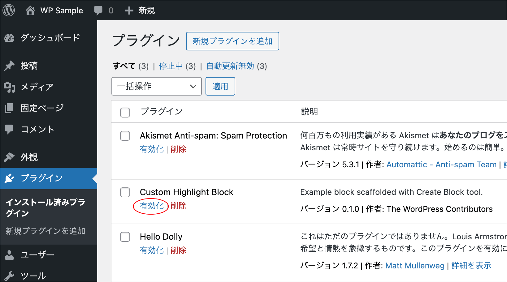
プラグインを有効化
プラグインページで、作成したひな形のブロックのプラグインを有効化します。
投稿にブロックを挿入します。ブロックが表示されない場合は、ページを再読込します。
ひな形のブロックが問題なく挿入でき、フロントエンド側で表示されることを確認して保存します。エディターでスタイルが適用されない場合は、ページを再読込します。
[注意] WordPress Highlight.js カスタムブロックの作成に掲載されいるブロック(my-highlight-block)を作成して有効化している場合は、無効化(または削除)する必要があります。
これから作成するブロックも、同じ JavaScript ファイルを読み込んでいるため、Highlight.js が重複して適用されてされしまうため正しく表示されません。
※ 但し、削除するとプラグインフォルダ内のすべてのファイルが失われるので注意が必要です。
また、Highlight.js を WordPress で使うに掲載されている CSS をテーマで読み込んでいたり、別のプラグインで Highlight.js を読み込んでいる場合も正しく表示されない可能性があります。
プラグインファイルの編集
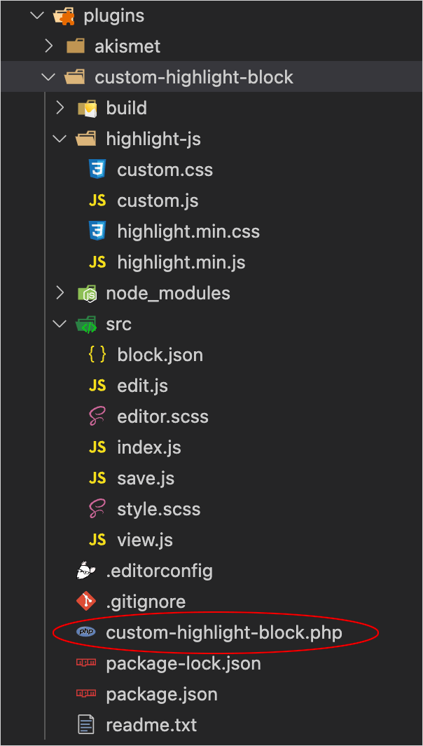
作成されたプラグインフォルダ(custom-highlight-block)のプラグインファイル(custom-highlight-block.php)を編集します。init フックへの関数名は異なる場合がありますが、その部分(61〜64行目)は雛形のまま変更しません。
Description や Author を適宜変更し、Highlight.js 関連ファイルの読み込みの記述(21〜58行目)を追加します。
<?php
/**
* Plugin Name:       Custom Highlight Block
* Description:       Custom Syntax Highlight Block using Hightlight.js.
* Requires at least: 6.1
* Requires PHP:      7.0
* Version:           0.1.0
* Author:            WebDesignLeaves
* License:           GPL-2.0-or-later
* License URI:       https://www.gnu.org/licenses/gpl-2.0.html
* Text Domain:       custom-highlight-block
*
* @package           wdl
*/

if ( ! defined( 'ABSPATH' ) ) {
  exit;
}

// 以下を追加
function add_wdl_custom_code_block_scripts_and_styles() {
  $dir = dirname(__FILE__);

  //管理画面以外(フロントエンド側でのみ読み込む)
  if (!is_admin()) {
    // highlight.js の JavaScript ファイルのエンキュー
    wp_enqueue_script(
      'highlight-js',
      plugins_url('/highlight-js/highlight.min.js', __FILE__),
      array(),
      filemtime("$dir/highlight-js/highlight.min.js"),
      true
    );
    // カスタマイズ用 JavaScript ファイルのエンキュー
    wp_enqueue_script(
      'custom-js',
      plugins_url('/highlight-js/custom.js', __FILE__),
      array('highlight-js'),
      filemtime("$dir/highlight-js/custom.js"),
      true
    );
    // highlight.js の基本スタイルのエンキュー
    wp_enqueue_style(
      'highlight-js-style',
      plugins_url('/highlight-js/highlight.min.css', __FILE__),
      array(),
      filemtime("$dir/highlight-js/highlight.min.css")
    );
    // カスタマイズ用スタイルのエンキュー
    wp_enqueue_style(
      'custom-style',
      plugins_url('/highlight-js/custom.css', __FILE__),
      array(),
      filemtime("$dir/highlight-js/custom.css")
    );
  }
}
add_action('enqueue_block_assets', 'add_wdl_custom_code_block_scripts_and_styles');

// 以下はひな形のコードから変更なし
function custom_highlight_block_custom_highlight_block_block_init() {
  register_block_type( __DIR__ . '/build' );
}
add_action( 'init', 'custom_highlight_block_custom_highlight_block_block_init' );
block.json の編集
src/block.json を編集します。
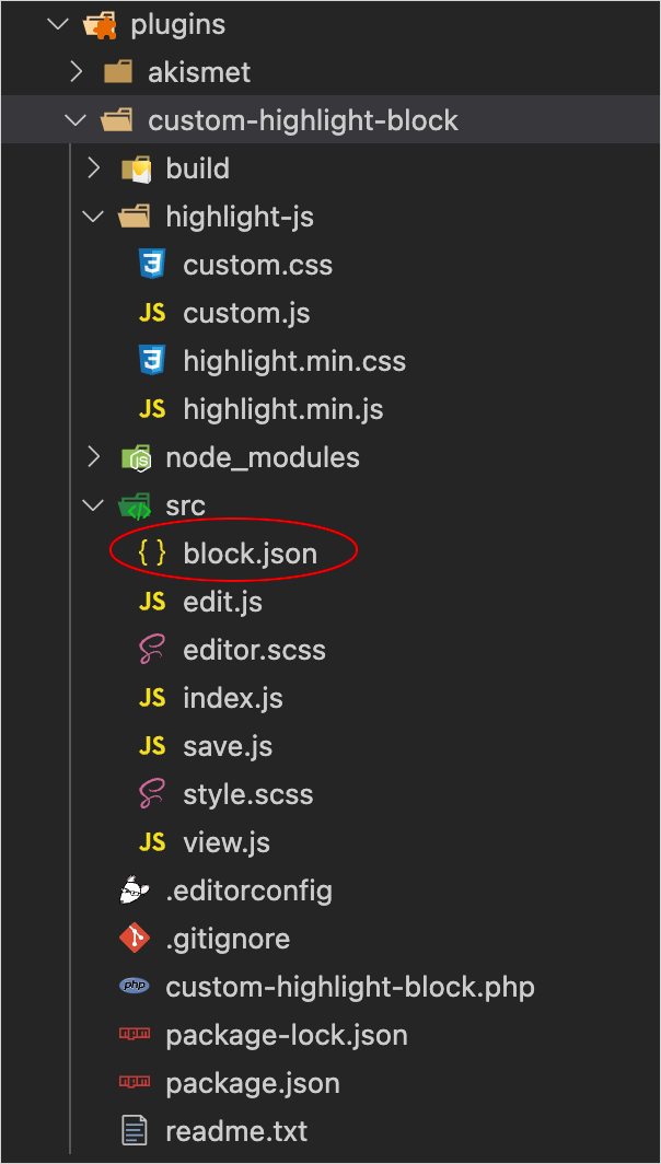
description を変更し、attributes(属性)を追加します。
attributes の codeText は、編集画面(エディタ)で入力するコードの文字列を保持するための属性で、type に string、default(初期値)に ""(空文字列)を指定し、ブロックの code 要素にテキストとして保存するように、source に text を、selector に code(要素)を指定します。
codeText 以外は、インスペクターに表示するオプションの値を保持するための属性です。
この時点では style.scss と view.js は使用しないので、"style": "file:./style-index.css" と "viewScript": "file:./view.js" の行を削除します。
また、アイコンは独自のアイコンを設定するので、"icon": "smiley" の行も削除します。
{
  "$schema": "https://schemas.wp.org/trunk/block.json",
  "apiVersion": 3,
  "name": "wdl/custom-highlight-block",
  "version": "0.1.0",
  "title": "Custom Highlight Block",
  "category": "widgets",
  "description": "Custom Syntax Highlight Block using Hightlight.js.",
  "example": {},
  "attributes": {
    "codeText": {
      "type": "string",
      "default": "",
      "source": "text",
      "selector": "code"
    },
    "language": {
      "type": "string"
    },
    "wrap": {
      "type": "boolean"
    },
    "noLineNum": {
      "type": "boolean"
    },
    "showNoLang": {
      "type": "boolean"
    },
    "noCopyBtn": {
      "type": "boolean"
    },
    "noToolbar": {
      "type": "boolean"
    },
    "label": {
      "type": "string"
    },
    "labelUrl": {
      "type": "string"
    },
    "targetBlank": {
      "type": "boolean"
    },
    "lineHighlight": {
      "type": "string"
    },
    "lineNumStart": {
      "type": "string"
    },
    "setLang": {
      "type": "string"
    },
    "maxLines": {
      "type": "string"
    },
    "maxLinesOffset": {
      "type": "string"
    },
    "maxLinesScrollTo": {
      "type": "string"
    },
    "noScroll": {
      "type": "boolean"
    },
    "noScrollFooter": {
      "type": "boolean"
    },
    "scrollFooterText": {
      "type": "string"
    },
    "noLineInfo": {
      "type": "boolean"
    },
    "copyNoPrompt": {
      "type": "boolean"
    },
    "copyNoSlComments": {
      "type": "boolean"
    },
    "copyNoMlComments": {
      "type": "boolean"
    },
    "copyNoHTMLComments": {
      "type": "boolean"
    },
    "toggleCode": {
      "type": "boolean"
    },
    "accordionOpenBtnLabel": {
      "type": "string"
    },
    "accordionCloseBtnLabel": {
      "type": "string"
    }
  },
  "supports": {
    "html": false
  },
  "textdomain": "custom-highlight-block",
  "editorScript": "file:./index.js",
  "editorStyle": "file:./index.css"
}
edit.js の編集
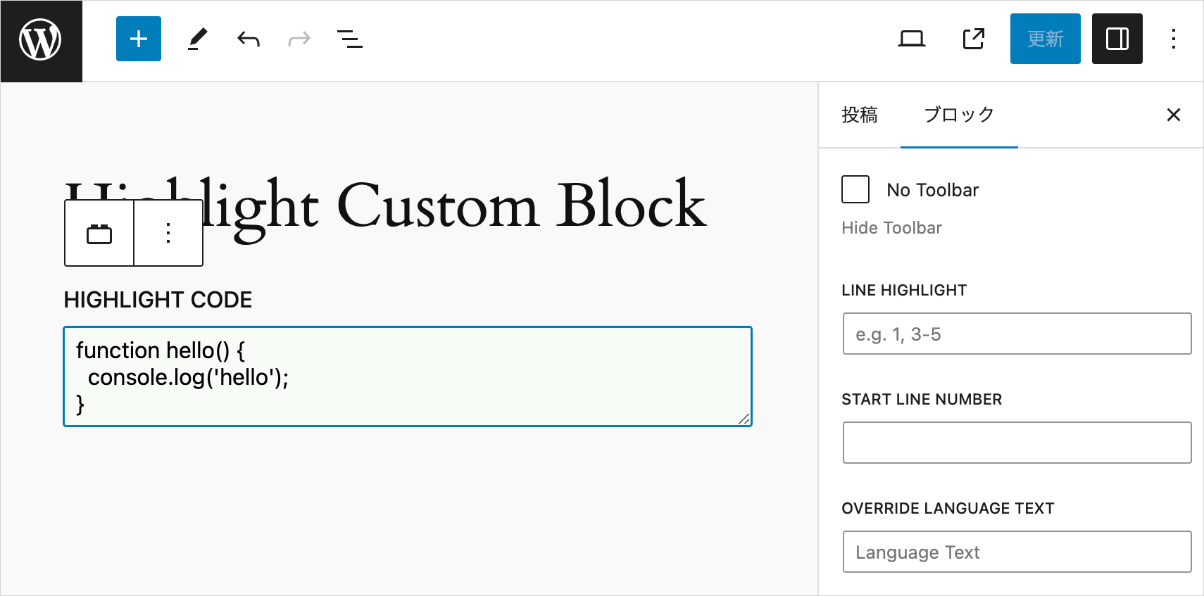
src/edit.js ではブロックがエディターでどのように機能し、どのように表示されるかを定義します。

エディターでは、textarea にコードを入力し、サイドバーのインスペクターで言語名を入力したり、折り返しや行番号表示などのオプションを設定できるようにします。そのための必要なコンポーネントをインポートします。
Edit() では属性(attributes)と属性を更新する関数(setAttributes)、及び ブロックが現在選択されているかどうかを表す isSelected を変数に受け取ります。
codeTextRows は TextareaControl コンポーネントの行数を指定するための変数で、入力されたコードの行数から算出しています。
インスペクターで表示するオプションの数が多いので、インスペクター部分は別途 getInspectorControls という関数で定義しています。項目はグループに分け、PanelBody の initialOpen で初期状態で表示するかどうかを関連項目の attributes の値を使って指定しています。
Edit() の return は配列で指定してインスペクター部分の関数 getInspectorControls() を呼び出し、エディターにレンダリングする入力エリアのブロックのラッパー要素に {...useBlockProps()} を指定して必要な属性を展開するようにします。
import { __ } from "@wordpress/i18n";
import { useBlockProps, InspectorControls } from "@wordpress/block-editor";
import { TextareaControl, PanelBody, TextControl, PanelRow, CheckboxControl } from "@wordpress/components";
import "./editor.scss";

export default function Edit({ attributes, setAttributes, isSelected }) {
  const codeTextRowCount = attributes.codeText.split(/\r|\r\n|\n/).length;
  const codeTextRows = codeTextRowCount > 3 ? codeTextRowCount : 3;

  // インスペクターを出力する関数
  const getInspectorControls = () => {
    return (
      <InspectorControls>
        <PanelBody title={__("Highlight Basic Settings", "custom-highlight-block")}>
          <PanelRow>
            <TextControl
              label={__("Language", "custom-highlight-block")}
              value={attributes.language}
              onChange={(value) => setAttributes({ language: value })}
              className="lang-name"
            />
          </PanelRow>
          <PanelRow>
            <TextControl
              label={__("Label", "custom-highlight-block")}
              value={attributes.label}
              onChange={(value) => setAttributes({ label: value })}
              className="label-name"
            />
          </PanelRow>
          <PanelRow>
            <CheckboxControl
              label={__("white-space: pre-wrap", "custom-highlight-block")}
              checked={attributes.wrap}
              onChange={(val) => setAttributes({ wrap: val })}
              help={__("Enable Text Auto Wrap", "custom-highlight-block")}
            />
          </PanelRow>
          <PanelRow>
            <CheckboxControl
              label={__("No Line Number", "custom-highlight-block")}
              checked={attributes.noLineNum}
              onChange={(val) => setAttributes({ noLineNum: val })}
              help={__("Hide Line Number", "custom-highlight-block")}
            />
          </PanelRow>
          <PanelRow>
            <CheckboxControl
              label={__("No Language Name", "custom-highlight-block")}
              checked={attributes.showNoLang}
              onChange={(val) => setAttributes({ showNoLang: val })}
              help={__("Hide Language Name", "custom-highlight-block")}
            />
          </PanelRow>
          <PanelRow>
            <CheckboxControl
              label={__("No Copy Button", "custom-highlight-block")}
              checked={attributes.noCopyBtn}
              onChange={(val) => setAttributes({ noCopyBtn: val })}
              help={__("Do Not Show Copy Button", "custom-highlight-block")}
            />
          </PanelRow>
          <PanelRow>
            <CheckboxControl
              label={__("No Toolbar", "custom-highlight-block")}
              checked={attributes.noToolbar}
              onChange={(val) => setAttributes({ noToolbar: val })}
              help={__("Hide Toolbar", "custom-highlight-block")}
            />
          </PanelRow>
          <PanelRow>
            <TextControl
              label={__("Line Highlight", "custom-highlight-block")}
              value={attributes.lineHighlight}
              onChange={(value) => setAttributes({ lineHighlight: value })}
              className="line-highlight"
              placeholder={__("e.g. 1, 3-5", "custom-highlight-block")}
            />
          </PanelRow>
          <PanelRow>
            <TextControl
              label={__("Start Line Number", "custom-highlight-block")}
              value={attributes.lineNumStart}
              onChange={(value) => setAttributes({ lineNumStart: value })}
              className="line-num-start"
            />
          </PanelRow>
          <PanelRow>
            <TextControl
              label={__("Override Language Text", "custom-highlight-block")}
              value={attributes.setLang}
              onChange={(value) => setAttributes({ setLang: value })}
              className="set-lang"
              placeholder={__("Language Text", "custom-highlight-block")}
            />
          </PanelRow>
          <PanelRow>
            <PanelBody
              title={__("LABEL Option", "custom-highlight-block")}
              initialOpen={attributes.labelUrl ? true : false}
            >
              <PanelRow>
                <TextControl
                  label={__("Label URL", "custom-highlight-block")}
                  value={attributes.labelUrl}
                  onChange={(value) => setAttributes({ labelUrl: value })}
                  className="label-url"
                />
              </PanelRow>
              <PanelRow>
                <CheckboxControl
                  label={__("target=_blank", "custom-highlight-block")}
                  checked={attributes.targetBlank}
                  onChange={(val) => setAttributes({ targetBlank: val })}
                  help={__("target attribute", "custom-highlight-block")}
                />
              </PanelRow>
            </PanelBody>
          </PanelRow>
          <PanelRow>
            <PanelBody
              title={__("Max Lines", "custom-highlight-block")}
              initialOpen={attributes.maxLines ? true : false}
            >
              <PanelRow>
                <TextControl
                  label={__("Set Max Lines", "custom-highlight-block")}
                  value={attributes.maxLines}
                  onChange={(value) => setAttributes({ maxLines: value })}
                  className="max-lines"
                  placeholder={__("specify max number of lines", "custom-highlight-block")}
                />
              </PanelRow>
              <PanelRow>
                <TextControl
                  label={__("Max Lines Offset (px)", "custom-highlight-block")}
                  value={attributes.maxLinesOffset}
                  onChange={(value) => setAttributes({ maxLinesOffset: value })}
                  className="max-lines-offset"
                  placeholder={__("offset height (pixel)", "custom-highlight-block")}
                />
              </PanelRow>
              <PanelRow>
                <TextControl
                  label={__("Scroll To Line Number", "custom-highlight-block")}
                  value={attributes.maxLinesScrollTo}
                  onChange={(value) => setAttributes({ maxLinesScrollTo: value })}
                  className="max-lines-scroll-to"
                />
              </PanelRow>
              <PanelRow>
                <CheckboxControl
                  label={__("No Scroll", "custom-highlight-block")}
                  checked={attributes.noScroll}
                  onChange={(val) => setAttributes({ noScroll: val })}
                  help={__("Make visible area fixed vertically", "custom-highlight-block")}
                />
              </PanelRow>
              <PanelRow>
                <CheckboxControl
                  label={__("No Scroll Footer", "custom-highlight-block")}
                  checked={attributes.noScrollFooter}
                  onChange={(val) => setAttributes({ noScrollFooter: val })}
                  help={__("Do not show scroll footer (information bar)", "custom-highlight-block")}
                />
              </PanelRow>
              <PanelRow>
                <CheckboxControl
                  label={__("No Line info on Scroll Footer", "custom-highlight-block")}
                  checked={attributes.noLineInfo}
                  onChange={(val) => setAttributes({ noLineInfo: val })}
                  help={__("Do not show line numbers on scroll footer (information bar)", "custom-highlight-block")}
                />
              </PanelRow>
              <PanelRow>
                <TextControl
                  label={__("Scroll Footer Text", "custom-highlight-block")}
                  value={attributes.scrollFooterText}
                  onChange={(value) => setAttributes({ scrollFooterText: value })}
                  className="scroll-footer-text"
                  help={__("text indicate that content is scrollable. default is 'scrollable'", "custom-highlight-block")}
                />
              </PanelRow>
            </PanelBody>
          </PanelRow>
          <PanelRow>
            <PanelBody
              title={__("Copy Option", "custom-highlight-block")}
              initialOpen={
                attributes.copyNoPrompt ||
                attributes.copyNoSlComments ||
                attributes.copyNoMlComments ||
                attributes.copyNoHTMLComments
                  ? true
                  : false
              }
            >
              <PanelRow>
                <CheckboxControl
                  label={__("No Prompt", "custom-highlight-block")}
                  checked={attributes.copyNoPrompt}
                  onChange={(val) => setAttributes({ copyNoPrompt: val })}
                  help={__("Exclude prompt ($, %)", "custom-highlight-block")}
                />
              </PanelRow>
              <PanelRow>
                <CheckboxControl
                  label={__("No Single-Line Comments", "custom-highlight-block")}
                  checked={attributes.copyNoSlComments}
                  onChange={(val) => setAttributes({ copyNoSlComments: val })}
                  help={__("Exclude Single Line Comments", "custom-highlight-block")}
                />
              </PanelRow>
              <PanelRow>
                <CheckboxControl
                  label={__("No Multi-Line Comments", "custom-highlight-block")}
                  checked={attributes.copyNoMlComments}
                  onChange={(val) => setAttributes({ copyNoMlComments: val })}
                  help={__("Exclude Single Line Comments", "custom-highlight-block")}
                />
              </PanelRow>
              <PanelRow>
                <CheckboxControl
                  label={__("No HTML Comments", "custom-highlight-block")}
                  checked={attributes.copyNoHTMLComments}
                  onChange={(val) => setAttributes({ copyNoHTMLComments: val })}
                  help={__("Exclude HTML Comments", "custom-highlight-block")}
                />
              </PanelRow>
            </PanelBody>
          </PanelRow>
          <PanelRow>
            <PanelBody
              title={__("Toggle Code Accordion", "custom-highlight-block")}
              initialOpen={attributes.toggleCode ? true : false}
            >
              <PanelRow>
                <CheckboxControl
                  label={__("Toggle Code", "custom-highlight-block")}
                  checked={attributes.toggleCode}
                  onChange={(val) => setAttributes({ toggleCode: val })}
                  help={__("Toggle (Show/Hide) Code ", "custom-highlight-block")}
                />
              </PanelRow>
              <PanelRow>
                <TextControl
                  label={__("Open Button Label", "custom-highlight-block")}
                  value={attributes.accordionOpenBtnLabel}
                  onChange={(value) => setAttributes({ accordionOpenBtnLabel: value })}
                  className="accordion-open-label"
                  placeholder={__("Open (Default)", "custom-highlight-block")}
                />
              </PanelRow>
              <PanelRow>
                <TextControl
                  label={__("Close Button Label", "custom-highlight-block")}
                  value={attributes.accordionCloseBtnLabel}
                  onChange={(value) => setAttributes({ accordionCloseBtnLabel: value })}
                  className="accordion-close-label"
                  placeholder={__("Close (Default)", "custom-highlight-block")}
                />
              </PanelRow>
            </PanelBody>
          </PanelRow>
        </PanelBody>
      </InspectorControls>
    );
  };

  //配列で指定
  return [
    getInspectorControls(),
    <div {...useBlockProps()}>
      <TextareaControl
        label={__("Highlight Code", "custom-highlight-block")}
        value={attributes.codeText}
        onChange={(value) => setAttributes({ codeText: value })}
        rows={codeTextRows}
        placeholder={__("Write your code...", "custom-highlight-block")}
        hideLabelFromVision={isSelected ? false : true}
      />
    </div>,
  ];
}
ファイルを保存して編集画面を再読み込みし、挿入したブロックの入力エリアを選択してフォーカスすると以下のように右側のインスペクターにオプションが表示されます。
save.js の編集
src/save.js ファイルは、ブロックが保存(出力)されたときに表示される HTML 構造を定義します。
save() では attributes を引数にとり、テキストエリアに入力されたコードのテキスト(attributes.codeText)をエスケープ処理して code 要素のコンテンツに指定し、属性(attributes)の値を使って code 要素と pre 要素のクラス属性や data-* 属性に指定します。
code 要素と pre 要素に指定する属性のオブジェクトを定義し、指定する属性を追加して、return ステートメントでそれぞれの要素に展開します。
どのようなクラスや data-* 属性をどの要素に指定するかは、Highlight.js のカスタマイズ用の JavaScript で定義されています。
return ステートメントでは、フラグメント (<>〜</>) で全体を囲み、attributes.toggleCode の値(アコーディオンで開閉表示するかどうか)が true の場合はアコーディオンのマークアップを追加します。
また、ブロックのラッパー要素に useBlockProps.save() から返されるブロック props を追加します。
import { useBlockProps } from "@wordpress/block-editor";
export default function save({ attributes }) {
// pre 要素に設定する属性のオブジェクト
const preAttributes = {};
// attributes の値により、pre 要素に設定するクラス属性を作成
let preClassList = attributes.wrap ? "pre-wrap" : "pre";
preClassList += attributes.noLineNum ? " no-line-num" : "";
preClassList += attributes.noCopyBtn ? " no-copy-btn" : "";
preClassList += attributes.targetBlank ? " target-blank" : "";
preClassList += attributes.noScroll ? " no-scroll" : "";
preClassList += attributes.noScrollFooter ? " no-scroll-footer" : "";
preClassList += attributes.noLineInfo ? " no-line-info" : "";
preClassList += attributes.copyNoPrompt ? " copy-no-prompt" : "";
preClassList += attributes.copyNoSlComments ? " copy-no-sl-comments" : "";
preClassList += attributes.copyNoMlComments ? " copy-no-ml-comments" : "";
preClassList += attributes.copyNoHTMLComments ? " copy-no-html-comments" : "";
// pre 要素に クラスを追加
preAttributes.className = preClassList;
// attributes の値により、pre 要素に data-* 属性を追加
if (attributes.label) preAttributes["data-label"] = attributes.label;
if (attributes.labelUrl) preAttributes["data-label-url"] = attributes.labelUrl;
if (attributes.lineHighlight) preAttributes["data-line-highlight"] = attributes.lineHighlight;
if (attributes.lineNumStart) preAttributes["data-line-num-start"] = attributes.lineNumStart;
if (attributes.maxLines) preAttributes["data-max-lines"] = attributes.maxLines;
if (attributes.maxLinesScrollTo) preAttributes["data-scroll-to"] = attributes.maxLinesScrollTo;
if (attributes.scrollFooterText) preAttributes["data-footer-text"] = attributes.scrollFooterText;
// code 要素に設定する属性のオブジェクト
const codeAttributes = {};
// code 要素に設定するクラス属性
let codeClassList;
if(attributes.language) codeClassList = `language-${attributes.language}`;
if (codeClassList) {
codeClassList += attributes.showNoLang ? " show-no-lang" : "";
} else {
codeClassList = attributes.showNoLang ? "show-no-lang" : "";
}
// code 要素に クラスを追加
if(codeClassList) codeAttributes.className = codeClassList;
// code 要素に設定する data-* 属性
if (attributes.setLang) codeAttributes["data-set-lang"] = attributes.setLang;
// テキストエリアに入力されたコードのテキストをエスケープ
const escapedCodeText = attributes.codeText.replace(/[<>&'"]/g, (match) => {
const specialChars = {
"<": "<",
">": ">",
"&": "&",
"'": "'",
'"': """,
};
return specialChars[match];
});
return (
<>
{attributes.toggleCode && ( // アコーディオンパネルで表示
<div {...useBlockProps.save()}>
<details class="toggle-code-animation">
<summary data-close-text={attributes.accordionCloseBtnLabel}>
{attributes.accordionOpenBtnLabel}
</summary>
<div class="details-content-wrapper">
<div class="details-content">
<div className={ attributes.noToolbar ? "hljs-wrap no-toolbar" : "hljs-wrap" }>
<pre {...preAttributes}>
<code {...codeAttributes}>{escapedCodeText}</code>
</pre>
</div>
</div>
</div>
</details>
</div>
)}
{!attributes.toggleCode && ( // アコーディオンパネルなし
<div {...useBlockProps.save()}>
<div className={ attributes.noToolbar ? "hljs-wrap no-toolbar" : "hljs-wrap" }>
<pre {...preAttributes}>
<code {...codeAttributes}>{escapedCodeText}</code>
</pre>
</div>
</div>
)}
</>
);
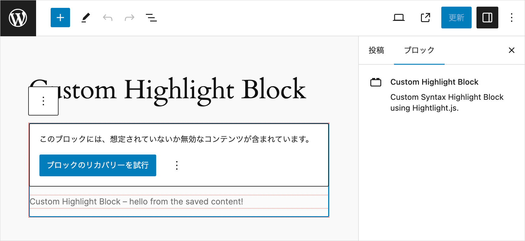
}ファイルを保存してエディターを再読み込みすると、save() 関数の return ステートメントが変更されたため以下のように表示されるので、「ブロックのリカバリーを試行」をクリックします。
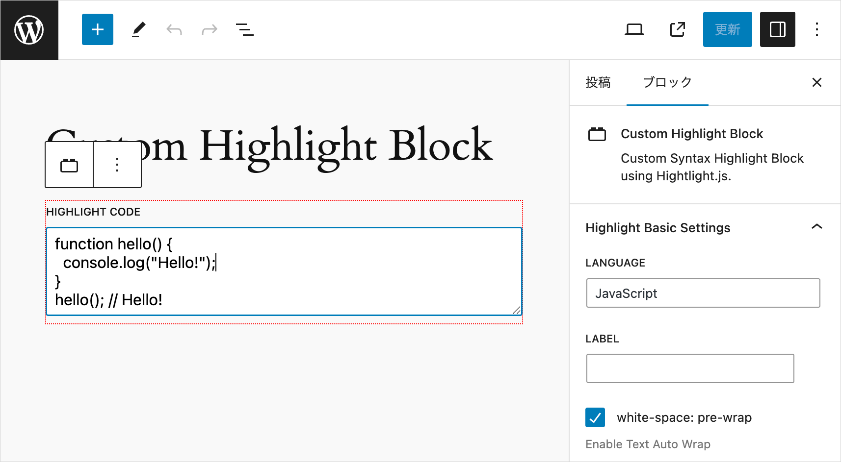
例えば、以下のようなコードを記述して、インスペクターで LANGUAGE に JavaScript と入力し、white-space: pre-wrap にチェックを入れて投稿を保存すると、
フロント側では以下のように表示されます。
editor.scss の編集
src/editor.scss を編集してエディターのスタイルを設定します。
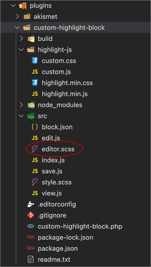
以下では、フォーカス時のテキストエリアの背景色(薄緑色)とラベルの文字サイズを設定しています。
/* フォーカス時のテキストエリアの背景色 */
.wp-block-wdl-custom-highlight-block textarea:focus {
  background-color: #f6fdf6;
}

/* テキストエリアのラベルの文字サイズ */
.wp-block-wdl-custom-highlight-block label.components-base-control__label {
  font-size: 16px;
}
ブロックにフォーカスすると背景色が薄緑色になります。
index.js の編集
src/index.js を編集します。
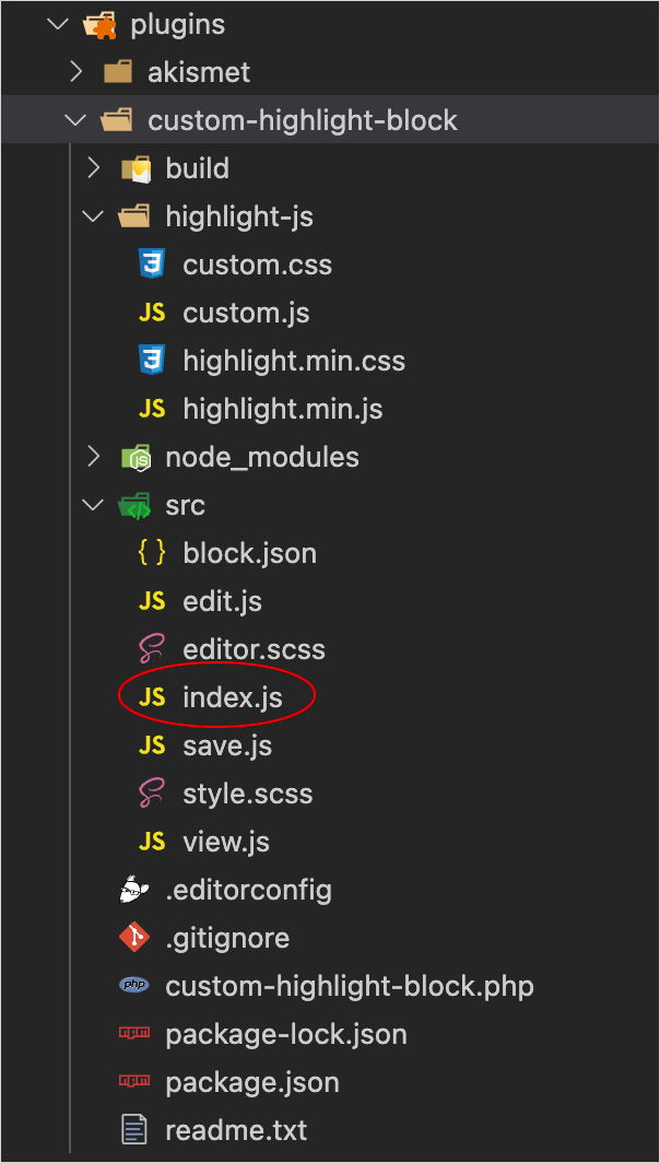
この時点では style.scss は使わないので import './style.scss'; の行を削除します(後で style.scss を使う構成で戻すのでコメントアウトしておいてもOKです)。
また、エディターのブロックには カスタムアイコン を設定するので、その定義と registerBlockType() に icon プロパティを追加します。
import { registerBlockType } from "@wordpress/blocks";
// import './style.scss'; // 削除
import Edit from "./edit";
import save from "./save";
import metadata from "./block.json";

// SVG アイコンの定義
const highlightIcon = (
  <svg
    viewBox="0 0 16 16"
    xmlns="http://www.w3.org/2000/svg"
    aria-hidden="true"
    focusable="false"
    width="24"
    height="24"
  >
    <path d="M16 8A8 8 0 1 0 0 8a8 8 0 0 0 16 0m-8 5v1H4.5a.5.5 0 0 0-.093.009A7 7 0 0 1 3.1 13zm0-1H2.255a7 7 0 0 1-.581-1H8zm-6.71-2a7 7 0 0 1-.22-1H8v1zM1 8q0-.51.07-1H8v1zm.29-2q.155-.519.384-1H8v1zm.965-2q.377-.54.846-1H8v1zm2.137-2A6.97 6.97 0 0 1 8 1v1z"/>
  </svg>
);

registerBlockType(metadata.name, {
  icon: highlightIcon,  // icon プロパティを追加
  edit: Edit,
  save,
});
ファイルを保存してエディターでページを再読み込みすると、設定したカスタムアイコンが表示されます。
プレビュー機能を追加
2024年8月10日 更新
プレビューの状態を格納するための変数を属性を使って定義していましたが、その場合、プレビュー切り替え時に「更新」ボタンがアクティブになってしまうため、属性の代わりに state 変数を使用するように変更しました。
プラグインファイル
プラグインファイル(custom-highlight-block.php)を以下のように、全てのファイルを管理画面(エディター側)とフロントエンド側の両方で読み込むように変更します。
<?php

/**
* Plugin Name:       Custom Highlight Block
* Description:       Custom Syntax Highlight Block using Hightlight.js.
* Requires at least: 6.1
* Requires PHP:      7.0
* Version:           0.1.0
* Author:            WebDesignLeaves
* License:           GPL-2.0-or-later
* License URI:       https://www.gnu.org/licenses/gpl-2.0.html
* Text Domain:       custom-highlight-block
*
* @package           wdl
*/

if (!defined('ABSPATH')) {
  exit;
}

// 以下を変更(管理画面とフロントエンド側の両方で読み込む)
function add_wdl_custom_code_block_scripts_and_styles() {
  $dir = dirname(__FILE__);

  // highlight.js の JavaScript ファイルのエンキュー
  wp_enqueue_script(
    'highlight-js',
    plugins_url('/highlight-js/highlight.min.js', __FILE__),
    array(),
    filemtime("$dir/highlight-js/highlight.min.js"),
    true
  );
  // カスタマイズ用 JavaScript ファイルのエンキュー
  wp_enqueue_script(
    'custom-js',
    plugins_url('/highlight-js/custom.js', __FILE__),
    array('highlight-js'),
    filemtime("$dir/highlight-js/custom.js"),
    true
  );
  // highlight.js の基本スタイルのエンキュー
  wp_enqueue_style(
    'highlight-js-style',
    plugins_url('/highlight-js/highlight.min.css', __FILE__),
    array(),
    filemtime("$dir/highlight-js/highlight.min.css")
  );
  // カスタマイズ用スタイルのエンキュー
  wp_enqueue_style(
    'custom-style',
    plugins_url('/highlight-js/custom.css', __FILE__),
    array(),
    filemtime("$dir/highlight-js/custom.css")
  );

}
add_action('enqueue_block_assets', 'add_wdl_custom_code_block_scripts_and_styles');

function custom_highlight_block_custom_highlight_block_block_init() {
  register_block_type(__DIR__ . '/build');
}
add_action('init', 'custom_highlight_block_custom_highlight_block_block_init');
カスタマイズ用の JavaScript の説明
このサンプルのカスタマイズ用の JavaScript に定義してある関数 mySetupHighlightJs() は Highlight.js の初期化とカスタマイズする関数です。
function mySetupHighlightJs(settings, targetWrapper = false) { // 493行目あたり
  ・・・省略・・・
}
第1引数 settings はオプションの設定オブジェクトです。第2引数にシンタックスハイライト表示する要素を渡すと、その要素のみに Highlight.js の初期化とカスタマイズを適用するようになっています。
フロントエンド側ではこの関数を第2引数は指定せずに呼び出して、全ての div.hljs-wrap 要素を対象に初期化とカスタマイズを適用しています(JavaScript を読み込むことで実行されます)。
プレビュー時には、edit.js で現在編集中の div.hljs-wrap 要素を第2引数に指定して、この要素のみを対象に呼び出します。
同様にアコーディオンアニメーションの関数 mySetupToggleDetailsAnimation() も引数に要素を渡すと、その要素のみにアニメーションを適用するようになっているので、フロントエンド側では引数は指定せずに呼び出して、全ての details.toggle-code-animation 要素を対象にアニメーションを適用し、プレビュー時には edit.js で編集中の details.toggle-code-animation 要素のみを対象に呼び出します。
function mySetupToggleDetailsAnimation(elem) { // 550行目あたり
  ・・・省略・・・
}
edit.js
edit.js ではツールバーに必要なコンポーネント(BlockControls、ToolbarGroup、ToolbarButton)やプレビュー時に Highlight.js の初期化とカスタマイズを適用する際に使用するフック(useRef、useEffect)、プレビューの状態を格納する state 変数を使用するためのフック(useState)、プレビュー時にインスペクタを無効にする際に使用するフック(useDisabled)をインポートします。
useState() でプレビューの状態を格納する state 変数 isEditMode とその更新関数 setEditMode の宣言します(属性を使わずに state 変数を使うのはプレビュー切替時に「更新」ボタンがアクティブになるのを防止するためです)。
そして追加でツールバーを出力する関数 getToolbarControls を定義して(304行目あたり)、ツールバーにプレビューと編集を切り替えるボタンを表示します(切り替えボタンにはカスタムアイコンを表示します)。
プレビュー時にハイライト表示するために、まず、code 要素の祖先の div.hljs-wrap と アコーディオンパネルの details 要素を参照できるように ref を宣言し、return 文で ref={codeWrapperRef} を div 要素に、ref={codeDetailsRef} を details 要素に指定します。
そして useEffect フックで isEditMode を調べてプレビューモードであれば、ハイライト表示する関数 mySetupHighlightJs() の第2引数に codeWrapperRef.current(div.hljs-wrap)を指定して適用します。
toggleCode 属性が true の場合はアコーディオンパネルでアニメーション表示するので、その場合は mySetupToggleDetailsAnimation() の引数に codeDetailsRef.current で details 要素を渡してアニメーションの関数を適用します。
また、プレビュー時の表示に必要な属性の設定やマークアップは、ほぼ save.js と同様ですが、ブロックのラッパー要素には {...useBlockProps()} を指定します。
import { __ } from "@wordpress/i18n";
// BlockControls を追加
import { useBlockProps, InspectorControls, BlockControls } from "@wordpress/block-editor";
// ToolbarGroup, ToolbarButton を追加
import { TextareaControl, PanelBody, TextControl, PanelRow, CheckboxControl, ToolbarGroup, ToolbarButton } from "@wordpress/components";
import "./editor.scss";
// useEffect, useRef, useState を追加
import { useEffect, useRef, useState } from "@wordpress/element";
// useDisabled を追加
import { useDisabled } from "@wordpress/compose";

export default function Edit({ attributes, setAttributes, isSelected }) {
  // useDisabled フック
  const disabledRef = useDisabled();
  // インスペクタの各要素のラッパーの div 要素へ設定する属性
  const inspectorDivAttributes = {};
  inspectorDivAttributes.className = 'inspectorDiv';

  // state 変数 isEditMode とその更新関数 setEditMode の宣言
  const [isEditMode, setEditMode] = useState(true);

  if (!isEditMode) {
    // プレビューモードではインスペクタへの入力を disalbed に(ref 属性に disabledRef を指定)
    inspectorDivAttributes.ref = disabledRef;
  }

  const codeTextRowCount = attributes.codeText.split(/\r|\r\n|\n/).length;
  const codeTextRows = codeTextRowCount > 3 ? codeTextRowCount : 3;

  // インスペクターを出力する関数
  const getInspectorControls = () => {
    return (
      <InspectorControls>
        <PanelBody title={__("Highlight Basic Settings", "custom-highlight-block")}>
        <div {...inspectorDivAttributes}>
          <PanelRow>
            <TextControl
              label={__("Language", "custom-highlight-block")}
              value={attributes.language}
              onChange={(value) => setAttributes({ language: value })}
              className="lang-name"
            />
          </PanelRow>
          <PanelRow>
            <TextControl
              label={__("Label", "custom-highlight-block")}
              value={attributes.label}
              onChange={(value) => setAttributes({ label: value })}
              className="label-name"
            />
          </PanelRow>
          <PanelRow>
            <CheckboxControl
              label={__("white-space: pre-wrap", "custom-highlight-block")}
              checked={attributes.wrap}
              onChange={(val) => setAttributes({ wrap: val })}
              help={__("Enable Text Auto Wrap", "custom-highlight-block")}
            />
          </PanelRow>
          <PanelRow>
            <CheckboxControl
              label={__("No Line Number", "custom-highlight-block")}
              checked={attributes.noLineNum}
              onChange={(val) => setAttributes({ noLineNum: val })}
              help={__("Hide Line Number", "custom-highlight-block")}
            />
          </PanelRow>
          <PanelRow>
            <CheckboxControl
              label={__("No Language Name", "custom-highlight-block")}
              checked={attributes.showNoLang}
              onChange={(val) => setAttributes({ showNoLang: val })}
              help={__("Hide Language Name", "custom-highlight-block")}
            />
          </PanelRow>
          <PanelRow>
            <CheckboxControl
              label={__("No Copy Button", "custom-highlight-block")}
              checked={attributes.noCopyBtn}
              onChange={(val) => setAttributes({ noCopyBtn: val })}
              help={__("Do Not Show Copy Button", "custom-highlight-block")}
            />
          </PanelRow>
          <PanelRow>
            <CheckboxControl
              label={__("No Toolbar", "custom-highlight-block")}
              checked={attributes.noToolbar}
              onChange={(val) => setAttributes({ noToolbar: val })}
              help={__("Hide Toolbar", "custom-highlight-block")}
            />
          </PanelRow>
          <PanelRow>
            <TextControl
              label={__("Line Highlight", "custom-highlight-block")}
              value={attributes.lineHighlight}
              onChange={(value) => setAttributes({ lineHighlight: value })}
              className="line-highlight"
              placeholder={__("e.g. 1, 3-5", "custom-highlight-block")}
            />
          </PanelRow>
          <PanelRow>
            <TextControl
              label={__("Start Line Number", "custom-highlight-block")}
              value={attributes.lineNumStart}
              onChange={(value) => setAttributes({ lineNumStart: value })}
              className="line-num-start"
            />
          </PanelRow>
          <PanelRow>
            <TextControl
              label={__("Override Language Text", "custom-highlight-block")}
              value={attributes.setLang}
              onChange={(value) => setAttributes({ setLang: value })}
              className="set-lang"
              placeholder={__("Language Text", "custom-highlight-block")}
            />
          </PanelRow>
          <PanelRow>
            <PanelBody
              title={__("LABEL Option", "custom-highlight-block")}
              initialOpen={attributes.labelUrl ? true : false}
            >
              <PanelRow>
                <TextControl
                  label={__("Label URL", "custom-highlight-block")}
                  value={attributes.labelUrl}
                  onChange={(value) => setAttributes({ labelUrl: value })}
                  className="label-url"
                />
              </PanelRow>
              <PanelRow>
                <CheckboxControl
                  label={__("target=_blank", "custom-highlight-block")}
                  checked={attributes.targetBlank}
                  onChange={(val) => setAttributes({ targetBlank: val })}
                  help={__("target attribute", "custom-highlight-block")}
                />
              </PanelRow>
            </PanelBody>
          </PanelRow>
          <PanelRow>
            <PanelBody
              title={__("Max Lines", "custom-highlight-block")}
              initialOpen={attributes.maxLines ? true : false}
            >
              <PanelRow>
                <TextControl
                  label={__("Set Max Lines", "custom-highlight-block")}
                  value={attributes.maxLines}
                  onChange={(value) => setAttributes({ maxLines: value })}
                  className="max-lines"
                  placeholder={__( "specify max number of lines", "custom-highlight-block" )}
                />
              </PanelRow>
              <PanelRow>
                <TextControl
                  label={__("Max Lines Offset (px)", "custom-highlight-block")}
                  value={attributes.maxLinesOffset}
                  onChange={(value) => setAttributes({ maxLinesOffset: value })}
                  className="max-lines-offset"
                  placeholder={__("offset height (pixel)", "custom-highlight-block")}
                />
              </PanelRow>
              <PanelRow>
                <TextControl
                  label={__("Scroll To Line Number", "custom-highlight-block")}
                  value={attributes.maxLinesScrollTo}
                  onChange={(value) => setAttributes({ maxLinesScrollTo: value })}
                  className="max-lines-scroll-to"
                />
              </PanelRow>
              <PanelRow>
                <CheckboxControl
                  label={__("No Scroll", "custom-highlight-block")}
                  checked={attributes.noScroll}
                  onChange={(val) => setAttributes({ noScroll: val })}
                  help={__("Make visible area fixed vertically", "custom-highlight-block")}
                />
              </PanelRow>
              <PanelRow>
                <CheckboxControl
                  label={__("No Scroll Footer", "custom-highlight-block")}
                  checked={attributes.noScrollFooter}
                  onChange={(val) => setAttributes({ noScrollFooter: val })}
                  help={__("Do not show scroll footer (information bar)", "custom-highlight-block")}
                />
              </PanelRow>
              <PanelRow>
                <CheckboxControl
                  label={__("No Line info on Scroll Footer", "custom-highlight-block")}
                  checked={attributes.noLineInfo}
                  onChange={(val) => setAttributes({ noLineInfo: val })}
                  help={__("Do not show line numbers on scroll footer (information bar)", "custom-highlight-block")}
                />
              </PanelRow>
              <PanelRow>
                <TextControl
                  label={__("Scroll Footer Text", "custom-highlight-block")}
                  value={attributes.scrollFooterText}
                  onChange={(value) => setAttributes({ scrollFooterText: value })}
                  className="scroll-footer-text"
                  placeholder={__("default: scrollable", "custom-highlight-block")}
                  help={__("Text indicate that content is scrollable. Enter space for icon only.", "custom-highlight-block")}
                />
              </PanelRow>
            </PanelBody>
          </PanelRow>
          <PanelRow>
            <PanelBody
              title={__("Copy Option", "custom-highlight-block")}
              initialOpen={
                attributes.copyNoPrompt ||
                attributes.copyNoSlComments ||
                attributes.copyNoMlComments ||
                attributes.copyNoHTMLComments
                  ? true
                  : false
              }
            >
              <PanelRow>
                <CheckboxControl
                  label={__("No Prompt", "custom-highlight-block")}
                  checked={attributes.copyNoPrompt}
                  onChange={(val) => setAttributes({ copyNoPrompt: val })}
                  help={__("Exclude prompt ($, %)", "custom-highlight-block")}
                />
              </PanelRow>
              <PanelRow>
                <CheckboxControl
                  label={__("No Single-Line Comments", "custom-highlight-block")}
                  checked={attributes.copyNoSlComments}
                  onChange={(val) => setAttributes({ copyNoSlComments: val })}
                  help={__("Exclude Single Line Comments", "custom-highlight-block")}
                />
              </PanelRow>
              <PanelRow>
                <CheckboxControl
                  label={__("No Multi-Line Comments", "custom-highlight-block")}
                  checked={attributes.copyNoMlComments}
                  onChange={(val) => setAttributes({ copyNoMlComments: val })}
                  help={__("Exclude Single Line Comments", "custom-highlight-block")}
                />
              </PanelRow>
              <PanelRow>
                <CheckboxControl
                  label={__("No HTML Comments", "custom-highlight-block")}
                  checked={attributes.copyNoHTMLComments}
                  onChange={(val) => setAttributes({ copyNoHTMLComments: val })}
                  help={__("Exclude HTML Comments", "custom-highlight-block")}
                />
              </PanelRow>
            </PanelBody>
          </PanelRow>
          <PanelRow>
            <PanelBody
              title={__("Toggle Code Accordion", "custom-highlight-block")}
              initialOpen={attributes.toggleCode ? true : false}
            >
              <PanelRow>
                <CheckboxControl
                  label={__("Toggle Code", "custom-highlight-block")}
                  checked={attributes.toggleCode}
                  onChange={(val) => setAttributes({ toggleCode: val })}
                  help={__("Toggle (Show/Hide) Code ", "custom-highlight-block")}
                />
              </PanelRow>
              <PanelRow>
                <TextControl
                  label={__("Open Button Label", "custom-highlight-block")}
                  value={attributes.accordionOpenBtnLabel}
                  onChange={(value) => setAttributes({ accordionOpenBtnLabel: value })}
                  className="accordion-open-label"
                  placeholder={__("Open (Default)", "custom-highlight-block")}
                />
              </PanelRow>
              <PanelRow>
                <TextControl
                  label={__("Close Button Label", "custom-highlight-block")}
                  value={attributes.accordionCloseBtnLabel}
                  onChange={(value) => setAttributes({ accordionCloseBtnLabel: value })}
                  className="accordion-close-label"
                  placeholder={__("Close (Default)", "custom-highlight-block")}
                />
              </PanelRow>
            </PanelBody>
          </PanelRow>
          </div>
        </PanelBody>
      </InspectorControls>
    );
  };

  // プレビューモードのボタンに使用するアイコン
  const codeIcon = (
    <svg
      viewBox="0 0 16 16"
      xmlns="http://www.w3.org/2000/svg"
      aria-hidden="true"
      focusable="false"
      width="24"
      height="24"
    >
      <path d="M10.478 1.647a.5.5 0 1 0-.956-.294l-4 13a.5.5 0 0 0 .956.294l4-13zM4.854 4.146a.5.5 0 0 1 0 .708L1.707 8l3.147 3.146a.5.5 0 0 1-.708.708l-3.5-3.5a.5.5 0 0 1 0-.708l3.5-3.5a.5.5 0 0 1 .708 0zm6.292 0a.5.5 0 0 0 0 .708L14.293 8l-3.147 3.146a.5.5 0 0 0 .708.708l3.5-3.5a.5.5 0 0 0 0-.708l-3.5-3.5a.5.5 0 0 0-.708 0z" />
    </svg>
  );

  // ツールバーを出力する関数
  const getToolbarControls = () => {
    return (
      <BlockControls>
        <ToolbarGroup>
          <ToolbarButton
            text={isEditMode ? "Preview" : "Edit"}
            icon={isEditMode ? codeIcon : "edit"}
            label={isEditMode ? "Preview" : "Edit"}
            className="edit-preview-button"
            onClick={() =>
              setEditMode( !isEditMode) // 値を反転
            }
          />
        </ToolbarGroup>
      </BlockControls>
    );
  };

  // ref を宣言してcode 要素の祖先の div.hljs-wrap に指定
  const codeWrapperRef = useRef(null);
  // ref を宣言してアコーディオンパネルの details 要素に指定
  const codeDetailsRef = useRef(null);

  useEffect(() => {
    // プレビューモードであれば
    if (!isEditMode) {
      // Highlight.js の初期化とカスタマイズの適用(codeWrapperRef.current は div.hljs-wrap)
      mySetupHighlightJs(myCustomHighlightJsSettings, codeWrapperRef.current);
      // アコーディオンパネルで表示する場合は更に以下の関数を適用
      if(attributes.toggleCode) {
        // アコーディオンパネルアニメーションを設定(codeDetailsRef.current は details 要素)
        mySetupToggleDetailsAnimation(codeDetailsRef.current);
      }
    }
  }, [isEditMode]);

  // ブロックが選択されていない場合はプレビューモードを終了
  useEffect(() => {
    setEditMode(true)
  }, [isSelected]);

  // pre 要素に設定する属性のオブジェクト
  const preAttributes = {};
  // attributes の値により、pre 要素に設定するクラス属性を作成
  let preClassList = attributes.wrap ? "pre-wrap" : "pre";
  preClassList += attributes.noLineNum ? " no-line-num" : "";
  preClassList += attributes.noCopyBtn ? " no-copy-btn" : "";
  preClassList += attributes.targetBlank ? " target-blank" : "";
  preClassList += attributes.noScroll ? " no-scroll" : "";
  preClassList += attributes.noScrollFooter ? " no-scroll-footer" : "";
  preClassList += attributes.noLineInfo ? " no-line-info" : "";
  preClassList += attributes.copyNoPrompt ? " copy-no-prompt" : "";
  preClassList += attributes.copyNoSlComments ? " copy-no-sl-comments" : "";
  preClassList += attributes.copyNoMlComments ? " copy-no-ml-comments" : "";
  preClassList += attributes.copyNoHTMLComments ? " copy-no-html-comments" : "";
  // pre 要素に クラスを追加
  preAttributes.className = preClassList;

  // attributes の値により、pre 要素に data-* 属性を追加
  if (attributes.label) preAttributes["data-label"] = attributes.label;
  if (attributes.labelUrl) preAttributes["data-label-url"] = attributes.labelUrl;
  if (attributes.lineHighlight) preAttributes["data-line-highlight"] = attributes.lineHighlight;
  if (attributes.lineNumStart) preAttributes["data-line-num-start"] = attributes.lineNumStart;
  if (attributes.maxLines) preAttributes["data-max-lines"] = attributes.maxLines;
  if (attributes.maxLinesScrollTo) preAttributes["data-scroll-to"] = attributes.maxLinesScrollTo;
  if (attributes.scrollFooterText) preAttributes["data-footer-text"] = attributes.scrollFooterText;

  // code 要素に設定する属性のオブジェクト
  const codeAttributes = {};
  // code 要素に設定するクラス属性
  let codeClassList;
  if(attributes.language) codeClassList = `language-${attributes.language}`;
  if (codeClassList) {
    codeClassList += attributes.showNoLang ? " show-no-lang" : "";
  } else {
    codeClassList = attributes.showNoLang ? "show-no-lang" : "";
  }
  // code 要素に クラスを追加
  if(codeClassList) codeAttributes.className = codeClassList;

  // code 要素に設定する data-* 属性
  if (attributes.setLang) codeAttributes["data-set-lang"] = attributes.setLang;

  //配列で指定
  return [
    getToolbarControls(),
    getInspectorControls(),
    <>
      {isEditMode && (  // 編集モード
        <div {...useBlockProps()}>
          <TextareaControl
            label={__("Highlight Code", "custom-highlight-block")}
            value={attributes.codeText}
            onChange={(value) => setAttributes({ codeText: value })}
            rows={codeTextRows}
            placeholder={__("Write your code...", "custom-highlight-block")}
            hideLabelFromVision={isSelected ? false : true}
            className="textarea-control"
          />
        </div>
      )}
      {!isEditMode && (  // プレビューモード
        <>
        {attributes.toggleCode && ( // アコーディオンパネルで表示
          <div {...useBlockProps()}>
            <details class="toggle-code-animation" ref={codeDetailsRef}>
              <summary data-close-text={attributes.accordionCloseBtnLabel}>
                {attributes.accordionOpenBtnLabel}
              </summary>
              <div class="details-content-wrapper">
                <div class="details-content">
                  <div className={ attributes.noToolbar ? "hljs-wrap no-toolbar" : "hljs-wrap" } ref={codeWrapperRef}>
                    <pre {...preAttributes}>
                      <code {...codeAttributes}>{attributes.codeText}</code>
                    </pre>
                  </div>
                </div>
              </div>
            </details>
          </div>
        )}
        {!attributes.toggleCode && ( // アコーディオンパネルなし
          <div {...useBlockProps()}>
            <div className={ attributes.noToolbar ? "hljs-wrap no-toolbar" : "hljs-wrap" } ref={codeWrapperRef}>
              <pre {...preAttributes}>
                <code {...codeAttributes}>{attributes.codeText}</code>
              </pre>
            </div>
          </div>
        )}
      </>
      )}
    </>,
  ];
}
editor.scss
プレビュー時にインスペクタを操作できないように disabled にしていますが、その際に見た目が変化しないので、disabled 状態なのかどうかがわかりやすいようにスタイルを追加します。
useDisabled フックを使って disabled にする場合、実際には inert="true" が要素に追加されるので、セレクタに [inert="true"] を使ってスタイルを指定します。
.wp-block-wdl-custom-highlight-block textarea:focus {
  background-color: #f6fdf6;
}

.wp-block-wdl-custom-highlight-block label.components-base-control__label {
  font-size: 16px;
}

/* 追加 */
.inspectorDiv [inert="true"] input {
  background-color: #eee;
  color: #ccc;
}

.inspectorDiv [inert="true"] input[type="checkbox"] {
  background-color: #ccc;
}

.inspectorDiv [inert="true"] label,
.inspectorDiv [inert="true"] input::placeholder,
.inspectorDiv [inert="true"] .components-button,
.inspectorDiv [inert="true"] .components-base-control__help {
  color: #ccc;
}
ファイルを保存して、エディタでブロックを選択すると、ツールバーにプレビューと編集の切り替えボタンが表示されます。
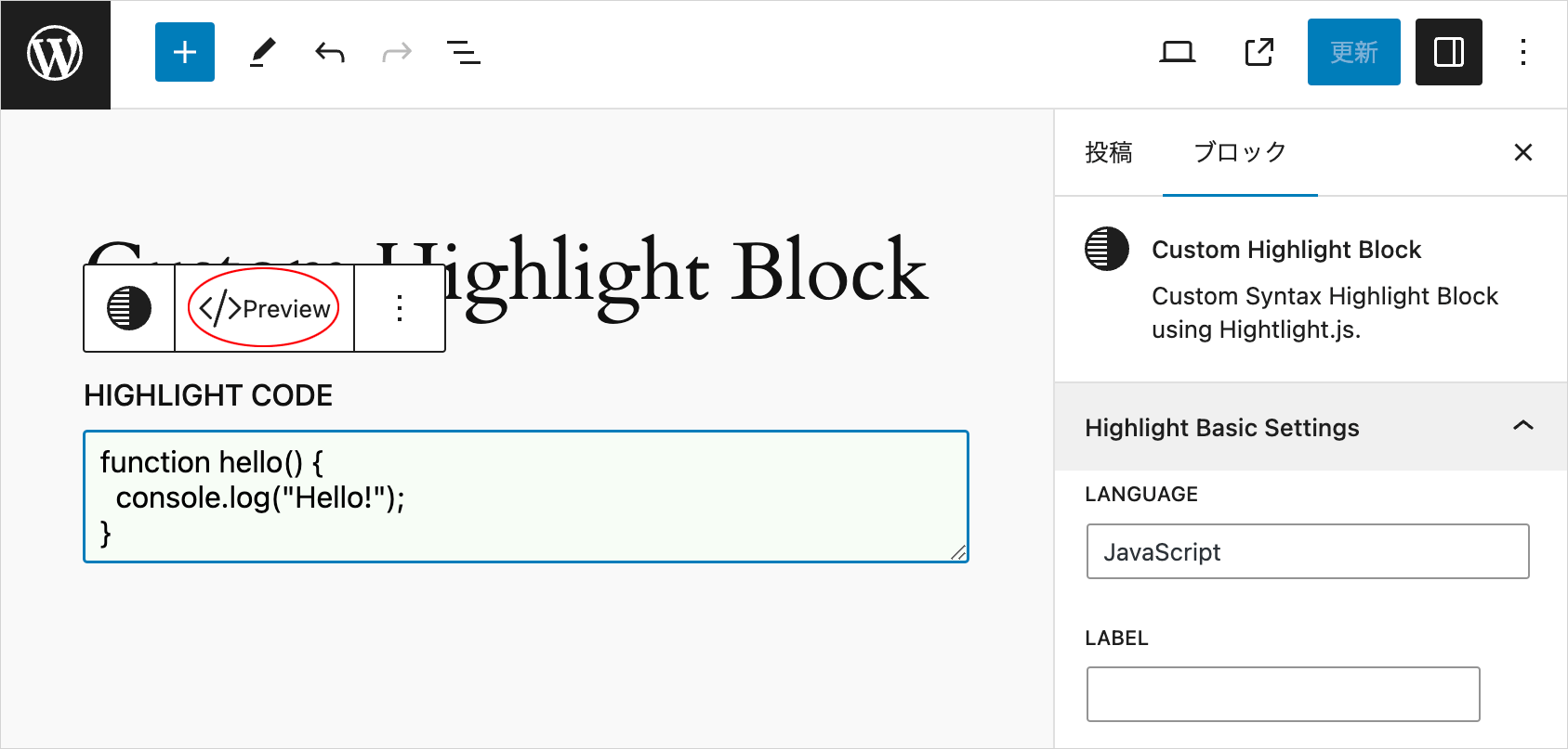
切り替えボタンをクリックすると、プレビュー表示に切り替わります。また、ボタンのラベルとインスペクタの表示も切り替わります(グレイアウトされます)。
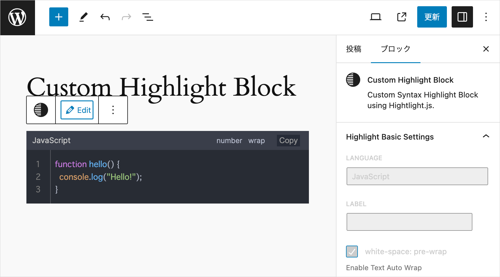
view.js と style.scss を使用する場合
ここまでは view.js と style.scss は使用しませんでしたが、これらのファイルを使用して構成することもできます。
view.js はブロックが表示されたときにフロントエンドで読み込まれ、style.scssはエディターとフロントエンドの両方で読み込まれます。
view.js では、フロントエンド用の JavaScript(highlight.min.js と custom.js)をまとめて読み込みます。
プラグインファイルで、エディター用の JavaScript(highlight.min.js と custom.js)を読み込みます。
style.scss では、CSS(highlight.min.css と custom.css)をまとめて読み込み、エディターとフロントエンドの両方に適用します。
この方法の場合、ビルド時にフロントエンド側のファイルはミニファイされるので、マニュアルでミニファイする必要がなく、また、ファイルをまとめるのでファイルの読み込みが減ります。
以下は view.js と style.scss を使用する場合の例です。
view.js
view.js に highlight.min.js と custom.js をまとめて記述します。
// highlight.min.js をコピーしてペースト
/*!
  Highlight.js v11.9.0 (git: b7ec4bfafc)
  (c) 2006-2023 undefined and other contributors
  License: BSD-3-Clause
*/
var hljs=function(){"use strict";function e(t){
return t instanceof Map?t.clear=t.delete=t.set=()=>{

・・・中略・・・

},{className:"number",begin:e.C_NUMBER_RE+"\\b",relevance:0},t,g,s],r=[...b]
;return r.pop(),r.push(i),l.contains=r,{name:"YAML",case_insensitive:!0,
aliases:["yml"],contains:b}}})();hljs.registerLanguage("yaml",e)})();

// custom.js をコピーしてペースト
document.addEventListener('DOMContentLoaded', () => {
  setupHighlightJs();
  setupToggleDetailsAnimation();
});

function setupHighlightJs() {
  const bodyClassList = document.body.classList;
  const wrapperSelector = 'div.hljs-wrap';
  let removeLineBrake = false;

・・・中略・・・

};
style.scss
style.scss に highlight.min.css と custom.css をまとめて記述します。
/* highlight.min.css(Highlight.js のテーマ CSS)をコピーしてペースト */
pre code.hljs{display:block;overflow-x:auto;padding:1em}code.hljs{padding:3px 5px}・・・中略・・・.hljs-strong{font-weight:700}.hljs-link{text-decoration:underline}

/* カスタマイズ用 CSS をコピーしてペースト */
.hljs-wrap {
  max-width: 780px;
  margin: 3rem 0;
  position: relative;
}

・・・中略・・・

details.code summary::before {
  content: "";
  position: absolute;
  top: 0;
  bottom: 0;
  left: 10px;
  margin: auto 0;
  width: 8px;
  height: 8px;
  border-top: 3px solid #097b27;
  border-right: 3px solid #097b27;
  transform: rotate(45deg);
}
.hljs-wrap .hljs-comment {
  color: #6b788f;
}
index.js
style.scss のインポートを追加します。
import { registerBlockType } from "@wordpress/blocks";
import './style.scss'; // 追加
import Edit from "./edit";
import save from "./save";
import metadata from "./block.json";

const highlightIcon = (
  <svg
    viewBox="0 0 16 16"
    xmlns="http://www.w3.org/2000/svg"
    aria-hidden="true"
    focusable="false"
    width="24"
    height="24"
  >
    <path d="M16 8A8 8 0 1 0 0 8a8 8 0 0 0 16 0m-8 5v1H4.5a.5.5 0 0 0-.093.009A7 7 0 0 1 3.1 13zm0-1H2.255a7 7 0 0 1-.581-1H8zm-6.71-2a7 7 0 0 1-.22-1H8v1zM1 8q0-.51.07-1H8v1zm.29-2q.155-.519.384-1H8v1zm.965-2q.377-.54.846-1H8v1zm2.137-2A6.97 6.97 0 0 1 8 1v1z"/>
  </svg>
);

registerBlockType(metadata.name, {
  icon: highlightIcon,
  edit: Edit,
  save,
});
block.json
"style": "file:./style-index.css", と "viewScript": "file:./view.js" の行を追加します。
{
  "$schema": "https://schemas.wp.org/trunk/block.json",
  "apiVersion": 3,
  "name": "wdl/custom-highlight-block",
  "version": "0.1.0",
  "title": "Custom Highlight Block",
  "category": "widgets",
  "description": "Custom Syntax Highlight Block using Hightlight.js.",
  "example": {},
  "attributes": {
    "codeText": {
      "type": "string",
      "default": "",
      "source": "text",
      "selector": "code"
    },
    "language": {
      "type": "string"
    },
    "wrap": {
      "type": "boolean"
    },
    "noLineNum": {
      "type": "boolean"
    },
    "showNoLang": {
      "type": "boolean"
    },
    "noCopyBtn": {
      "type": "boolean"
    },
    "noToolbar": {
      "type": "boolean"
    },
    "label": {
      "type": "string"
    },
    "labelUrl": {
      "type": "string"
    },
    "targetBlank": {
      "type": "boolean"
    },
    "lineHighlight": {
      "type": "string"
    },
    "lineNumStart": {
      "type": "string"
    },
    "setLang": {
      "type": "string"
    },
    "maxLines": {
      "type": "string"
    },
    "maxLinesOffset": {
      "type": "string"
    },
    "maxLinesScrollTo": {
      "type": "string"
    },
    "noScroll": {
      "type": "boolean"
    },
    "noScrollFooter": {
      "type": "boolean"
    },
    "scrollFooterText": {
      "type": "string"
    },
    "noLineInfo": {
      "type": "boolean"
    },
    "copyNoPrompt": {
      "type": "boolean"
    },
    "copyNoSlComments": {
      "type": "boolean"
    },
    "copyNoMlComments": {
      "type": "boolean"
    },
    "copyNoHTMLComments": {
      "type": "boolean"
    },
    "toggleCode": {
      "type": "boolean"
    },
    "accordionOpenBtnLabel": {
      "type": "string"
    },
    "accordionCloseBtnLabel": {
      "type": "string"
    }
  },
  "supports": {
    "html": false
  },
  "textdomain": "custom-highlight-block",
  "editorScript": "file:./index.js",
  "editorStyle": "file:./index.css",
  "style": "file:./style-index.css",
  "viewScript": "file:./view.js"
}
プラグインファイル
プラグインファイル custom-highlight-block.php では、管理画面(エディター)の場合にのみ、Highlight.js の highlight.min.js と custom.js を読み込みます。
<?php

/**
* Plugin Name:       Custom Highlight Block
* Description:       Custom Syntax Highlight Block using Hightlight.js.
* Requires at least: 6.1
* Requires PHP:      7.0
* Version:           0.1.0
* Author:            WebDesignLeaves
* License:           GPL-2.0-or-later
* License URI:       https://www.gnu.org/licenses/gpl-2.0.html
* Text Domain:       custom-highlight-block
*
* @package           wdl
*/

if (!defined('ABSPATH')) {
  exit;
}

function add_wdl_custom_code_block_scripts_and_styles() {
  $dir = dirname(__FILE__);

  // 管理画面(エディター)の場合にのみ JavaScript ファイルをエンキュー
  if(is_admin()) {
    wp_enqueue_script(
      'highlight-js',
      plugins_url('/highlight-js/highlight.min.js', __FILE__),
      array(),
      filemtime("$dir/highlight-js/highlight.min.js"),
      true
    );
    wp_enqueue_script(
      'custom-js',
      plugins_url('/highlight-js/custom.js', __FILE__),
      array('highlight-js'),
      filemtime("$dir/highlight-js/custom.js"),
      true
    );
  }
}
add_action('enqueue_block_assets', 'add_wdl_custom_code_block_scripts_and_styles');

function custom_highlight_block_custom_highlight_block_block_init() {
  register_block_type(__DIR__ . '/build');
}
add_action('init', 'custom_highlight_block_custom_highlight_block_block_init');
edit.js と save.js に変更はありません。
これでファイルを保存してコンパイルすれば、view.js と style.scss を使用した構成になります。
クリーンアップ
不要なコードやファイルを削除します。
view.js と style.scss を使用しない場合は、index.js の style.scss の import や block.json の style と viewScript の行は削除し、view.js と style.scss のファイルを削除することができます。
view.js と style.scss を使用する構成の場合は、highlight-js フォルダの CSS(custom.css、highlight.min.css)を削除することができます。JavaScript は残しておきます。
後でわかりにくくなければ、ファイルを残しておいても問題ありません。
ビルド
すべてのファイルを保存して問題がなければ、control + c を押して npm start コマンドを終了し、npm run build を実行して、本番環境用にビルドします。
plugin-zip
npm run plugin-zip を実行して、プラグインの zip ファイルを作成することができますが、デフォルトではプラグインファイルと readme.txt、及び build ディレクトリのファイルが zip ファイルに含まれます。
zip ファイルに highlight-js フォルダに配置した JavaScript や CSS などを含めるには、package.json の files フィールドに zip ファイルに含めるファイルやディレクトリを指定します。
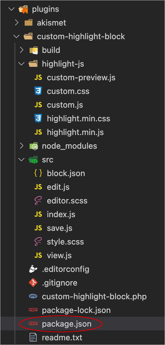
以下は、package.json にfiles フィールドを追加して、生成される zip ファイルに highlight-js フォルダ内のファイルと src フォルダのファイルを含めるようにする例です。
{
  "name": "custom-highlight-block",
  "version": "0.1.0",
  "description": "Example block scaffolded with Create Block tool.",
  "author": "The WordPress Contributors",
  "license": "GPL-2.0-or-later",
  "main": "build/index.js",
  "scripts": {
    "build": "wp-scripts build",
    "format": "wp-scripts format",
    "lint:css": "wp-scripts lint-style",
    "lint:js": "wp-scripts lint-js",
    "packages-update": "wp-scripts packages-update",
    "plugin-zip": "wp-scripts plugin-zip",
    "start": "wp-scripts start"
  },
  "files": [ "highlight-js", "build", "src", "custom-highlight-block.php" ],
  "devDependencies": {
    "@wordpress/scripts": "^27.5.0"
  }
}
上記の場合、例えば、以下のような実行結果になります(view.js と style.scss を使用する構成で、CSS ファイルも残している場合)。
バグ
行数を指定して表示するオプション(Max Lines)を指定してアコーディオンパネルで表示すると、Google Chrome 以外の Firefox や Safari(iOS) などでは、行番号横の枠線が表示されません。
プラグインを無効化・削除した場合
プラグインを無効化すると、ハイライト表示はされなくなりますが、save() 関数で保存したマークアップが残ります。例えば、以下のようなコードが入力されて保存されている場合、
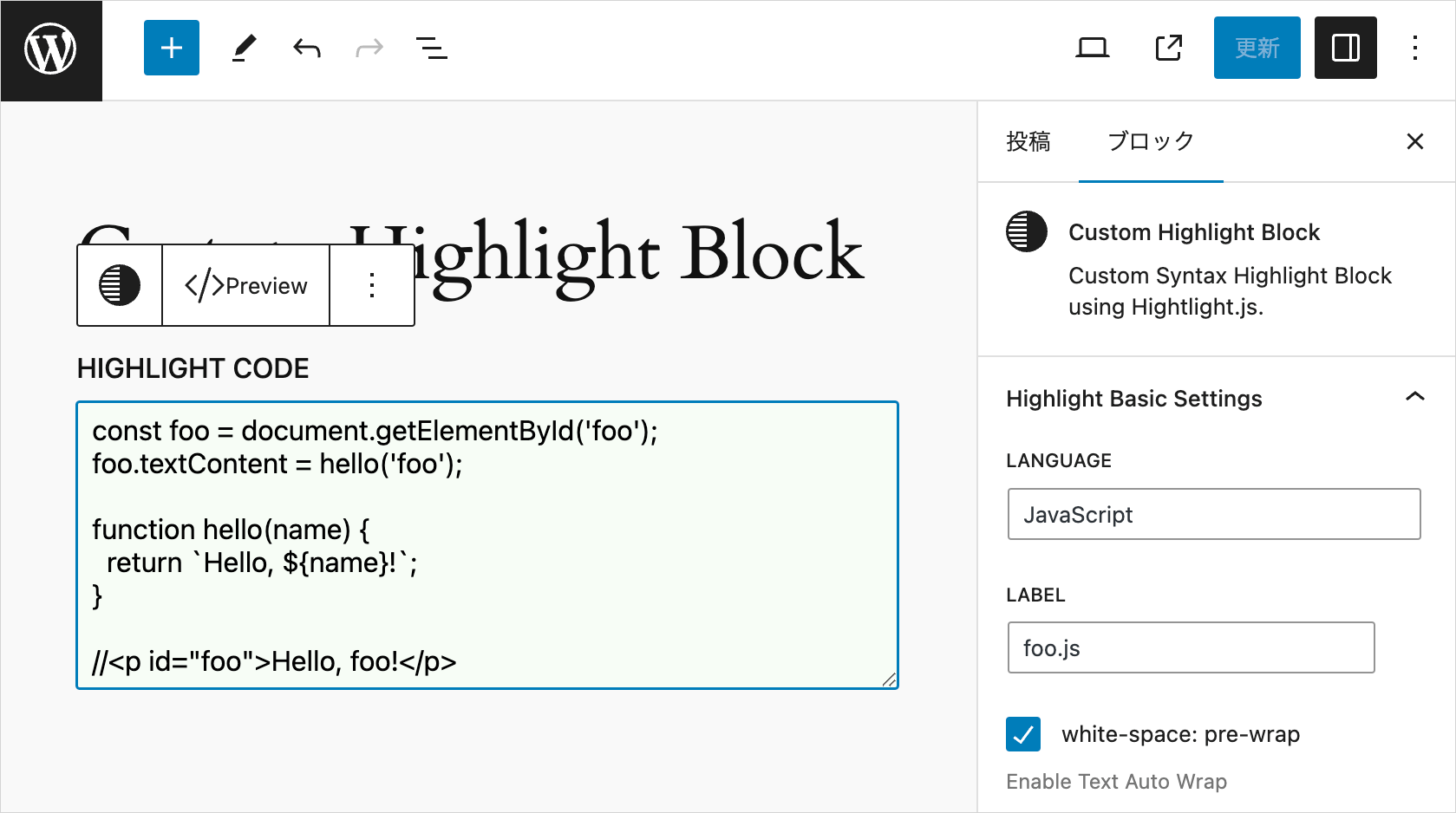
コードエディターで確認すると、以下のようなマークアップになっています。
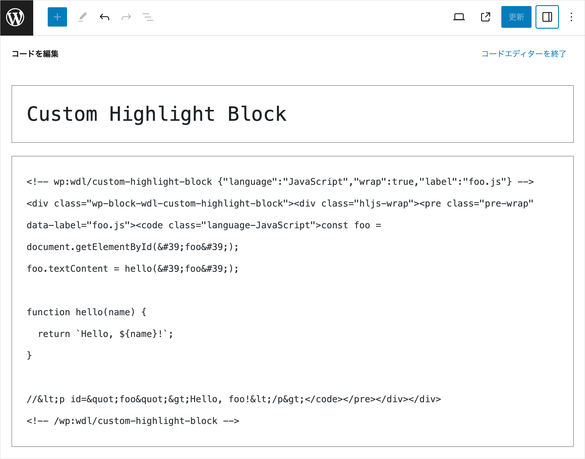
コメントタグに囲まれた以下のようなマークアップ部分が保存されます。
save() 関数で useBlockProps.save() を指定した div 要素(.wp-block-wdl-custom-highlight-block)でラップされ、オプションで指定したクラスや data-* 属性が pre 要素や code 要素に追加され、入力内容がエスケープされてテキストコンテンツになっています。
<div class="wp-block-wdl-custom-highlight-block"><div class="hljs-wrap"><pre class="pre-wrap" data-label="foo.js"><code class="language-JavaScript">const foo = document.getElementById('foo');
foo.textContent = hello('foo');
function hello(name) {
return `Hello, ${name}!`;
}
//<p id="foo">Hello, foo!</p></code></pre></div></div>プラグインを無効化(※または削除)すると、以下のように表示されます。
[注意]※ プラグインを削除すると、作成したプラグインフォルダとその中身がすべて削除され、戻すことはできないので注意が必要です(開発中のファイルが全てなくなります)。
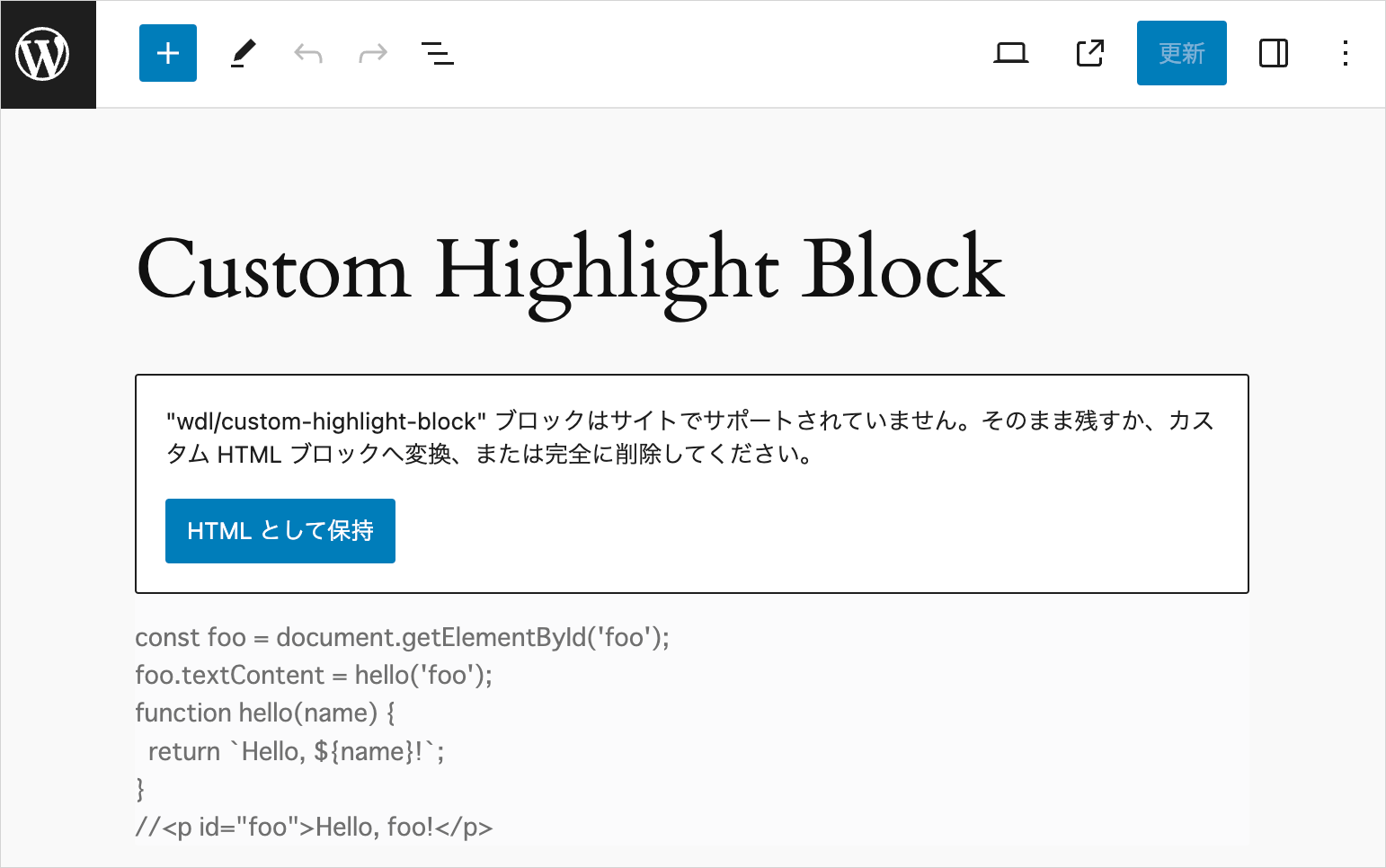
「HTMLとして保存」をクリックすると、以下のように前述のマークアップがカスタム HTML ブロックに変換されます。
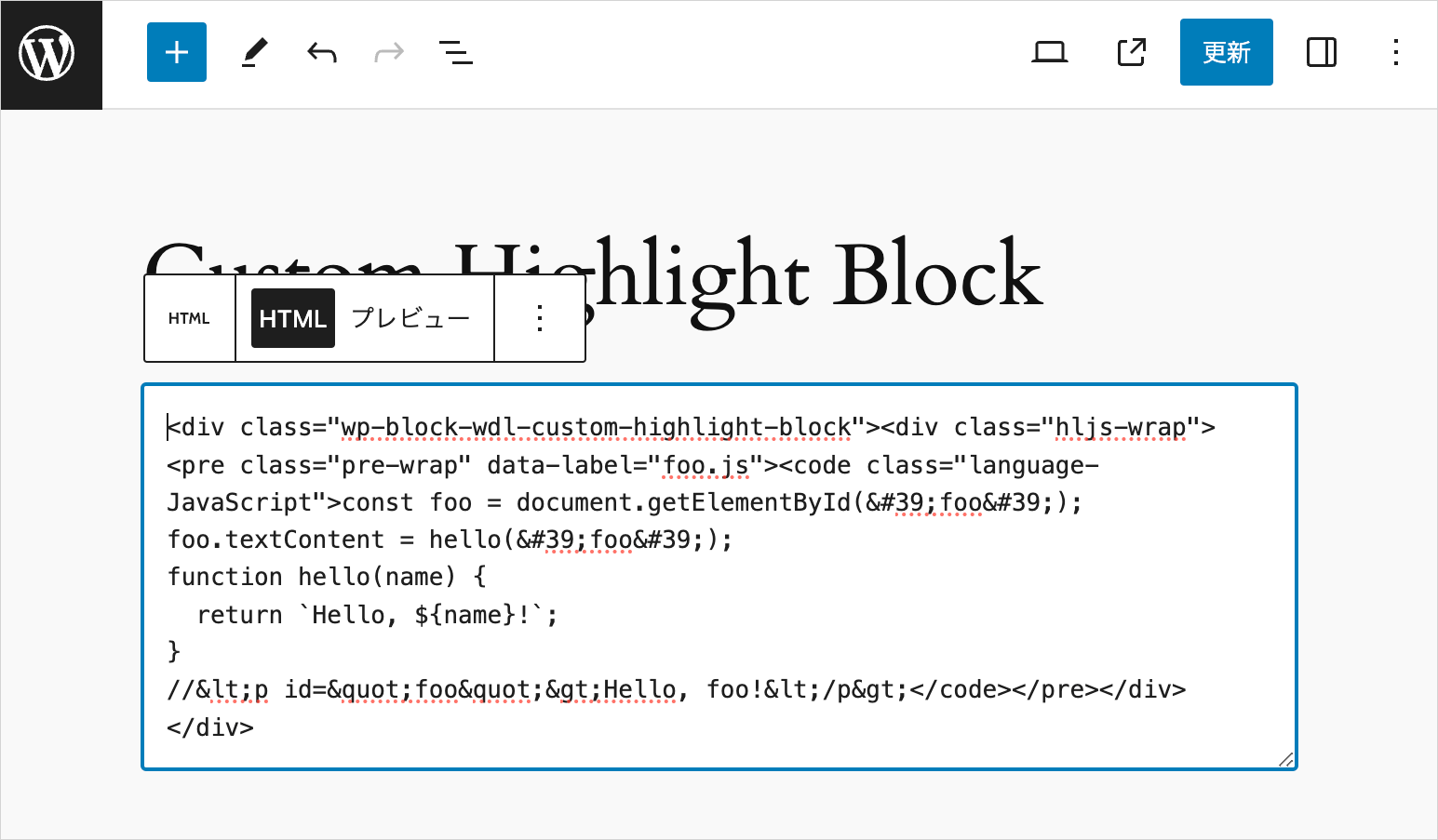
save() 関数の変更
save() 関数を変更して return ステートメント内に変更が発生すると、妥当性検証プロセスにより、ブロックでバリデーションエラーが発生します。
例えば、以下のように return ステートメントにクラス属性を追加しただけでも、全てのブロックでバリデーションエラーが発生します。
export default function save({ attributes }) {
  ・・・中略・・・
  return (
    <>
    ・・・中略・・・
      {!attributes.toggleCode && (
        <div {...useBlockProps.save()}>
          { /* div 要素のクラス属性に foo を追加 */ }
          <div className={ attributes.noToolbar ? "hljs-wrap no-toolbar" : "hljs-wrap foo" }>
            <pre {...preAttributes}>
              <code {...codeAttributes}>{escapedCodeText}</code>
            </pre>
          </div>
        </div>
      )}
    </>
  );
}
エディターでは全てのブロックで以下のようなエラーが表示されます。この例の場合、フロントエンド側は特にエラーはなく、今まで通りの表示になります。
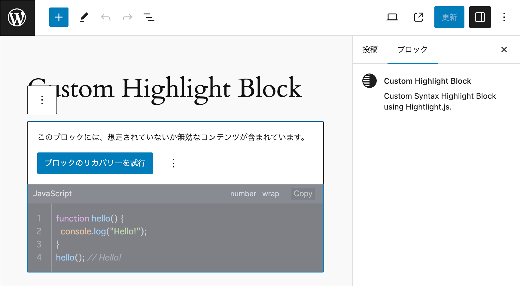
「ブロックのリカバリーを試行」をクリックすればエラーはなくなりますが、全てのブロックでその操作を行うのは大変です。
このような場合は、非推奨(deprecated)バージョンを用意して、バリデーションエラーを回避することができます。
詳細:ブロックの非推奨プロセス
クラス名の変更
必要に応じて、出力されるマークアップのクラス名を変更することもできます。
但し、すでに作成されたブロックがある場合は、クラス名を変更すると妥当性検証プロセスにより、ブロックでバリデーションエラーが発生するので、前述の save() 関数の変更と同様の対応が必要になります。
ラッパーの div 要素に出力されるクラスを変更
ラッパー要素に出力されるクラス名は hljs-wrap ですが、これを変更するには以下を変更します。
| ファイル | 変更箇所 |
|---|---|
| custom.js と view.js | wrapperClassName の値(hljs-wrap)を変更 |
| edit.js と save.js | wrapperClassList の値(hljs-wrap)を変更 |
| style.css と custom.css | .hljs-wrap を変更するクラス名に変更(それぞれ1箇所) |
ラッパーに出力されるアコーディオン用のクラスを変更
アコーディオンパネルで表示する場合、ラッパー要素には hljs-wrap に加えて toggle-accordion というクラスも出力されますが、これを変更するには以下を変更します。
| ファイル | 変更箇所 |
|---|---|
| custom.js と view.js | accordionClassName の値(toggle-accordion)を変更 |
| edit.js と save.js | wrapperClassList += " toggle-accordion "; の toggle-accordion を変更 |
アコーディオンパネルを JS で追加
以下は、これまでに作成した save.js と edit.js 及び editor.scss を部分的に変更して、アコーディオンパネルを JavaScript で追加するように書き換える例です。
以下を行うメリットはありませんが、個人的な覚書として掲載しています。
[注意]
もし、すでにアコーディオンパネルで表示しているコードがある場合は、以下の変更を行うと、妥当性検証プロセスによりブロックでバリデーションエラーが発生します。その場合は、それぞれのブロックで「ブロックのリカバリーを試行」をクリックすればエラーは消えます。
JavaScript で後からコード部分を非表示にするため、アコーディオンパネルのコードを初回表示する際や再読み込みをした際にチラツキが発生します。
また、プラグインを無効化や削除した場合は、JavaScript により追加されたアコーディオンパネルのマークアップは残りません(WordPress のデータベースには保存されません)。
以下は、カスタマイズ用 JavaScript(custom.js)に記述されているアコーディオンパネルを追加する関数 myAddAccordionPanel() の呼び出しと定義部分の抜粋です。
myAddAccordionPanel() は、第1引数で指定された toggle-accordion クラスを持つ要素にアコーディオンパネルのマークアップを追加します(15-18行目)。第2引数が指定された場合は、その要素のみにアコーディオンパネルのマークアップを追加します(21行目)。
そしてその要素が data-open-text 属性や data-close-text 属性の値を持っていれば、それらを開閉ボタンのラベルに設定します(30-35行目)。
// 開閉パネルを追加する関数の呼び出し(フロントエンド側)
myAddAccordionPanel(myCustomHighlightJsSettings.accordionClassName);  // 引数の myCustomHighlightJsSettings.accordionClassName は 'toggle-accordion'(クラス名)

// 開閉パネル(アコーディオンパネル)を指定されたクラスを持つ要素(または第2引数で渡された単一の要素)に追加する関数
function myAddAccordionPanel(targetClassName, elem = null) {
  // details 要素に付与するクラス
  const detailsClass = 'toggle-code-animation';
  // details 要素内のコンテンツを格納する div 要素に付与するクラス
  const detailsContentClass = 'details-content';
  // details 要素内のコンテンツを格納する要素のラッパーに付与するクラス
  const detailsContentWrapperClass = 'details-content-wrapper';
  // 第2引数の elem が指定されていなければ、第1引数のクラス名を使って要素を取得してパネルを追加
  if(!elem) {
    // パネルを追加する要素を取得
    const targetElems = document.getElementsByClassName(targetClassName);
    for (const elem of targetElems) {
      addPanel(elem);
    }
  }else{
    // 第2引数の elem が指定されていれば、その要素にパネルを追加
    addPanel(elem);
  }
  // アコーディオンパネルを受け取った要素に追加する関数
  function addPanel(elem) {
    // アコーディオンパネルを開くボタンのテキスト
    let summaryOpenText = "Open";
    // アコーディオンパネルを閉じるボタンのテキスト
    let summaryCloseText = "Close";
    if (elem) {
      if(elem.hasAttribute('data-open-text')) {
        summaryOpenText = elem.getAttribute('data-open-text');
      }
      if(elem.hasAttribute('data-close-text')) {
        summaryCloseText = elem.getAttribute('data-close-text');
      }
      // details 要素を作成
      const detailsElem = document.createElement('details');
      detailsElem.classList.add(detailsClass);
      // 作成した details 要素の HTML(summary 要素と div 要素)を設定
      detailsElem.innerHTML = `<summary data-close-text="${summaryCloseText}">${summaryOpenText}</summary>
  <div class="${detailsContentWrapperClass}">
    <div class="${detailsContentClass}"></div>
  </div>`;
      // コードブロックのラッパー要素を details 要素でラップする
      elem.insertAdjacentElement('beforebegin', detailsElem);
      detailsElem.querySelector('.' + detailsContentClass).appendChild(elem);
    }
  }
}
npm start を実行して開発を開始します。
save.js
save.js では、attributes の toggleCode が true の場合は、ラッパー要素に toggle-accordion クラスを追加し、accordionOpenBtnLabel や accordionCloseBtnLabel が指定されていれば、それらの値をラッパー要素の data-open-text と data-close-text 属性にに設定して開閉ボタンのテキストとします。
そのため、ラッパー要素に設定する属性 wrapperAttributes の作成の記述を追加します。
// ラッパー要素(div.hljs-wrap)に設定する属性のオブジェクト
const wrapperAttributes = {};

// ラッパー要素に設定するクラス属性
let wrapperClassList = "hljs-wrap";
if(attributes.noToolbar) {
  wrapperClassList += " no-toolbar";
}
if(attributes.toggleCode) {
  wrapperClassList += " toggle-accordion ";
}

// ラッパー要素に クラスを追加
if(wrapperClassList) wrapperAttributes.className = wrapperClassList;

// attributes の値により、ラッパー要素に data-* 属性を追加
if (attributes.accordionOpenBtnLabel) wrapperAttributes["data-open-text"] = attributes.accordionOpenBtnLabel;
if (attributes.accordionCloseBtnLabel) wrapperAttributes["data-close-text"] = attributes.accordionCloseBtnLabel;
そして return 文ではアコーディオンパネルで表示するマークアップは不要になるので削除し、ラッパー要素(3行目) に上記で作成した属性のオブジェクトを展開します。
return (
  <div {...useBlockProps.save()}>
    <div { ...wrapperAttributes }>
      <pre {...preAttributes}>
        <code {...codeAttributes}>{escapedCodeText}</code>
      </pre>
    </div>
  </div>
);
変更後の save.js は以下のようになります。
import { useBlockProps } from "@wordpress/block-editor";
export default function save({ attributes }) {
// pre 要素に設定する属性のオブジェクト
const preAttributes = {};
// attributes の値により、pre 要素に設定するクラス属性を作成
let preClassList = attributes.wrap ? "pre-wrap" : "pre";
preClassList += attributes.noLineNum ? " no-line-num" : "";
preClassList += attributes.noCopyBtn ? " no-copy-btn" : "";
preClassList += attributes.targetBlank ? " target-blank" : "";
preClassList += attributes.noScroll ? " no-scroll" : "";
preClassList += attributes.noScrollFooter ? " no-scroll-footer" : "";
preClassList += attributes.noLineInfo ? " no-line-info" : "";
preClassList += attributes.copyNoPrompt ? " copy-no-prompt" : "";
preClassList += attributes.copyNoSlComments ? " copy-no-sl-comments" : "";
preClassList += attributes.copyNoMlComments ? " copy-no-ml-comments" : "";
preClassList += attributes.copyNoHTMLComments ? " copy-no-html-comments" : "";
// pre 要素に クラスを追加
preAttributes.className = preClassList;
// attributes の値により、pre 要素に data-* 属性を追加
if (attributes.label) preAttributes["data-label"] = attributes.label;
if (attributes.labelUrl) preAttributes["data-label-url"] = attributes.labelUrl;
if (attributes.lineHighlight) preAttributes["data-line-highlight"] = attributes.lineHighlight;
if (attributes.lineNumStart) preAttributes["data-line-num-start"] = attributes.lineNumStart;
if (attributes.maxLines) preAttributes["data-max-lines"] = attributes.maxLines;
if (attributes.maxLinesScrollTo) preAttributes["data-scroll-to"] = attributes.maxLinesScrollTo;
if (attributes.scrollFooterText) preAttributes["data-footer-text"] = attributes.scrollFooterText;
// code 要素に設定する属性のオブジェクト
const codeAttributes = {};
// code 要素に設定するクラス属性
let codeClassList;
if(attributes.language) codeClassList = `language-${attributes.language}`;
if (codeClassList) {
codeClassList += attributes.showNoLang ? " show-no-lang" : "";
} else {
codeClassList = attributes.showNoLang ? "show-no-lang" : "";
}
// code 要素に クラスを追加
if(codeClassList) codeAttributes.className = codeClassList;
// code 要素に設定する data-* 属性
if (attributes.setLang) codeAttributes["data-set-lang"] = attributes.setLang;
// ラッパー要素(div.hljs-wrap)に設定する属性のオブジェクト
const wrapperAttributes = {};
// ラッパー要素に設定するクラス属性
let wrapperClassList = "hljs-wrap";
if(attributes.noToolbar) {
wrapperClassList += " no-toolbar";
}
if(attributes.toggleCode) {
wrapperClassList += " toggle-accordion ";
}
// ラッパー要素に クラスを追加
if(wrapperClassList) wrapperAttributes.className = wrapperClassList;
// attributes の値により、ラッパー要素に data-* 属性を追加
if (attributes.accordionOpenBtnLabel) wrapperAttributes["data-open-text"] = attributes.accordionOpenBtnLabel;
if (attributes.accordionCloseBtnLabel) wrapperAttributes["data-close-text"] = attributes.accordionCloseBtnLabel;
// テキストエリアに入力されたコードのテキストをエスケープ
const escapedCodeText = attributes.codeText.replace(/[<>&'"]/g, (match) => {
const specialChars = {
"<": "<",
">": ">",
"&": "&",
"'": "'",
'"': """,
};
return specialChars[match];
});
// 出力するマークアップの JSX を return
return (
<div {...useBlockProps.save()}>
<div { ...wrapperAttributes }>
<pre {...preAttributes}>
<code {...codeAttributes}>{escapedCodeText}</code>
</pre>
</div>
</div>
);
}edit.js
edit.js を編集します。
アコーディオンパネル(details 要素と summary 要素のマークアップ)は JavaScript で追加するため、以下4行目の codeDetailsRef は不要になるので削除します。
 // ref を宣言してcode 要素の祖先の div.hljs-wrap に指定
const codeWrapperRef = useRef(null);
// ref を宣言してアコーディオンパネルの details 要素に指定
const codeDetailsRef = useRef(null); // この行を削除
useEffect() を以下のように書き換えます。
アコーディオンパネルで表示する(attributes.toggleCode が true)場合はラッパー要素にパネルを追加するため、myAddAccordionPanel の第2引数にラッパー要素の ref を渡して呼び出します (9行目)。
パネルを追加したラッパー要素から最も近い祖先の details 要素を closest('details') で取得して、アニメーションの関数 mySetupToggleDetailsAnimation に渡します。
useEffect(() => {
  // プレビューモードであれば
  if (!attributes.isEditMode) {
    // Highlight.js の初期化とカスタマイズの適用(codeWrapperRef.current は div.hljs-wrap)
    mySetupHighlightJs(myCustomHighlightJsSettings, codeWrapperRef.current);
    // アコーディオンパネルで表示する場合は更に以下の関数を適用
    if(attributes.toggleCode) {
      // パネルを追加する関数の呼び出しを追加(ラッパー要素にパネルを追加)
      myAddAccordionPanel('', codeWrapperRef.current);
      // パネルを追加したラッパー要素からパネルの details 要素を参照(取得)
      const detailsElem = codeWrapperRef.current.closest('details');
      // アコーディオンパネルアニメーションを設定(detailsElem は上記で取得した details 要素)
      mySetupToggleDetailsAnimation(detailsElem);
    }
  }
}, [attributes.isEditMode]);
save.js 同様、ラッパー要素に追加する属性を作成します(save.js に追加した内容と同じです)。
attributes の toggleCode が true の場合はラッパー要素に toggle-accordion クラスを追加し、accordionOpenBtnLabel や accordionCloseBtnLabel が指定されている場合は、それらの値を data-* 属性に指定して追加します。
// ラッパー要素(div.hljs-wrap)に設定する属性のオブジェクト
const wrapperAttributes = {};

// ラッパー要素に設定するクラス属性
let wrapperClassList = "hljs-wrap";
if(attributes.noToolbar) {
  wrapperClassList += " no-toolbar";
}
if(attributes.toggleCode) {
  wrapperClassList += " toggle-accordion ";
}

// ラッパー要素に クラスを追加
if(wrapperClassList) wrapperAttributes.className = wrapperClassList;


// attributes の値により、ラッパー要素に data-* 属性を追加
if (attributes.accordionOpenBtnLabel) wrapperAttributes["data-open-text"] = attributes.accordionOpenBtnLabel;
if (attributes.accordionCloseBtnLabel) wrapperAttributes["data-close-text"] = attributes.accordionCloseBtnLabel;
return 文のプレビューモードの出力ではアコーディオンパネルで表示する部分は不要になりますが、ラッパー要素に上記で作成した属性のオブジェクト(wrapperAttributes)を展開します(20行目)。
return [
  getToolbarControls(),
  getInspectorControls(),
  <>
    {attributes.isEditMode && (  // 編集モード
      <div {...useBlockProps()}>
        <TextareaControl
          label={__("Highlight Code", "custom-highlight-block")}
          value={attributes.codeText}
          onChange={(value) => setAttributes({ codeText: value })}
          rows={codeTextRows}
          placeholder={__("Write your code...", "custom-highlight-block")}
          hideLabelFromVision={isSelected ? false : true}
          className="textarea-control"
        />
      </div>
    )}
    {!attributes.isEditMode && (  // プレビューモード
      <div {...useBlockProps()}>
        <div { ...wrapperAttributes } ref={codeWrapperRef}>
          <pre {...preAttributes}>
            <code {...codeAttributes}>{attributes.codeText}</code>
          </pre>
        </div>
      </div>
    )}
  </>,
];
変更後の edit.js は以下のようになります。
import { __ } from "@wordpress/i18n";
// BlockControls を追加
import { useBlockProps, InspectorControls, BlockControls } from "@wordpress/block-editor";
// ToolbarGroup, ToolbarButton を追加
import { TextareaControl, PanelBody, TextControl, PanelRow, CheckboxControl, ToolbarGroup, ToolbarButton } from "@wordpress/components";
import "./editor.scss";
// useEffect, useRef を追加
import { useEffect, useRef } from "@wordpress/element";
// useDisabled を追加
import { useDisabled } from "@wordpress/compose";

export default function Edit({ attributes, setAttributes, isSelected }) {
  // useDisabled フック
  const disabledRef = useDisabled();
  // インスペクタの各要素のラッパーの div 要素へ設定する属性
  const inspectorDivAttributes = {};
  inspectorDivAttributes.className = 'inspectorDiv';
  if (!attributes.isEditMode) {
    // プレビューモードではインスペクタへの入力を disalbed に(ref 属性に disabledRef を指定)
    inspectorDivAttributes.ref = disabledRef;
  }

  const codeTextRowCount = attributes.codeText.split(/\r|\r\n|\n/).length;
  const codeTextRows = codeTextRowCount > 3 ? codeTextRowCount : 3;

  // インスペクターを出力する関数
  const getInspectorControls = () => {
    return (
      <InspectorControls>
        <PanelBody title={__("Highlight Basic Settings", "custom-highlight-block")}>
        <div {...inspectorDivAttributes}>
          <PanelRow>
            <TextControl
              label={__("Language", "custom-highlight-block")}
              value={attributes.language}
              onChange={(value) => setAttributes({ language: value })}
              className="lang-name"
            />
          </PanelRow>
          <PanelRow>
            <TextControl
              label={__("Label", "custom-highlight-block")}
              value={attributes.label}
              onChange={(value) => setAttributes({ label: value })}
              className="label-name"
            />
          </PanelRow>
          <PanelRow>
            <CheckboxControl
              label={__("white-space: pre-wrap", "custom-highlight-block")}
              checked={attributes.wrap}
              onChange={(val) => setAttributes({ wrap: val })}
              help={__("Enable Text Auto Wrap", "custom-highlight-block")}
            />
          </PanelRow>
          <PanelRow>
            <CheckboxControl
              label={__("No Line Number", "custom-highlight-block")}
              checked={attributes.noLineNum}
              onChange={(val) => setAttributes({ noLineNum: val })}
              help={__("Hide Line Number", "custom-highlight-block")}
            />
          </PanelRow>
          <PanelRow>
            <CheckboxControl
              label={__("No Language Name", "custom-highlight-block")}
              checked={attributes.showNoLang}
              onChange={(val) => setAttributes({ showNoLang: val })}
              help={__("Hide Language Name", "custom-highlight-block")}
            />
          </PanelRow>
          <PanelRow>
            <CheckboxControl
              label={__("No Copy Button", "custom-highlight-block")}
              checked={attributes.noCopyBtn}
              onChange={(val) => setAttributes({ noCopyBtn: val })}
              help={__("Do Not Show Copy Button", "custom-highlight-block")}
            />
          </PanelRow>
          <PanelRow>
            <CheckboxControl
              label={__("No Toolbar", "custom-highlight-block")}
              checked={attributes.noToolbar}
              onChange={(val) => setAttributes({ noToolbar: val })}
              help={__("Hide Toolbar", "custom-highlight-block")}
            />
          </PanelRow>
          <PanelRow>
            <TextControl
              label={__("Line Highlight", "custom-highlight-block")}
              value={attributes.lineHighlight}
              onChange={(value) => setAttributes({ lineHighlight: value })}
              className="line-highlight"
              placeholder={__("e.g. 1, 3-5", "custom-highlight-block")}
            />
          </PanelRow>
          <PanelRow>
            <TextControl
              label={__("Start Line Number", "custom-highlight-block")}
              value={attributes.lineNumStart}
              onChange={(value) => setAttributes({ lineNumStart: value })}
              className="line-num-start"
            />
          </PanelRow>
          <PanelRow>
            <TextControl
              label={__("Override Language Text", "custom-highlight-block")}
              value={attributes.setLang}
              onChange={(value) => setAttributes({ setLang: value })}
              className="set-lang"
              placeholder={__("Language Text", "custom-highlight-block")}
            />
          </PanelRow>
          <PanelRow>
            <PanelBody
              title={__("LABEL Option", "custom-highlight-block")}
              initialOpen={attributes.labelUrl ? true : false}
            >
              <PanelRow>
                <TextControl
                  label={__("Label URL", "custom-highlight-block")}
                  value={attributes.labelUrl}
                  onChange={(value) => setAttributes({ labelUrl: value })}
                  className="label-url"
                />
              </PanelRow>
              <PanelRow>
                <CheckboxControl
                  label={__("target=_blank", "custom-highlight-block")}
                  checked={attributes.targetBlank}
                  onChange={(val) => setAttributes({ targetBlank: val })}
                  help={__("target attribute", "custom-highlight-block")}
                />
              </PanelRow>
            </PanelBody>
          </PanelRow>
          <PanelRow>
            <PanelBody
              title={__("Max Lines", "custom-highlight-block")}
              initialOpen={attributes.maxLines ? true : false}
            >
              <PanelRow>
                <TextControl
                  label={__("Set Max Lines", "custom-highlight-block")}
                  value={attributes.maxLines}
                  onChange={(value) => setAttributes({ maxLines: value })}
                  className="max-lines"
                  placeholder={__( "specify max number of lines", "custom-highlight-block" )}
                />
              </PanelRow>
              <PanelRow>
                <TextControl
                  label={__("Max Lines Offset (px)", "custom-highlight-block")}
                  value={attributes.maxLinesOffset}
                  onChange={(value) => setAttributes({ maxLinesOffset: value })}
                  className="max-lines-offset"
                  placeholder={__("offset height (pixel)", "custom-highlight-block")}
                />
              </PanelRow>
              <PanelRow>
                <TextControl
                  label={__("Scroll To Line Number", "custom-highlight-block")}
                  value={attributes.maxLinesScrollTo}
                  onChange={(value) => setAttributes({ maxLinesScrollTo: value })}
                  className="max-lines-scroll-to"
                />
              </PanelRow>
              <PanelRow>
                <CheckboxControl
                  label={__("No Scroll", "custom-highlight-block")}
                  checked={attributes.noScroll}
                  onChange={(val) => setAttributes({ noScroll: val })}
                  help={__("Make visible area fixed vertically", "custom-highlight-block")}
                />
              </PanelRow>
              <PanelRow>
                <CheckboxControl
                  label={__("No Scroll Footer", "custom-highlight-block")}
                  checked={attributes.noScrollFooter}
                  onChange={(val) => setAttributes({ noScrollFooter: val })}
                  help={__("Do not show scroll footer (information bar)", "custom-highlight-block")}
                />
              </PanelRow>
              <PanelRow>
                <CheckboxControl
                  label={__("No Line info on Scroll Footer", "custom-highlight-block")}
                  checked={attributes.noLineInfo}
                  onChange={(val) => setAttributes({ noLineInfo: val })}
                  help={__("Do not show line numbers on scroll footer (information bar)", "custom-highlight-block")}
                />
              </PanelRow>
              <PanelRow>
                <TextControl
                  label={__("Scroll Footer Text", "custom-highlight-block")}
                  value={attributes.scrollFooterText}
                  onChange={(value) => setAttributes({ scrollFooterText: value })}
                  className="scroll-footer-text"
                  placeholder={__("default: scrollable", "custom-highlight-block")}
                  help={__("Text indicate that content is scrollable. Enter space for icon only.", "custom-highlight-block")}
                />
              </PanelRow>
            </PanelBody>
          </PanelRow>
          <PanelRow>
            <PanelBody
              title={__("Copy Option", "custom-highlight-block")}
              initialOpen={
                attributes.copyNoPrompt ||
                attributes.copyNoSlComments ||
                attributes.copyNoMlComments ||
                attributes.copyNoHTMLComments
                  ? true
                  : false
              }
            >
              <PanelRow>
                <CheckboxControl
                  label={__("No Prompt", "custom-highlight-block")}
                  checked={attributes.copyNoPrompt}
                  onChange={(val) => setAttributes({ copyNoPrompt: val })}
                  help={__("Exclude prompt ($, %)", "custom-highlight-block")}
                />
              </PanelRow>
              <PanelRow>
                <CheckboxControl
                  label={__("No Single-Line Comments", "custom-highlight-block")}
                  checked={attributes.copyNoSlComments}
                  onChange={(val) => setAttributes({ copyNoSlComments: val })}
                  help={__("Exclude Single Line Comments", "custom-highlight-block")}
                />
              </PanelRow>
              <PanelRow>
                <CheckboxControl
                  label={__("No Multi-Line Comments", "custom-highlight-block")}
                  checked={attributes.copyNoMlComments}
                  onChange={(val) => setAttributes({ copyNoMlComments: val })}
                  help={__("Exclude Single Line Comments", "custom-highlight-block")}
                />
              </PanelRow>
              <PanelRow>
                <CheckboxControl
                  label={__("No HTML Comments", "custom-highlight-block")}
                  checked={attributes.copyNoHTMLComments}
                  onChange={(val) => setAttributes({ copyNoHTMLComments: val })}
                  help={__("Exclude HTML Comments", "custom-highlight-block")}
                />
              </PanelRow>
            </PanelBody>
          </PanelRow>
          <PanelRow>
            <PanelBody
              title={__("Toggle Code Accordion", "custom-highlight-block")}
              initialOpen={attributes.toggleCode ? true : false}
            >
              <PanelRow>
                <CheckboxControl
                  label={__("Toggle Code", "custom-highlight-block")}
                  checked={attributes.toggleCode}
                  onChange={(val) => setAttributes({ toggleCode: val })}
                  help={__("Toggle (Show/Hide) Code ", "custom-highlight-block")}
                />
              </PanelRow>
              <PanelRow>
                <TextControl
                  label={__("Open Button Label", "custom-highlight-block")}
                  value={attributes.accordionOpenBtnLabel}
                  onChange={(value) => setAttributes({ accordionOpenBtnLabel: value })}
                  className="accordion-open-label"
                  placeholder={__("Open (Default)", "custom-highlight-block")}
                />
              </PanelRow>
              <PanelRow>
                <TextControl
                  label={__("Close Button Label", "custom-highlight-block")}
                  value={attributes.accordionCloseBtnLabel}
                  onChange={(value) => setAttributes({ accordionCloseBtnLabel: value })}
                  className="accordion-close-label"
                  placeholder={__("Close (Default)", "custom-highlight-block")}
                />
              </PanelRow>
            </PanelBody>
          </PanelRow>
          </div>
        </PanelBody>
      </InspectorControls>
    );
  };

  // プレビューモードのボタンに使用するアイコン
  const codeIcon = (
    <svg
      viewBox="0 0 16 16"
      xmlns="http://www.w3.org/2000/svg"
      aria-hidden="true"
      focusable="false"
      width="24"
      height="24"
    >
      <path d="M10.478 1.647a.5.5 0 1 0-.956-.294l-4 13a.5.5 0 0 0 .956.294l4-13zM4.854 4.146a.5.5 0 0 1 0 .708L1.707 8l3.147 3.146a.5.5 0 0 1-.708.708l-3.5-3.5a.5.5 0 0 1 0-.708l3.5-3.5a.5.5 0 0 1 .708 0zm6.292 0a.5.5 0 0 0 0 .708L14.293 8l-3.147 3.146a.5.5 0 0 0 .708.708l3.5-3.5a.5.5 0 0 0 0-.708l-3.5-3.5a.5.5 0 0 0-.708 0z" />
    </svg>
  );

  // ツールバーを出力する関数
  const getToolbarControls = () => {
    return (
      <BlockControls>
        <ToolbarGroup>
          <ToolbarButton
            text={attributes.isEditMode ? "Preview" : "Edit"}
            icon={attributes.isEditMode ? codeIcon : "edit"}
            label={attributes.isEditMode ? "Preview" : "Edit"}
            className="edit-preview-button"
            onClick={() =>
              setAttributes({ isEditMode: !attributes.isEditMode }) // 値を反転
            }
          />
        </ToolbarGroup>
      </BlockControls>
    );
  };

  // ref を宣言してcode 要素の祖先の div.hljs-wrap に指定
  const codeWrapperRef = useRef(null);

  useEffect(() => {
    // プレビューモードであれば
    if (!attributes.isEditMode) {
      // Highlight.js の初期化とカスタマイズの適用(codeWrapperRef.current は div.hljs-wrap)
      mySetupHighlightJs(myCustomHighlightJsSettings, codeWrapperRef.current);
      // アコーディオンパネルで表示する場合は更に以下の関数を適用
      if(attributes.toggleCode) {
        // パネルを追加する関数の呼び出しを追加(ラッパー要素にパネルを追加)
        myAddAccordionPanel('', codeWrapperRef.current);
        // パネルを追加したラッパー要素からパネルの details 要素を参照(取得)
        const detailsElem = codeWrapperRef.current.closest('details')
        // アコーディオンパネルアニメーションを設定(detailsElem は上記で取得した details 要素)
        mySetupToggleDetailsAnimation(detailsElem);
      }
    }
  }, [attributes.isEditMode]);

  // ブロックが選択されていない場合はプレビューモードを終了
  if (!isSelected) {
    setAttributes({ isEditMode: true });
  }

  // pre 要素に設定する属性のオブジェクト
  const preAttributes = {};
  // attributes の値により、pre 要素に設定するクラス属性を作成
  let preClassList = attributes.wrap ? "pre-wrap" : "pre";
  preClassList += attributes.noLineNum ? " no-line-num" : "";
  preClassList += attributes.noCopyBtn ? " no-copy-btn" : "";
  preClassList += attributes.targetBlank ? " target-blank" : "";
  preClassList += attributes.noScroll ? " no-scroll" : "";
  preClassList += attributes.noScrollFooter ? " no-scroll-footer" : "";
  preClassList += attributes.noLineInfo ? " no-line-info" : "";
  preClassList += attributes.copyNoPrompt ? " copy-no-prompt" : "";
  preClassList += attributes.copyNoSlComments ? " copy-no-sl-comments" : "";
  preClassList += attributes.copyNoMlComments ? " copy-no-ml-comments" : "";
  preClassList += attributes.copyNoHTMLComments ? " copy-no-html-comments" : "";
  // pre 要素に クラスを追加
  preAttributes.className = preClassList;

  // attributes の値により、pre 要素に data-* 属性を追加
  if (attributes.label) preAttributes["data-label"] = attributes.label;
  if (attributes.labelUrl) preAttributes["data-label-url"] = attributes.labelUrl;
  if (attributes.lineHighlight) preAttributes["data-line-highlight"] = attributes.lineHighlight;
  if (attributes.lineNumStart) preAttributes["data-line-num-start"] = attributes.lineNumStart;
  if (attributes.maxLines) preAttributes["data-max-lines"] = attributes.maxLines;
  if (attributes.maxLinesScrollTo) preAttributes["data-scroll-to"] = attributes.maxLinesScrollTo;
  if (attributes.scrollFooterText) preAttributes["data-footer-text"] = attributes.scrollFooterText;

  // code 要素に設定する属性のオブジェクト
  const codeAttributes = {};
  // code 要素に設定するクラス属性
  let codeClassList;
  if(attributes.language) codeClassList = `language-${attributes.language}`;
  if (codeClassList) {
    codeClassList += attributes.showNoLang ? " show-no-lang" : "";
  } else {
    codeClassList = attributes.showNoLang ? "show-no-lang" : "";
  }
  // code 要素に クラスを追加
  if(codeClassList) codeAttributes.className = codeClassList;

  // code 要素に設定する data-* 属性
  if (attributes.setLang) codeAttributes["data-set-lang"] = attributes.setLang;

  // ラッパー要素(div.hljs-wrap)に設定する属性のオブジェクト
  const wrapperAttributes = {};

  // ラッパー要素に設定するクラス属性
  let wrapperClassList = "hljs-wrap";
  if(attributes.noToolbar) {
    wrapperClassList += " no-toolbar";
  }
  if(attributes.toggleCode) {
    wrapperClassList += " toggle-accordion ";
  }

  // ラッパー要素に クラスを追加
  if(wrapperClassList) wrapperAttributes.className = wrapperClassList;

  // attributes の値により、ラッパー要素に data-* 属性を追加
  if (attributes.accordionOpenBtnLabel) wrapperAttributes["data-open-text"] = attributes.accordionOpenBtnLabel;
  if (attributes.accordionCloseBtnLabel) wrapperAttributes["data-close-text"] = attributes.accordionCloseBtnLabel;

  //配列で指定
  return [
    getToolbarControls(),
    getInspectorControls(),
    <>
      {attributes.isEditMode && (  // 編集モード
        <div {...useBlockProps()}>
          <TextareaControl
            label={__("Highlight Code", "custom-highlight-block")}
            value={attributes.codeText}
            onChange={(value) => setAttributes({ codeText: value })}
            rows={codeTextRows}
            placeholder={__("Write your code...", "custom-highlight-block")}
            hideLabelFromVision={isSelected ? false : true}
            className="textarea-control"
          />
        </div>
      )}
      {!attributes.isEditMode && (  // プレビューモード
        <div {...useBlockProps()}>
          <div { ...wrapperAttributes } ref={codeWrapperRef}>
            <pre {...preAttributes}>
              <code {...codeAttributes}>{attributes.codeText}</code>
            </pre>
          </div>
        </div>
      )}
    </>,
  ];
}